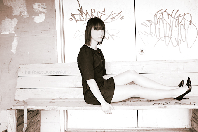
Remember:
–Read How to Critique a Photo
–Make a critique sandwich – something positive, something you would have done differently, something positive
–My rule: no improvement tip = deleted comment
–This will benefit the person leaving the critique just as much if not more than the person receiving the critique.
Thanks to Yvonne at Half Past Wonderful for submitting the following image.
Settings: ISO 100, SS 1/400, f/4.0
I also wanted to let you know that I will open back up the opportunity to submit your image for critiques next week. I will take the first 12 people to submit images and then I will close it again for about 3 months so we can critique those images. Remember, you may ONLY submit an image if you have critiqued at least 2 other images.


What an interesting location for a shot – I love the “urban feel” to it! If I had to change something, I would have moved the model further back on the bench so she was looking into more negative space and to take better advantage of the rule of thirds. I think I would have also asked her to move her right hand back a bit so she didn’t look so slouched over. But overall, it’s a great picture- I love the black and white edit- so clean and fresh!
Lovely photo! Great job making sure to bend some limbs so she doesn’t look so uncomfortable. Love the b&w processing. I think that I would have liked to see her either move back on the bench or have the framing of the photo so that she was more on the left of the photo, it feels like she is sorta leaving the frame and I think that could have fixed that. Also I would have loved to see her more toward the bottom of the frame with some negative space above her to give it some demension (that is just me though). Really neat location for a photo shoot! Good job!
A GREAT PHOTO IN THE MAKING- I LOVE THE BENCH AND ITS ROUGHNESS AS WELL AS THE URBAN FEEL TO THE PHOTO. I AGREE WITH THE TWO COMMENTS PREVIOUSLY POSTED ABOUT THE PLACEMENT OF THE SUBJECT TO THE LEFT TO DRAW THE OBSERVER IN AS WELL AS HER POSE ON THE BENCH BEING A BIT UNNATURAL…. ALSO IT LOOKS LIKE THAT GRAFFITI IS FORMING A HALO AROUND THE SUBJECTS HEAD SO THE PLACEMENT TO THE LEFT WOULD HAVE ELIMINATED THAT. I LOVE THE EDIT OVERALL IT’S VERY SOFT KIND OF A CONTRADICTION TO THE LOCATION BEING MORE HARD AROUND THE EDGES.
i hope this was helpful and not too hard on the critique side of things.
I really like the composition, so creative! Overall I feel the photo is lacking in contrast and maybe a bit over exposed, maybe you could increase the blacks a bit. I think having the subject move back where the wall, instead of the doors are behind her might help. The words seem to be jumping our of her head;) I had this happen when I was doing a Christmas shoot this past fall. The father appeared to have a big read bow coming out of the top of his head :) You did a great job nailing the focus. The image is very sharp. Keep up the great work.
Great photo! I like the urban location and the black and white conversion – it kind of gives it an edgy look. I do agree with the others that I would have cropped in on her a little tighter and not left the empty space to the left. But I like the story / personality you captured. Great job!!
I love the photo and the location looks great! If i would do it differently, I would pull the model back on the bench using the rule of thirds. I’d love to see this in color, with the contrast of the writing on the wall and her outfit. The model could also turn her shoulders more toward the camera for better posture that would match her legs. I love how sharp and crisp everything is. And how she stands out from the background. Great job!!!
I really love this photo. The pink/black/white tones give it a glam/urban vibe that makes me want to BE that girl. The location is perfect, as is the styling of the model. Her expression makes me curious to know what she’s thinking about…it makes me want to keep looking at this photo. Amazing job capturing that look. To “click it up a notch” I would’ve moved her back on the bench. This would help with the rule of thirds, and it would give a little more contrast between her face and that pinkish looking wall, instead of having white on white. It also looks like graffiti is coming out of her head, so moving her back would help with that, too. Another thing I would change is possibly bringing down the contrast a hair, even though I kind of like where it’s at. The thing is, with the contrast this high, and with this much white, it’s just such a hot/bright photo…a little much to look at. However, moving her back on the bench so her face is not on that white may help with balancing that out. In any case, this is a unique photo that has a story to tell. Well done!
I love the idea of this photo, and the model is fantastic, I agree – her expression is “Curious” – a little playful something going on. I do however have to say it feels to “whitewashed” the edgy urban contrast with her clean office look blend together. I’m not going to repeat about the graffiti halo. ;) And just a final comment on her pose, its a bit awkward to me. I think someone had mentioned upper body toward the camera a bit more? otherwise maybe bending forward to the back leg that she’s lifting? And a little shadow to draw her leg from the bench. I do adore the pose and contrast – model versus background. The clarity of the photo is spot on!
I really like the lighting, there are so many things about the other comments I agree with. I love the contrast of the classy dress with the Urban setting. the one thing that I noticed first that I would to different would be her hair in her eyes, I just didn’t find it attractive. And I really like the clear and crisp look of the picture.
First off I love black and white, it makes the photograph exclusively depend on the subject and background. It makes it simple beauty. For some reason I am drawn to the open space behind the subject, it seems like there should have been little space behind the subject and more space in front of her. I like the contrast of the urban location and the classic style of the subject. I would have liked to see more of the other side of her face, if you possibly moved a little bit off centered to the left, down a little and had her look back and down it might have made a more sensual feel – especially if she moved her front arm a little behind to let her sit up a little more. Overall, I think it is really good. Very creative and original. And that is something to smile about! Creativity!!!
I really like the starkness of the setting – gives the feel of an abandoned warehouse. The black and white adds to that feel. I agree with other comments that i would have moved her further to the left on the bench. And perhaps would have moved the camera even further to the left so she would have been looking slightly over her shoulder at the camera