Remember:
–Read How to Critique a Photo
–Make a critique sandwich – something positive, something you would have done differently, something positive
–My rule: no improvement tip = deleted comment
–This will benefit the person leaving the photo critique just as much if not more than the person receiving the critique.
Thanks to Erin Chauvin for submitting the following images.
Settings: ISO 1600, SS 1/80, f/2.8
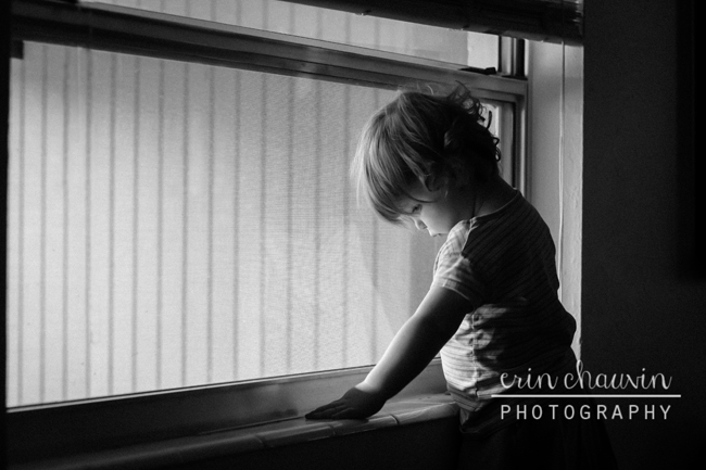


I wouldn’t do anything to this image. This is probably her child… it i does not need to be perfect, because the soul of the image is perfect.
Hey Laurie!
Since this is the Critique Me series I encourage you to study the image and find something you would do differently or improve upon. Every image out there has something that could be improved upon or changed. The people who submit images for this series want to learn and hear your feedback. Thanks!
I still wouldn’t. I like the image. I think instead of taking the time to fix it… she needs to play with him/ her, cuddle, etc.. I mean we can talk about editing out the hardware at the top, but that is removing part of the home. You can remove the reflection in the window, but that is part of him. Maybe she could have step backed and opened up the image some… of course moving might have made him move and ruined the image. Maybe my critique is to pick an image that actually needs to be critiqued.
I chose this image in particular because black and white conversions have been a struggle for me. I also struggled with the composition of this shot because she was so near the window and our house is so small it’s hard to capture some moments with my 50mm. I wanted to get another’s perspective on how I might have changed the cropping or how to improve on the B&W conversion.
This shot might not have been an ideal choice for critique but I love this image and would like to improve it before I print it and with my “mommy goggles” on I hit a wall in figuring out how. Thanks for your input though.
Maybe I have my Mommy goggles on too… and that is why I am adamant about leaving it the way it is. ;) It is something I would have taken.
This is a really good images. It’s real and raw, capturing the child as they really are, which I love! The only thing I would change, which is out of the photographer’s hands is the window view. The lines are a little distracting. I do also love the coloring, the black and white looks dead on.
Thank you so much! I really wish the view from that window was totally different. Unfortunately, it looks right into our car port and the wall with the lines is the ugly laundry room that is out there.
I also have been really working on nailing black and white conversions so it means a lot that someone thinks that I’ve got it. :)
I think this image is gorgeous, and at first I couldn’t find anything! The lighting is just wow. But for the sake of critique, I suppose I would have liked to see what the picture looked like with the window top not be there, sort of going through the top of his head like that. I also might have tried to get rid of the window shade and cord, just to remove all those extra distractions so you can really focus on the child. So lovely, though!
Thank you! We have these weird narrow windows in our house (I live in Florida in a cement block house and it seems as though those windows come standard in these houses). My daughter has a habit of standing on the love seat that is beneath this window and looking out waiting for daddy to come home. After 10 minutes of calling for him, I told her that he wasn’t coming home for another hour and she immediately looked down super sad. I was SO glad I had my camera handy!
I love images where a young child is doing anything other than smiling for the camera. The black and white complement the mood/feeel of this image incredibly well. I’m glad I’m not the only one who is having difficulty finding anything to improve. My first thought waas the window frame cuttting through his hair and if it could be done without changing the angle on his eye then it would be an improvement. I kind of like the vertical lines in the background but what must be reflections of the lines in his shirt are a bit distracting. Great image and any of these changes would, at best, only make minor tweaks to an already great image. Very well done!!!!!!
I really love this! Love the light coming in from the window, love that it is in black and white. I love subtly lighted images like this, using a single light source. REally dramatic. I like the black and white but I would personally brighten it just a tad.Personally I like the lines on the window (from blinds?). Really nice image.
I love the image as well. Love the mood portrayed. Trying to be pernickity…. hmmm…. I think I would change the photographers physical position. I think I would have physically moved over 10-20 degrees to the left making the walls look more balanced in the picture. Either that or crop the image just a bit tighter to remove the tiny sliver of black wall on the left and crop the blinds out on the right hand side. Balance is just slightly off. Great image! I’m just being pernickity for the sake of the critique. :)
I love the emotion captured in this picture! You really sit back and wonder what the child is thinking about. I would crop in just a bit to remove the top window portion. The extra light on the top can pull away from the light by the child’s face. I really like the black and white color of this image, it really adds to the great story. Lovely image!
I love the light that is falling on the child’s face and the fact that all of face is in the light. I would say that some kind of reflector on their back would have been good to add just a little light to the back of the shirt. I love the darkness behind them, it brings your eye to the face but just a little more on the back of the shirt would have been nice.
I never thought about using a reflector. I’ll have to give it a shot next time! Thanks!
This is a lovely picture; it captured a quiet special moment in time. I like the reflection of the child in the glass; the composition of the picture is great and is very intriguing too, as is hard to tell if the child is indoors or outdoors. They say that the best pictures are the ones that make the observer think and move their eyes around the image, so for sure this image did it for me. I would have cropped the image to hide the black wall a little so the focus is on the child and also would have taken the picture from a lower perspective to see that cute face little more.
I think that the black and white conversion is great. It’s darker and really enhances the mood of the photo and supports the subjects expression.
Maybe cropping in tighter to eliminate some of the dead space would behind her. I love the photo as is, but for the sake of critique I’d be interested to see if a slight change in position or composition would intensify the mood a little.
Love the light on her face. It’s such a great photo. Nice job!
I love that it is black and white, good choice. I would like to have changed the lighting in the back of the child a little more…maybe a little wider aperture? The view out the window isn’t ideal, but that can’t really be changed when you are “grabbing the moment”. I think it’s a great moment of a child’s momentary downtimes and it shows the emotion well.
I really love your picture. The black and white image adds so much to the emotion your child is sharing. There is so many interesting lines in the window design. I think you could try and crop the photo down just from the top. This way you could simplify some of the clutter at the top of your photo caused by the window lock. So huggable…keep up your wonderful work. Liz
What a gorgeous image! Your black and white conversion is wonderful! Maybe having the little boy looking straight out the window rather than down would be nice? Not sure how you could make him though! Kids do what they want!
Otherwise- the composition of this picture is great. I like how the window lines draw your eye to the subject.
Lovely shot. I would like to see it cropped in a bit tighter, removing some upper and right sided space. I would lighten the shadows just a bit and brighten the face a smidge. Other than that, I wouldn’t do anything else. I really like this shot.
I love the mood on this! Your child’s expression is wonderful, I’m such a sucker for moody images!
I agree about potentially cropping the image, as well as adding some brightness. I personally like a little more contrast in my black and whites, which might be helped by adding brightness, or potentially adding a bit more contrast?
I also actually like the lines out the window, it makes it interesting!
This is a really breathtaking shot. I love that you chose to convert it to black and white because it really allows the expression on the child’s face and the emotion of the photo to stand out. If it were me, I would increase the blacks a tiny bit and brighten the window area so there is a little bit more contrast to the image. I think the composition is great though. I wouldn’t change the crop.
I agree with everyone’s compliments. This is a lovely moment captured. I might suggest you crop the photo tight on your child’s back and head, eliminating the border of the window frame on top and the white from the window frame on camera right. His body will act as a leading line to his sweet face and his gaze will lead us down again. Keep the negative space of the window view to the left and the leading line of the window sill on the bottom which will again lead us back to his sweet face. Does the make sense? That will eliminate all the distractions. Great work!
I love the colour, B&W is perfect here.
I agree with Juli I, I would crop against child’s back and I would only show bottom piece of window glass. I would show child in a 1/3 of rest of picture.
It’s a natural shot, you can pose them, so a job well done!
That was meant to be… It’s a natural shot, you CAN’T pose them, so a job well done. Oups! Still loving the photo on a second look!
I absolutely love this image. These are my kinds of images… you get so much feeling from them, wondering what the child is thinking or feeling. The only thing that I can see to improve it, is to crop it a little tighter. Maybe right behind the child so that some of the space behind the subject is lessened and most of the space is in front. The leading lines from the window frame are great. The black and white conversion gives it a wonderful moody feel. Love it!!!!
I agree with most of the responses….gorgeous, real and moody. I love everything about the photo. if I had to change anything, it would be the string hanging from the shade. I love the composition and processing, it’s perfect for this capture!