Remember:
–Read How to Critique a Photo
–Make a critique sandwich – something positive, something you would have done differently, something positive
–My rule: no improvement tip = deleted comment
–This will benefit the person leaving the photo critique just as much if not more than the person receiving the critique.
Thanks to Scott at Scott Fairbairn Photography for submitting the following image.
Settings: ISO 400, f/2.0, SS 1/160
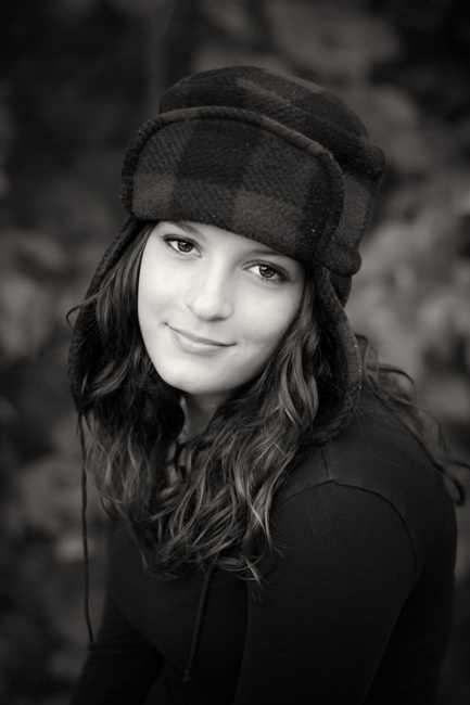


I love this photo! Her shy smile and quirky hat is just adorable! I would have tried to lighten the background a little to develop a little more contrast around her shirt/hat/hair..in the B&W it sort of fades together, so maybe work a little with the contrasting in PP. I love the bokeh of the background, as well! So good! Great job!
I love this image, Scott! I love the soft lighting, the black vignette, and the way the viewer’s eye is directed right to her face. You really made her eyes pop! I would have done a bit more post-processing to this image, though. I would recommend editing out the the white fuzz on the front of her cap and the string hanging down on the left side. I’d also burn in the seam on her shoulder so there’s not a highlight there. These are such minor things, but they are also quick fixes in Photoshop, and could improve the image. Also, the lighting might have been a bit more interesting if it had been more directional and controlled. Still, a truly great image!
Love, love, love it! Don’t you love photographing this age…they know how to work the camera! Critique: not too much except maybe some how gotten rid of the strap/tie that is on the right side of her shoulder, I find that my eyes are drawn to it…no pun intended! Great catch light and lighting…beautiful subject!
Beautiful girl and photo! I had to think for a minute before coming up with any critique so I could tell you how much I like it too. :) Beautiful catchlights, bokeh, expression. Her coat and hat fade into the background because they are so similar in tone. Can you lighten either the edges of her hair, or the background a bit? Great job!
I love the black and white conversion you did and how it really allows you to focus on her face. If I were to change anything, it might have been to have her sit up straighter because at least for me, the curve of her back and shoulders is a little distracting. I might have also pulled back the drop a tiny bit. I LOVE the creamy Bokeh you achieved in the background. Nothing makes this girl’s heart sing quite like a lovely bokeh-ed background in a portrait!
What a pretty girl, and those stunning eyes are caught beautifully. Like Erin, I would have her sit up straighter, I’m all into correct posture these days! Apart for that, I think it’s a wonderful picture that the subject will treasure for years to come.
I was just thinking the color version might provide the contrast between subject and background too. But I still love this B&W, just a thought!
What a beautiful model! I really love this image in black and white although her jacket blends a bit too much into the dark background. Maybe a bit more of a smile would bring out some personality too?
It was hard to critique this image, beautifully shot and love her hat!
Hi Scott – I appreciate the rich inky blacks in the exposure of this shot – very dramatic against the subject’s clear and bright complexion. I would experiment with throwing the cropping even more off center to give it a more editorial feel which might even add more to the mood you captured here so well. You might also consider brightening/lightening the hair exposure a tiny bit for increased contrast against her dark shirt and maybe spot-removing a few dusty artifacts on the brim of her cap and editing out the string dangling down. My comments are minor though – I just think they could add a touch more polish to an already impressive image. Thank you for the opportunity to practice my critiquing skills.
Great shot Scott! I love her head positioning and composition of the photo. I think that the B&W conversion does a great job of pulling the observers eye to her face.
With that being said I’d like to see a the background lightened slightly to make her pop into the front of the photo. A slight adjustment to the contract and mid tones maybe. With everything dark the rest of the photo seems to blend together, her shirt, hat and hair into the back ground. A colour version would be interesting to see!
Regardless, it’s still a captivating photo! I’ve been stuck staring at it for that past 10 minutes.
This is a great B & W! I love the composition too. So finding a critique is hard here, but here is my attempt…There are a few specs off fuzz on that hat…and it has also slightly shadowed her eyes/ forehead. A little catch light edit in her eyes could help there. But otherwise, so beautiful!
Love it!!! I like that all the other colors of the photo blend, because it makes her face and eyes pop. The only thing I would have done differently is clean up the lint and threads on the hat in post. Maybe add just a tad more contrast. I love that her pose is relaxed and natural. Beautiful image!!!
I love the black and white, but I wonder what the color version would look like. I think I would have lightened the background slightly, and I would have hid the tie string of her hat (my eye goes right to it). I love the bokeh in the background and her face is lovely.
Wow, such a beautiful image. I love her smile and the sharp eyes. Maybe try this in color and see if it lightens up the background, so they don’t blend in as much! Also maybe edit out the string by her jacket in PP. This is an awesome image though!! Great job! :)
WOW wow WOW! Fantastic image. I personally LOVE the creaminess of her face in contrast to the dark clothes, hat and background. Everything is drawn right into that expression. It was a challenge to find something to critique, but the only thing really is that string hanging down. It is ever so slightly distracting. Other than, that…beauty. Great subject, bokeh and post process!
Love this photo! It is just a fabulous black and white. I do agree with some of the other comments about the string and the seam on her shirt but they are really small compared to the overall quality of the photo. I also seem to get a glare off of her face as it is so white compared to the rest of the photo but that could be just my eyes. There is also some fuzz on her hat that shows up white that I would fix if you are cloning out some of the other items. Overall fantastic job!
Honestly this picture is amazing!!! I LOVE the black and white conversion, it just makes an image more dramatic….I maybe would have not cropped in so tight (especially if your client wants to order a canvas)…Great job posing your subject and making her look relaxed in front of the camera! :)
What a beautiful shot! I love the black and white and the tones in the image. The center composition really works here. I think I might would have moved just a teeny tiny bit to the right, to get the rest of her hair in the shot. It looks like maybe part of her curls were chopped on the bottom? I have to wonder what the color version would look like, too…. :) The bokeh is beautiful and you did a great job making her eyes pop.
Really beautiful image. I love her expression, eye contact and the background bokeh. It is a tad dark for my taste but I tend to like bright black and white images. I might have also pulled back just a touch. Great image though! I like it in b and w!
I like the darkness of the image. maybe you could have her hands in image to add to composition. i also like the angle of her face. nice capture.
This is great! Her whole face has great focus….nothing that looks blurry. I like the black and white, but with what appears to be a fall time background, I would like to see this in color. Overall, the pose and comp look wonderful.
Nice website. My thanks for doing such a good job. I will definitely check to this site to find out more and inform my coworkers about your site.
nba jersey clearance cheap youth jerseys mlb