Remember:
–Read How to Critique a Photo
–Make a critique sandwich – something positive, something you would have done differently, something positive
–My rule: no improvement tip = deleted comment
–This will benefit the person leaving the photo critique just as much if not more than the person receiving the critique.
Thank you to Clare for submitting the following image.
Settings: ISO 800, SS 1/400, f/2.5
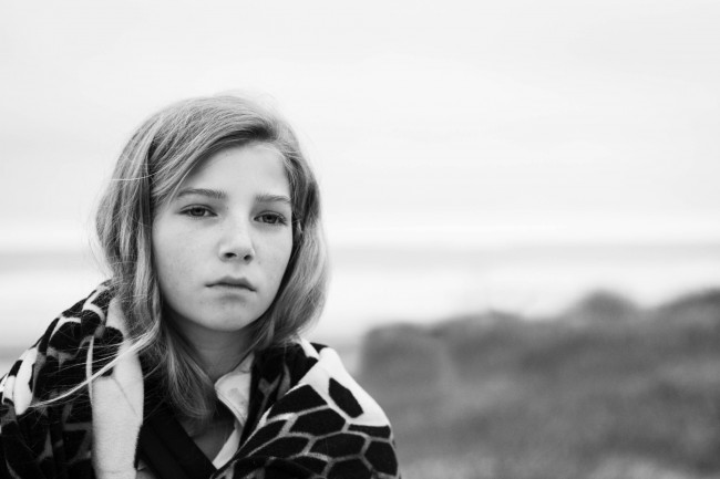


This image is so hard for me to critique!!! Great mood captured in the subject and all over feel of the photo…the horizon line is a little distracting to me because of where it falls along the photo…but overall great black and white, very compelling!
J
This is definitely an image that calls for a B&W conversion — the mood fits it perfectly!!! I might consider adjusting the crop a bit so that her head/eyes fall in the top third of the picture as well because you definitely nailed the rule of thirds on the left. Great capture of a very soulful moment!
I love how her gaze and the emotion on her face makes you wonder what she is thinking. Black and white seems to fit the mood of the photo. To me the lighting on her face seems a little flat…and somehow…off. Trying to figure out how to fix it. I think some highlights on the face ( I don’t know if you could maybe create this in post processing?) would help capture her face better and be more flattering. As for the horizon, I’m not a big fan of over photoshoping, but I think in this case I would almost be tempted to take out the back horizon line just because it goes along the line of her face. Just a personal preference thing. You created a very captivating photo.
What a moving picture! My only criticism is that the black and white seems almost a little too dark…especially in the face. I would try using Photoshop to play around with the black and white so that there is a little more light in the processing. Nice picture!
The mood and feel of this image are fantastic!! I think your processing choices enhance these quite nicely. This image just says somber and pensive to me. If her face was brighter or more flattering I think it would detract from the image even though it might make her look “better”. I might have shot this wide open to further blur the background. That along with the dark horizon line running through the middle of her face are minor points in a great image. Thanks for sharing!! Great work!!
This photo is FANTASTIC!! The only thing that is throwing me off a bit is the placement of her eyes. I think the composition could be enhanced if her eyes fell on the top left rule-of-thirds intersection point. Excellent work!! :D
Gorgeous mood of this photo. Love the black and white. I would have liked to seen more contrast in the background or no horizon line all together. The expression on her face is great and I love the wind blowing the hair. Very nice work!
Love the photo! I think it is a great shot and perfect for black and white. I agree with the other comments about either increasing the contrast in the background or changing the horizon line to not be as visible. Overall a great photo! Thanks so much for sharing!
I love the emotion from the photo. I almost want to cry because the girl looks so truly sad. Her eyes look a bit like dark holes to me. I would go in and brighten just her eyes up so they are not so black. Whether this was posed or not it looks completely natural and unposed. Awesome.
The lighting on the face is a little flat… i would have done a three quarter lighting on the right side of her face with no reflector. It would of added a more dramatic feel to the photograph and complemented her deep thinking/ concerned look… but besides that i love the photo, and the black and white goes perfectly with the mood of the photograph.
This is a wonderful image to look at and contemplate what this beautiful girl is thinking about. Perhaps brightening up her eyes just a bit would add to the image. I personally like the horizon line as it creates a sense of an ocean or some body of water behind her. Very soulful image.
First time critiquing here! (wasn’t sure if you needed to know that or not, but saw other people saying so, so I thought I would too :)
Ohh, so many things I like about this photo! The clarity is awesome, and I think f/2.5 was the perfect aperture to have it set on for this photo! I would like to see this photo in color though. Maybe it would have been good to scoot the camera over to the left a bit too, so we could see more of her shoulder. Just a thought! :) Overall though, this is a fabulous photo and you are very talented! Well done!
The atmosphere in this photo is fantastic! The B&W treatment definitely rocked. Normally I would increase the contrast a bit more, just to darken the mood a bit in a B&W photo, but I think that’s more of a personal taste thing and your photograph is fantastic as it is. What I would suggest though (in my own opinion) is that I feel like the background takes up a bit too much space, so I would crop it smaller, have the model’s face become bigger relatively speaking, and have the background take up less space. Otherwise though, the movement implied in the photograph–the wind moving her hair and such–really showcases the aesthetic level of the photo! :)
Gorgeous images, would love to see the midtones raised and maybe a texture would suit this image but its really great nice conversion too