Remember:
–Read How to Critique a Photo
–Make a critique sandwich – something positive, something you would have done differently, something positive
–My rule: no improvement tip = deleted comment
–This will benefit the person leaving the photo critique just as much if not more than the person receiving the critique.
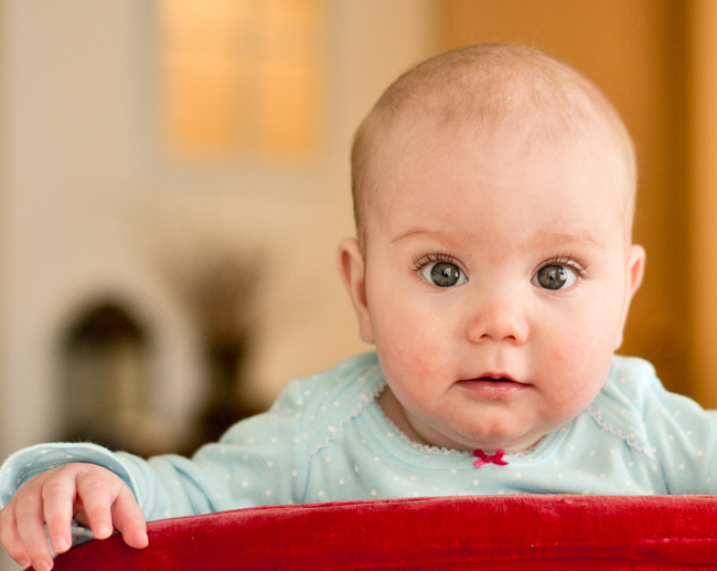
Thank you to Kristin for submitting the following image.
Settings: ISO 400, SS 1/125, f/2.5


First time critiquing here!
You have GREAT focus. I judge the focus of my pictures on how clearly I can see each eyelash and you nailed it! The dark objects behind and to the left of the baby are kind of distracting. I probably would have cloned those in Photoshop. I also might have pulled back a little bit, just so the baby’s fingers weren’t so close to the edge of the frame. Great clarity on the face though. And the catch lights in the eyes are awesome. Between the catch lights and sharp focus, the eyes really stand out!
Your focus is spot on, and the catchlights are awesome! I’d also pull back just a tad to be sure and get all of her little right hand in the frame; some might consider running a skin smoothing action at very low opacity to even out some of the redness in her face … even though I personally prefer to leave as is. Great use of shooting wide open to have the background fall away!!
This is my first time critiquing ever…. and…. I have no idea what I am talking about (most of the time)… so here it goes.
The image makes me smile! Love the sharpness in her eyes. I would have tried to smooth out her skin a tad. Not so much that her skin looks fake, but just enough so my focus can stay on her darling expression. I also like the contrast between her shirt and the red object in the front. She looks like she has such a fun personality.
beautiful shot. i like the composition and the focus of her eyes. maybe pull back so we can see her other hand. i like the blurred background. its a great classic capture.
How stinking cute is she!
Focus on the eyes looks great, and love you can see the details of her eye lashes.
Can you remove the black objects to her right? I think removing those distractions will take your photo to a new level. Even removing that picture right next to her head, so the wall looks solid, will really put the focus on her.
If you don’t have Photoshop or Lightroom, Picmonkey.com has a cloning tool you can use. I’d just pick a clean part of the wall and then clone the wall over the distractions. Rather primitive, but it works!
But, really, it’s a sweet photo. Good job!
I love this photo! The catchlights in her eyes are gorgeous!
I agree with the others about the dark objects in the background being a little distracting, and also, I think next time you should try zooming out a little bit so that the baby’s fingers aren’t so close to the frame.
I love the contrast between the baby’s shirt and the red thing in front, and the way the little bow is brought out by the redness of the thing in front.
What a beautiful shot of a beautiful baby! I love the way the baby’s eyes are in perfect focus, and I also enjoy the beautiful catchlights–they really enhance the sparkle in the eyes. The exposure is just right too, and I like the shallow depth of field. I also think that the fact that you didn’t smooth the skin is such a nice touch because baby skin is beautiful in its own right without enhancements.
I agree with the others in this forum who suggested that you pull back a bit so that the fingers on the right hand aren’t so close to the frame. Alternatively you could have reframed the shot by moving the camera to the left.
One aspect that I might have changed is the white balance–the baby’s skin seems to have just the slightest bit of a yellow cast–I imagine because the walls seem to be painted yellow and they might be reflecting that light onto the baby….
Lovely portrait, and thanks so much for sharing!
Those eyes are amazing. As long as you have them your shot is great. I think that rather than pulling back I would come in tighter though, and probably orient the shot vertically. I would also love to see how the shot works in black and white. This image just has a great feel and that carries a great deal of weight with me. Well done!!
First time here too. Love the shot, her eyes just sparkle!
I really like the composition and being able to see her little hand. I probably would have done it in black and white or even just desaturated a little bit (I’m really into that look at the moment!). And maybe brightened it up a little bit to really make her eyes pop. The things in the background are a bit distracting too but don’t think they take away from this gorgeous little poppet!
Wow, what a cutie! And such a great shot. Her eyes are so amazing!
My only critique would be smooth out the skin just a bit. And for me, the eyes are so stunning, that I probably would have cropped it in really tight, possibly even cut off the top of her head. This would also solve some of the distracting things from the background. If there is one thing that I’ve learned with photographing babies – you really can’t get in close enough.
I could be wrong, but I would try this in black and white – her eyes might pop even more. :)
Overall, a really sweet image.
Beautiful catchlights in the eyes and a great expression on that babies face!!
I personally would try to make the image less warm. Smoothing the babies skin would be a good touch but not necessary, I like babies skin natural so it doesn’t bother me much.
Wonderful bokeh and pose! Great job!! :D
This picture makes me smile! I love that your focus is spot on and really draws me to the eyes. I would have bumped up my curves a little more to “blow out” her skin a bit so it gives that nice creamy appearance. I love a little warmth in photos but I think I probably would have toned this one down a bit. But I absolutely love the contrast between the red object in front of her and the blue of her outfit. Great picture!
Beautiful baby. I love the composition of this image. The focus on her eyes is wonderful. I can almost count her eyelashes. The window in the back distracts me a little bit as do the black areas in the background. Wonderful DOF and I LOVE that her little bow matches the foreground and love the velvet texture of the foreground. Sweetness abounds in her little face.
Your focus is phenomenal! Beautiful color contrast and the eyes pop wonderfully. This looks like a photo I would have took. Sometimes i like to clean up babies faces a little to reduce the read but its also a personal preference to yourself and the client. Again great photo!
The focus, like many others have said, is fantastic! My opinion, though, is that when I first looked at the photo I felt a bit overwhelmed. I think while the color contrast is great, they were almost all warm colors, so that distracted me a bit from the baby’s face. The background, too, is a bit cluttered to my eyes. I’d say that this photo is fantastic in that it’s not only a great capture but also a great moment to capture, but it feels overall a little bit too much and I think cleaning it up somewhat should do the trick very nicely! :)
The eyes really sparkle, beautiful. I agree with the others, the dark spots in the back are distracting need taken out and I would have done something with the red spots on the face. The composition is great, the red chair gives it a good contrast of colors.
LOVE IT!! I think I am in the minority here but I think the composition is wonderful I like the fact I can see only one hand. I agree that the dark image is a bit distracting, but on first glance the only thing I noticed was the crisp clarity of the eyes and lashes. I personally like soft light on babies, and might have tried a lower ISO and a diffuser on my flash such as a Gary Fong. Overall it is a keeper, and sometimes with little ones it is about capturing the moment not about the camera settings.