Remember:
–Read How to Critique a Photo
–Make a critique sandwich – something positive, something you would have done differently, something positive
–My rule: no improvement tip = deleted comment
–This will benefit the person leaving the photo critique just as much if not more than the person receiving the critique.
Thank you to Kassondra at Chachi’s Memories for submitting the following image.
Settings: f/3.5, SS 1/125, ISO 400
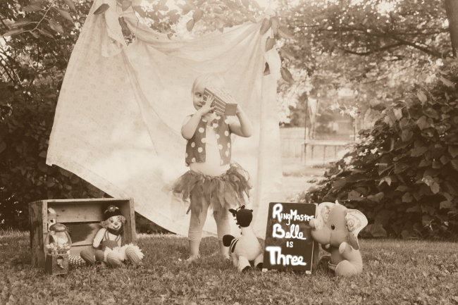


This is a cute set-up with the toys, pretty little girl and the sheet tied to the trees. For me this photo is a little soft but maybe that was the look the photographer was going for. I think the girl as the focal point could have been sharper. Sweet idea!
I agree with Jessica that the focal point could have been a little sharper. Personally, I would have kept the photo color and added a small shaded circle frame to direct your eyes towards the middle. Hope that makes sense!
-Samantha
The sun shining through the trees is really lovely. I always like that look. It might be better though, if it didn’t wash out the clarity of the little girl’s face. Also, maybe instead of black & white…a muted color might add charm & a bit more whimsy to this charming photo. I LOVE the props & set up :)
What a wonderful concept…love the circus idea! I agree with the above post, perhaps the beautiful little girl could have been a bit sharper. Really like the antique look of the photo.
I love the way she handle the colours, light and dark. But for me personal is it too much different things in one picture. Next to the “curtain” where the child stands I see a open spot to the back. My attention goes all the time to that spot and not to the child.
I would like to do the photo again and than one without the “curtain” and one with the “curtain” for the entire opening. For the rest it is a very great idea to do this with kids.
I love that it actually looks like she can see through that popcorn box. As much as I would love to see this in color, With use of the Sepia I do like the vintage feel this picture has.
I know there will be much info posted here, after all, we all do things differently and have our own style so its not a meant to be negaitve. For my eye, I think the child should be engaging more with the whole setup, looks a bit too staged. I also would like to see a bit less greenery so crop the photo some and add more contrast; the picture is flat and does not show much definition. Overall it’s a cute shoot.
Super cute idea!!! I think the photo is just a little too soft also, her face/hair is easily getting lost with the sheet behind her. Again, cute idea :)
Cute set up! I love the blanket flowing in the background. I think this shot could be a little tighter even including everything in it. I feel like there is a little too much empty space on the right. Love the little girl’s outfit and how’s she’s playing/we’re getting a glimpse of her world.
Very charming shot. I feel the child could use more detail-the highlights are a little too blown out, resulting in low contrast within. Don’t get me wrong, I like the overall character of the picture-maybe a little more dof would be great, to really bring out the main focus; the child. The background is competing with the main subject. I like the set-up with the teddy bears etc. really cute. Not sure about the sepia toning-maybe too much of an antique feel. Vivid colours might give it a little more character and authentic feel (the polka dot vest would in my opinion profit of colour treatment). How about replacing the background alltogether with a less detailed and softer one to make the foreground subjects pop some more. Someone suggested to crop out some of the background and I agree with that). Again I really like the setup and I don’t see a problem with the staging-I like that because it’s done well. I hope I didn’t sound too harsh on my critique, because I really like the shot. Oh, by the way-Happy birthday to the child.
I’m really torn here. I really do like the FEEL of this image. I really do not like the fact that my eye just seems to roam around the image and never really finds a focal point to land on. While this certainly hits on the cute factor I’m personally not a fan of heavily staged images, especially for young children. The feeling still carries the image for me so I say well done!!
I love the old-time feel of this photograph. It’s so airy. I would perhaps have added some extra contrast just to pull out some of the features. I love that there is a contrast with the contrast (ugh, words are not my friend today) but I think the ethereal feel would be enhanced if some of the darker background was cropped. It’s awesome though, reminds me of a sepia circus/entertainment photograph.
Hannah
http://www.thelemonhive.com
So cute! I love “themed” photos like this one- I love all the props you used to convey the “circus” feel! While the props are cute though, I feel like the image is a bit cluttered- I’d like to see it cropped in closer so I’m not “searching” all over the image to find out what’s going on- maybe use cropping to achieve the rule of thirds so that your eye is drawn right to the subject, the happy birthday girl. Otherwise, I love the back lighting and the way you processed it to give it a vintage circus feel!
Very nice use of props! You really have a touch for setting all that up! Very creative use of the blanket in the back too! If I were you, I may have left this in color. I’m (personally) not a huge fan of sepia tones, but again, that’s just me. It looks like you have some really pretty sunlight coming through the branches at the top. I think we may have been able to see it better had it been in color. But really, good job! And where do you find all those cute props!!!!?? :)
Very cute idea and props! I feel the image is kind of flat and could use some contrast. I find the opening to the right distracting as well as the very bright R, B, T on the sign. I love the backlighting!
What a cute picture! I love the styling of it and the theme. One thing that my eye is immediately drawn too is the white writing on the sign. Since it isn’t that vintagey sepia tone, it just doesn’t fit. I’d leave that in the sepia tone. I’m feeling like the girl is blending in a little too much into the background sheet. I think you should play with the levels/curves, and black and white mix. I am not seeing any really dark darks and I feel like it needs a little contrast. This would fix the child blending into the blanket. I am not seeing any really white whites either. This would fix the situation with the white lettering. Maybe pull up the clarity as well too to help with getting things to pop and more contrast. I love the vintage feeling that you created with this picture. I think just a little work with the contrast and toning will really make this one pop!
The composition is perfect. But i would add more midtone contrast to the child so it would draw the viewer’s eye.
Very darling little girl. I love the light and the way the sheet is hanging in the trees. Very nice. When looking at the image I want to see more of the darling little girl’s face… especially her eyes. She has such a naturally inquisitive look on her face and I think that gets lost in the expanse of the image. Would love to see this cropped in more closely and would love to see a color version. The image makes me curious about the colors of her tutu and polka dot vest. I imagine those colors contrasted with the greenery in the image would be stunning. Very nice image with a great feel to it. Good job.