Remember:
–Read How to Critique a Photo
–Make a critique sandwich – something positive, something you would have done differently, something positive
–My rule: no improvement tip = deleted comment
–This will benefit the person leaving the photo critique just as much if not more than the person receiving the critique.
Thank you to Diana Chao for submitting the following image.
Settings: ISO: 800, SS: 1/400, f/4.0
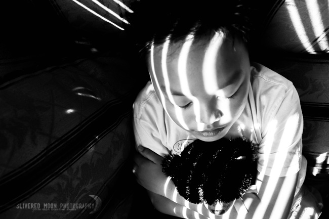


I love how you have placed her off center and her eyes according to the rule of thirds to draw attention to the fact that her eyes are closed rather than a viewer only focusing on the sun lines. She could be sleeping or just resting, it looks peaceful. :)
I think I would have placed her in the top left corner allowing the sun lines to be longer. This would also remove the few spots on the dark pillow as I find them a little distracting.
Overall I love the mood you have captured and I love the contrast displayed. Keep up the good work!
Amanda
(My first critique, feel free to critique it. lol)
This photo has character and class. What I love about it (as well as all your other photos that I was looking at on Flickr) is the emotion that is not necessarily strong but able to be felt in your photos.
However, on clarity on this photo, I would have angled a little differently, because the sun shadows are already a little distracting (not that that’s a bad thing), but I think a less distracting angle would be better and bring clarity to the photo. Get what I’m saying?
I love what Amanda said above about the “mood” of the photo! So true! You for sure did it right in post-processing!! Love the B&W! :)
I love the play with lights and shadows. The composition is beautiful. The only thing I might suggest differently would be to crop down the negative space just a bit more, it would clean up the odd spaces of light in the background and highlight just subject and her/his bear a little more. It’s a fantastic image either way and brings to mind a sense of optimism in that even in the darkness there is the comfort of finding a sliver of light. Beautiful job.
What a cool picture! I love how you used the slats of light to highlight and contour over the little boy’s body! I had to look at the picture for a little while to see that he is holding a teddy bear. I’d try to bring that out a little because right now it is a black blotch and I bet the shadows are blown too. Hopefully you can lighten that area up a little to bring out more detail in the teddy bear. I love how his eyes are closed and I love eyelash shots! Nice work!!!
Oooooo I love the lighting in this photo! Very clever and good emotion. The only thing I might have done is compose it somewhat differently. I would have got closer to their eye level, only because I’m confused about how they’re sitting/laying as is. Other than that, I think it’s great. I love that it’s monochrome and you can really focus on the dramatic lighting. Really nice work!
I absolutely love this photo. The lines on the child and the walls are amazing. I think one thing I sould have done differently is maybe taken the picture straight on instead of over the child. I had trouble figuring out what the child was holding and I think being lower would make it easier. I think that making this B&W really makes this photo stand out as well. This photo is great and I just want to give that little kid a hug. Great emotion!
Great photo – love the streaks of sunlight! If it were me, I would have moved down a little more to capture a little more of the surroundings, to get a better feel of what I’m look at. Love the black & white! That makes it really a fantastic photo!!
You really captured emotion! I love it! The only thing I would have tried is lowering my angle. So I would be just slightly above eye level. I love the black and white. and I love how her eyes are the main focus.
i really like that this photo is black and white. i love the drama and contrast that is shown. i think i would have tried to change the composition a bit. i’m not sure what is going on in the photo. i think i would have had more concentrated focus on the subjects face (a more dramatic portrait look, with less going on in the background) or gone a bit wider to show more of what is happening. i love the expression that is captured. it’s rare to capture a child with such a serene look. nice work!
This is a really interesting photo. I think it really draws the eye in. I’m not so great at setting up photos like this, so I always like to see how others do it.
I think the left side of the photo is a bit distracting. I can tell there is something there, but I can’t tell what. I think it pulls the eye away a bit from the subject.
I love how the light hits your subject’s face. It looks like she is dreaming and makes me wonder what she is thinking about. :)
Thanks for sharing with us!
Thanks for all the comments, everyone! :) He’s actually a boy, but in this case the gender neutrality works better, I think? xD