Remember:
–Read How to Critique a Photo
–Make a critique sandwich – something positive, something you would have done differently, something positive
–My rule: no improvement tip = deleted comment
–This will benefit the person leaving the photo critique just as much if not more than the person receiving the critique.
Thank you to Sabrina of Moments in Paradise Photography for submitting the following image.
Settings: ISO 200 | ss 1/80 | f/5.6
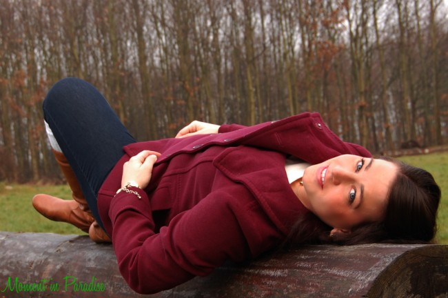


Editing-wise, the colors are beautiful. I might have tried to take a little red out of her face but that’s just my style. Her skin looks amazing. The one big thing that I would change is the position. Maybe not necessarily change the model, but the photographer needs to walk around a little and capture the same pose from a couple different angles. This angle seems a little awkward to me. But idea is awesome! I do this pose ALOT with my boudoir sessions. :)
I like the angle you are shooting at and unique pose you have your model in. Her legs look a little awkward so I would slightly reposition her. I would also shoot a little more open so the background has more of a bokeh look and maybe bump the ISO to 400. I love the creativity! Keep up the good work! :)
I like that you used a low ISO to capture the vivid blue color of her eyes. But I think the pose is a little awkward and unnatural, and I would have either positioned myself to capture more of a head shot or opened up my aperture so that the focus could be on those eyes, and get the attention off of her body (which maybe looks like she’s trying really hard to balance on that log). You also did a great job with white balance. Even though I can see the gray sky in the background, her skin looks warm.
Positive: The eyes of the model are sharp, so the DoF looks good, which is in my opinion really important.
Thing I would have done differently: I would have pose the model differently, she doesn’t look comfortable, her leg/feet look awkwardly positioned. Also, the horizon line looks crooked, but maybe it’s the field that looks like that?
Beautiful colors. I would have taken the picture more at an angle, zoomed in slightly, and stopped it down to focus more on her face and blur the body.
I love the tree lined background & how you chose to make the subject larger than life. The focal point looks a bit off (maybe on the jacket) & I would prefer it to be on the subject’s eyes so that you get more sharpness of the face. Her pose looks a bit uncomfortable, like she didn’t know what to do with her legs, maybe try both legs up instead. Interesting concept & lovely fall/winter colors!
I love the colors in this photo! I find myself focusing on her red jacket first instead of her face. Two possible options….a slightly different angle or perhaps not such a close up. Love the setting. :)
This is a beautiful picture I love the forground focus and the background out of focus. It keeps attention on the beautiful girl!
One thing to be careful of is her right toe peeks out from behind her(right behind her left foot). It is a mystery limb because you can’t see where it comes from. Make sure that there arent any miscellaneous limbs peaking out from behind something (may that be their own body or someone elses body). Beautiful picture! Beautiful girl! Great Job!
The angle you shot at is different and unique. I would have blurred the trees in the back ground. I think the color hues are amazing.
For me the white balance may be off a bit on the warm side. The posing looks uncomfortable and this seems to be showing in her face too. Maybe next time try posing her with her left hand under her head and one knee bent and one hanging off the log. This will let her body bend upward a bit easier. Also maybe pull her hair around her face. I also agree with straightening the trees a bit. The focus looks good and the direction I think you were heading is really pretty. Good luck, keep shooting. :)
The model’s outfit is perfect! That maroon coat makes me feel so warm just looking at it! I do wish this photo was taken from above. The straight on angle doesn’t make her look flattering because I can’t see all of the body. I want to see more of those boots! Maybe shoot from above with her legs either stretched out or just off to the side of the log. or you could have had her lay on her side so she was looking right into the camera but with you looking straight on as you did here. I really like where this photo is going though!
The composition and level at which the photo was captured is nice. I would consider zooming out and tilting the camera to the left just a little. This would improve the feel that the woman is crammed into the shot and would also improve the proportions of the photograph! As far as posing, I would reposition her arms to look more comfortable Zander natural. For example, maybe take her left arm and bend if up behind her head so it gives the appearance that she was resting on her arm.
You captured great catch-lights in her eyes and her expression shows that you made her feel comfortable in front of the camera. There are two things that really pop out at me, it looks like maybe the focus did not fall directly on her face and her face feels too warm and red. I would take out some of the warmth from her skin tones and boost the midtones a bit. I would set my focal point to fall right on her eye which will keep her face in focus next time.
The first thing I noticed was what a good job you did editing. Good job! :) I would like to see more bokeh in this photo, and would have approached it at a slightly different angle. The clarity is amazing though!
The outfit is fabulous. I find the pose to be awkward. I think it would do the subject justice to be standing up and showing off her adorable boots. My phone won’t blow up the picture, but it looks like the retouching isn’t taking away from her beauty. That is so important!!!!! The SS seems a little low to me. I think a higher ISO, with a larger aperture and faster SS would guard against any camera shake or loss of focus that can happen when we drag the shutter on a live subject.
I love the angle you pose the model. I would tried to get both legs of the model so it would not look like one of hers got cut off. (it might be hard to pose and get both legs though…LOL) Also, I’d like to smoothen background and paint a bit for dimension. BTW, your photo and tone is pretty!
I think this photo has great colors and I love the trees in the background. I’m definitely no pro, but to me when I look at the tree line it looks like there is some weird distortion. I also think that the model looks VERY uncomfortable, like she’s thinking hurry up and take the shot so I can move! I do like her laying on the log (which I love by the way), she just needs to be in a more natural, comfortable position. You could try something like her laying back somewhat like she is here, except next to the log with her arm propped on it with her head kicked back kind of like it is in this shot. I think it would look more natural like that and you could still get that beautiful log and have the same angle (which I also like).
I love the colors of this photo! It has a very Autumn feel to it. I would love to see the same set up in the Spring time! I think I would have adjusted the angle, though. I feel like her legs are a little awkward. I might have backed up, and moved up and left just a tad to adjust the angle. I love her smile! Your focus looks really good and I Just love the color. I know I said that already, but I do like it a lot! Happy shooting! :)
Love the colour scheme and models pose, althoigh her legs seems to have disappeared under her. The background trees add to the log she is posing on, but would blurr background trees to emphasize model more……a pretty shot xx
I like that the shot seems to be well focused and her jacket pops in the red color.
I think I would have re positioned her legs- possibly bent the back leg and had the front leg straight out. I would try to get her to put her far arm (her right arm) bent and her hand under her head. Trying to make triangles in the composition. Maybe add a little haze too.
I like the idea. She looks relaxed and comfortable.
The colors and lighting are beautiful, however the pose is extremely awkward to me. I have inner ear issues and i felt like the model was going to fall off the log at any minute, it also made me a little dizzy trying to look at her face. You can’t really see her face that well, and she seems to be a very pretty lady so I think a regular sitting up pose would have worked better, or one on her stomach where you can see her face better. The background of trees etc is gorgeous, so great job on that.
I love that she is lying down, I would have turned her just a tad more, so you can see both feet and not just the toe of her back foot, I love the colors though! Really pretty!
I agree with the other critiques about the pose being awkward. When I very first glanced at this image I thought it was a maternity shot. The girl doesn’t looks pregnant by any means it is the pose that made my mind jump to this conclusion. The pose and angle put too much focus on the girls body and not enough on her face which I think is why it reminds me of a maternity photo. You have the right set up with a great wardrobe, colors and location. Play around with some other poses.
Hi!
First of all, I love the colors, and the lines are nice, too- really draws me in to the photograph. I would have angled it a bit differently,,, the trees look lopsided, and without her other knee showing, it looks, to me, like she is hanging on for dear life! I think you did a beautiful job “filling the frame, ” though, and it a great shot! Very creative idea! Thanks for sharing your work with us :)
I love the colors, it’s warm I wish maybe it was closer to her face more cut out some l her body, let her relax cause you can kind of see it in her face. I love the idea and the tree in the background along with her laying on the log! Going to go like your page. Thanks for sharing
The color is gorgeous .. you may try to blurr the tree and use a spot like effect on her face with darkening of the edges… beautiful shot and composition
I like the pose! She looks so lovely and relaxed. I also like that you’ve used the available props in the environment (the log), and that her clothing matches the fall-looking scene perfectly.
It might help to use a faster shutterspeed during portrait sessions to increase the sharpness of the image. I feel like her eyes are getting a little bit lost where they should be crisp. The lighting is a bit uneven as well: there are blown out highlights on the hands, but the bottom half of the face seems slightly underexposed. A reflector (even just a piece of white poster board to reflect light) to fill in the face might help.
Another great thing about this photo is that it uses the rule of thirds really well. The girl is the in bottom third of the image and her face hits a quadrant of space on the right. This creates a pleasing composition
I love the composition of this picture, and I love the rich colors. I would change the positioning of her foot in this shot, maybe extending her leg out a little further, as it looks a little awkward.
I like the sharpness/focus you got on the model’s eyes- very clear & beautiful! I feel like her skin is a bit red so I would lighten it up a bit & change the positionof the model because it is awkward- I’m missing seeing the one leg. I like the warmth of this picture- the jacket, tree line in contrast to the grass. Good pic & thanks for sharing!
I love the scene. The log and background are wonderful elements. I find my eye focuses more on the red coat than on the model’s eyes. Maybe change the angle just a tad, or zoom in a little? I like the creativity, though.
I love the colors, but I might have brought up the exposure a bit. The first thing I noticed is the horizon line of the trees is way off. This makes the photo look super crooked. I would’ve also come in closer and gotten more of her face rather than her whole body. Her leg and foot are very distracting. I would also bring down the reds in her face. I agree with pp that the focus seems to be on her coat rather than her face.
The overall object of the photo is great! Colors are wonderful, as well as the tree-lined background. I only have two suggestions: One the angle could be changed to capture her face more. She doesn’t look comfortable. When trying a different angle, I would then suggest repositioning her legs. That’s it! The photo is sweet and inviting. Great job & thanks for sharing! :-)
The colors in this photo are beautiful. The positioning is somewhat awkward though. The angle of her face or the camera is a little off and it seems as if there’s not a clear focal point. Maybe taking a couple of steps to the right or left and focusing on her upper half would make for a more flattering pose. Kudos for thinking outside of the box and trying an unconventional pose!
What a gorgeous photo! I love the lighting as well as the backdrop. Fall pictures are some of my favorite outdoor backdrops. I would have changed the angle a little- either shoot more eye level or possibly from her feet rather than her head. Help proportion everything out a little as well as help make the pose more natural with a foot off the log or hand by her face and then do a close up option as well. All in all I live the overall concept of the mood and look of the photo. Just a few small tweeks to hit it out of the park!
The colors are amazing. The jacket choice really complements her skin tones – you did a nice job in post processing. I like the idea of the pose, but the legs position is a little odd, I’m not sure how to improve it. Lastly, I love the depth of field you were able to obtain. I really struggle with this, and you did a nice job getting all of her in focus.
Beautiful colors! Love the models outfit and the setting. The pose feels awkward to me, almost like she felt awkward and that is coming through in the photo. Also her skin looks a tad too orange. The colors in the photo are great! Love that red jacket!
I love the model, and I love the colors! The whole photo has a very nice Fall feel to it. I also love the expression on the model’s face — it seems very natural and very pretty (I love how you were able to capture her eyes and the eye contact!)
The things that I would change a little would be the legs/feet position (when I look at the boots, it seems a bit awkward). Also, the hands seem a little awkward to me as well. I’m thinking if you had the model bend one leg while putting her foot firmly on the log, then maybe put her one hand on the leg or something like that — something to break the symmetry of the hands.
Other than that, great job — very cool angle and very creative! Keep it up! Nice job! :)
This is a beautiful picture, I love the colors and the warmth. I probably would have posed the legs of the model a little differently or shot from a slightly different angle to draw all of the attention to her beautiful face. I also would have tucked in the bracelet chain. Great picture, I love the change from the typical portrait poses. :)
Very beautiful, saw whole series of Julie on your site. Great variety. Prefer it cropped at waist to cut out legs as on site. Would have liked it as a closer in portrait with the neck down and trees blurred. Have her eyes and facial featured really pop. She has long waves, would have been nice to cascade them down the log for texture. She seems a bit stiff and uncomfortable, try to snap a laugh as she is lying down next time!
The colors in this photograph really pop against the background! I would have tried a different angle for this shot as the model looks a bit awkward. I love the lines that the log and the model created against the trees. It really leads my eyes around the photograph! Keep up the good work :)
like the pose, I think a lot of boudoir angles are similar to this. Like the colors. I would’ve set the ISO’s at 100 and done a faster shutter speed. Don’t know what lens you used but f/5.6 is a good setting with my 50mm. Maybe step back a little bit from your subject and take a couple of shots at different distances and positions. Love the creativeness of this and I hope you have more.
Love the warm colors of the background as well as the model’s clothing. Interesting positioning of the model on the tree stump. Creative way to shoot a portrait. When shooting photos, I tend to want to include 2 hands or 2 feet. By having a limb out of frame or cropped, sometimes it makes the model look awkward. If she was lying on her belly with legs bent up and supporting her head with both hands showing, she may have felt more anchored on the tree stump, thus looking more relaxed. Other than that, great out of the box shot
I love that you put her ON TOP of the LOG. The horizon looks crooked in the abckground. The model is beautiful and the oxblood color coat compliments her skin tones lovely.
Overall I love this concept. Colors of the coat and jeans look great and really pop against the background. I would blur the background a bit more but I know that is tough bc of depth of field issue. I would take some red out of her face and add a bit more tone to her hands. Love the angle idea but it looks not quite there. Maybe moving a bit more to the right.I would button her coat up a bit more so you are not looking so much into it with a “wing” sticking out. Love this idea of her laying on her back and that you didn’t do the traditional laying on her stomach but she looks uncomfortable. She looks like her legs and hands can’t get in a more natural position because she might fall off. I would take this idea a bit further with the angle and maybe kicking her legs straight up. Slightly falling off. Maybe capturing her getting into the position. Funny movements that would give an after reaction of laughter and more natural body position…more caught in the moment verses posed.
She is gorgeous. I think her outfit is great here but would have loved to see more of the boots to compliment the colors & setting. So, for me the pose is distracting for such a great background & beautiful girl.
I love the subject looking back at the camera. She has lovely eyes. I think I would crop out below her knees and focus more on her torso and face. To me the photo is about her. I would open the aperture wider so that she is the subject and what is in the background is there but is not detracting from the portrait.
I just want to say thank you all for all the great feedback!! I will be working on the photo again tonight, and will be posting an edit taking your advice into consideration!! I was surprised by how much response I got on here. Thank you so much Courtney for choosing my photo to be critiqued this has been a wonderful experience for someone just starting to make her way in the photography world!!
This is such a creative shot, I like the way you had your subject pose, and the sharpness of the photo is great. The only item I would change perhaps in editing is the composition. I would crop the photo a bit so that it is more of a head shot and the focus comes in on her face. Otherwise this is a very lovely photo! Great job. :)
I love the concept of this image. If I am correct, the pose that I believe she is going for is such a feminine and winsome pose. However, I think that the model needs more coaching in order to be able to actually reach that pose. Her legs look “stuffed” into an uncomfortable position. I might put both of her feet on the log so both legs create an A shape, then put her right hand behind her neck to help it not hang so funny. I’d also lose the log because its obvious that she is having trouble balancing. Maybe a blanket for her to lay on? I’d also shoot her at just a minimally higher angle. Completely eye level seems a bit awkward
As for editing. Yay for rich colors! I would bump the exposure up just a hair personally, and burn her hands just slightly as they are washed out already and bumping up the exposure would create two glowing orbs! I’d also tweak the white balance. IMO its a little warm.
Nice work though and keep on shooting!
I love the pose! Great idea!!
I think that I would #1) Crop it a little, #2) have her do something with her hands, because she seems like maybe she’s a little awkward, #3) warm the photo up a little.
All in all, awesome photo!!! I know I’m being super nit-picky, but it’s a really nice photo, captures a nice smile, and gorgeous feel!! Good job!!
The crispness of the photo is great. I would have taken some of the red out of her face and maybe a little different pose or angle as she looks a little awkward. The colors the model is wearing and the colors in the surroundings compliment each other very well. Overall I think you did great!
It has such a rich fall feeling to it. I also love that the pose is a little out of the ordinary which is fun but her legs do look awkward. Cropping may help. The horizon line of trees is not horizontal and that keeps drawing my attention over the lovely subject. A little editing and I think this shot could really be beyond spectacular,
i’d suggest opening up the aperture a little more and raising the ISO, which would allow you to shoot at a faster ss. personally, I don’t like shooting people at anything lower than 1/100.
i like your site, live in Honduras, Medical Doctor but love to take pictures, looking for photography themes, my family hides from me when they see me coming with my camera, but then again, look for me when they need an old family picture, wish i could say no.
i like the picture but think it lacks bockeh
First of all, beautiful colors. I love the warm, fall look. I think I would have upped the shutter speed a bit. It looks a little fuzzy to me. I know I’ve been focusing recently on having my shutter speed at a minimum of 1/125. Even when I’m concentrating on holding the camera as still as possible, I’ll find that I have some shake which makes my photos look not quite as sharp as I had hoped. I really like your edit of the photo. The colors and skin tone look great to me.
I really like the rustic, fall theme of the image. The model’s coat is such a beautiful burgundy color. I think the pose is a little awkward – perhaps it is because the model’s right leg is missing from the composition.
Overall a good image!
Sabrina,
I love the color harmony that you’ve got going on here – jacket, sliver of white shirt, jeans, and beautiful brunette against the subtle landscape. These were great choices and really make her stand out! If it were my photo session, I would probably have shot w/ a faster ss (helps to nail the focus which I would place on the eyes), used a slightly wider aperture (to blur the background and the models legs further), placed both of her legs up on the log at a gentle angle (to provide a natural looking, stable pose and a nice visual blue triangle), and tried some different framing options. Her elbow almost rests on the bottom of the frame, which can be visually confusing. As a general rule, it is better to crop into the object (in this case, her arm) or give it more “breathing” room. Actually, adding more of the log below would give the model a nice solid base to visually rest upon. Sifting the framing slightly to the right would have moved your center of interest (her eyes) to a position of thirds, which is a pleasing place to be. Otherwise, a tighter crop of the model would have been an alternate option. I find checking my histogram periodically is really helpful so areas don’t get blown out, as the model’s hands appear to be. This could maybe be remedied in post production. I would also tone down the warmth of her face. In closing, I think that you’ve shown your artist’s eye by the “out-of-the-box” pose that you captured! Oh, and what a gorgeous smile :)
I love the richness and the variety of textures and colors captured. I think there is too much focus on the coat though which draws away from her face. I would have tried to make her eyes pop a little more and focused more on the face. I do like the uniqueness of the shot and makes it more intimate with the subject.