Remember:
–Read How to Critique a Photo
–Make a critique sandwich – something positive, something you would have done differently, something positive
–My rule: no improvement tip = deleted comment
–This will benefit the person leaving the photo critique just as much if not more than the person receiving the critique.
–If you would like to have an image critiqued be sure to read How to submit an image for critique.
Thank you to Jennifer of Butterfly Kisses Photography by Jennifer for submitting the following image.
Settings: ISO 400 | SS 1/400 | f/4.2
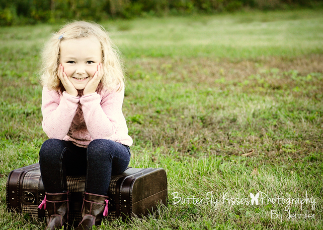


Hello Jennifer! Beautiful photograph! I love how you have the little girl off to one side of the frame! It really adds depth and a playfulness. It may just be my eyes or my monitor, but it seems a little over-exposed, especially around her face. She’s very pale, and I think that may be why. All in all, though I love the picture! The little suitcase she’s on is ADORABLE! I need to begin amassing props, myself! Thanks for sharing– I did, indeed, learn something, too! <3
I like the composition, and the attention to rule of thirds.
the only thing I would’ve probably take note of, is including the tips of her feet/shoes as not to ‘amputate’
otherwise, well done!
I love the picture!! Super cute concept! Maybe bring out the blond of her hair a little more and make it stand out. Maybe contrast? She is a cutie!
Very cute! I would try to pull out a little bit so her feet are all in. Is there another spot in the lawn that is not quite as patchy?
We were in a park that was pretty patchy. I could have cloned a bit to make the brown patches a bit more green. Thanks for your comments!
I actually like the brown patches. Good contrast and realism.
Hi Jennifer,
I too think the pose is truly awesome.. I would warm up her skin tone just a little to add some definition in her skin from the hair…love the picture. Good job!
I agree with steph- Beautiful photograph of a cute kid. It seems like the skin coloring is off and I would point the suitcase toward the inside of the photograph. I also think the girl’s feet should not be cut off. I love the suitcase too and that she is off center.
Tips of toes has already been mentioned ( I am guilty of doing this ALL the time). Love the photo but skin looks a little green on my ipad. Might just be my ipad. Again, this is a wonderful photo!
What a cutie! I love the set up here! It looks as though the white balance isn’t quite right and she’s looking a little green. I would love if you had pulled back just a little so we could see the rest of her boots too. I love the composition and the suitcase! Too cute!
I like the composition, pose and suitcase prop. Something about her skin tone is off, it had a yellow green cast to it, maybe try to correct that a bit. Also, try to avoid chopped parts, the tips of her feet are cut off here. Overall, good image. Nice sharpness without being overdone.
Beautiful little girl:). A more interesting background would make this image stand out ‘from the rest’ a bit better, and i’d agree with the over exposure look… Shadows placed just right on a face make for an especially stunning image. Even still great job!
I like the use of negative space and that she’s framed by the light green. Her skin tone seems a bit off to me, maybe a bit green? And I wish I could see the toes of her boots. Good use of the Rule of Thirds and I love the little suitcase! Good job. :-)
Cute shot! Widen your aperture to blur out the background more, and make sure to get the white balance fixed. Softer shadows would be great to see, too much contrast makes for a flatter looking picture. Great pose and props, gorgeous girl;)
This is such an adorable little girl and wonderful pose! I love the setup with the grass, the treeline, the suitcase, and the girl. The lack of distractions is perfect and I enjoy your use of negative space. My suggestion would be to move the girl slightly to the right in the frame so she will be in true thirds position. She is a bit to the left of left thirds (you want in the left thirds gridline). Others have already said this, but to concur, she has a greenish cast to her skin and is also slightly overexposed. Overall, at truly adorable image!
Love the suitcase chair! Love that the child is in the left corner of the picture! Her face is so pale, and hair so light. I don’t think I would have put her hands on her face. Maybe she should have them on the suitcase or her dark pants. The light pink sweater does not help her pale face either. Needed a “standout” hairbow. Not sure if you had any control over some of those issues. Overall, a very sweet picture!! Great job!
I love this pose, the expression, the little girl! I would probably have a little more room for her feet in the frame and her face does look a little overexposed for the rich browns in the boots and suitcase. Can you add a curves layer and mask it onto her face to pull the brightness down? This is so cute and fun, I love that you are pulled into her face.
I would change the white balance and crop differently. It is a cute image though. I like the prop. Maybe use an action to warm up her face, it looks a little green.
Love it! I would also like to see all of her feet. Also, would it be possible to differentiate between where her forehead ends and hairline begins? If that makes sense. Maybe someway to highlight the hair? I don’t know how to say what I mean lol.
I’m strictly an amateur – but know what I like…. Love your subject and blurred background but the dark jeans and suitcase distracts from the fair, beautiful little girl. Could they be lightened up a bit? Also I would prefer her on the other side of the picture to give more space toward which she is turned. You captured a great smile!
I love her pose– both hands on her face! I would have liked to see all of her feet. I suitcase is so cute!
I think this is a gorgeous picture, even the feet. I don’t feel it looks too bad as the feet weren’t cut off in the middle or at the ankle…..just the toes. So, I love the way it looks. I do feel it is a little overexposed, I would have maybe brought the ISO to 200 to add a little color to her face. That being said the color of the jeans, and suitcase look good, so maybe she is very pale to start with.
I like it a lot! The only thing I would do differently is have the subject face into the frame.
Great eye contact and expression! I am on my uncalibrated monitor at work, but you have a grass color cast going on and the WB seems off. I see tons of green and yellow so maybe adjust your tint and add more magenta. The foot chop is also something to keep in mind for next time. Overall though it is a great capture! Just needs some pp love!
I looooove the composition! I’m partial to putting my subject right in the side of the frame. It looks great here. I think the white balance could use a tweak – her skin looks a little green to me, making her look a little ill. But great moment, I love the genuinely happy expression!
Very cute pose, prop, and location. The first thing I noticed was her eyes didn’t have a catch light in them. I’m a total amateur so giving advice on how to get it I’m not sure. I think if she’s looking at the sun she would have it. I know there are tutorials on here. You can do it in editing but I think it looks alien like. I also love the position of her off to the side.
Jennifer, Cute shot, I love how you framed it up and my attention is immediately drawn to her eyes. Her faces is a little overexposed, and her skin tone seems a little yellow. I would play some with white balance and draw down exposure a tad in LR or aperture (mac editing software). Also, there seems to be a little too much contrast for my taste, but I’m not sure that would be critique(able) ;)The vintage look is nice with the shot, and I enjoy the props.
Jennifer,
Great composition! The things I would tweek would be the exposure and color, fill in the areas of the grass where it was not plush and maybe even add a softening filter. The suitcase was used well! Sweet little girl!
Cute!! Her skin has a green hue which works well with the background but not on her. I would warm her up which would make her stand out against the cooler background.
I love the composition of this shot, having the little girl off center and having the suitcase at a slight angle is awesome. The photo does look a little overexposed, but it may just be me. I would dial it down just a touch to make the colors a bit richer. I do like what you’ve done with the depth of field. Well done!
I love the pose and connection to the camera. For this image, I would prefer a center composition because the negative space doesn’t lend anything to the image. Also since she is looking straight on the camera instead of into or out of the frame I would choose centered. She also looked a little green to me. I would like to see this with a clean edit. I think the styling is great and I love the suitcase and how it goes well with the colors in the background. Great connection and pose for her age!!!
This is such an adorable picture. I particularly love the set up of her sitting on the suitcase along with the pose. The only thing I can say is wrong with it is the exposure seems a little bright and therefore washing her out a little bit. Other than that this is such a great picture.
Hi Jennifer,
Adorable is the first word that comes to mind! This little girl is so cute and the pose is perfect for accentuating that! Also, the suitcase is a great prop, full of charm and just the right scale for her diminutive size. I agree with many of the others, in that I would have given more “breathing” room at the bottom of the frame so her toes weren’t cut off and I would have added just a tiny bit on the left hand side (the suitcase sits a touch too close to the frame). It appears to me that you may have dodged part of the grassy background and the upper part of the little girl. I like the muted greens and tan/rust grasses off to her right, although I think I may see a faint line where this editing ended. The little girl looks too washed out/high key to me, with a color cast that is unnatural. Reserving rich color for the foreground, suitcase, and little girl will make for an eye-catching image, thus I would work toward adjusting those aspects. Focus on the face looks sharp – great. Key to portraiture is capturing personality and you’ve certainly done that in a big way :) Nice work!
I feel as though there is a green colour cast on the subjects skin and hair probably picking up from all the grass and light. I would do a quick correction in Photoshop. It feels as though the composition should be reversed. What I mean is the the suitcase and legs are angled to the left, so my brain wants to see the girl on the right side of the photo.
Love this image and the vintage feel. There is a greenish tone and over exposure to the little girl’s skin and hair that I would warm up. Great off centre composition (I was drawn to the little girl’s face first) and use of props!
I love the pose and the slight pop of color on her boots and the beautiful exposure. Because this darling seems to be angled to the left, I would have put the negative space on the left instead of the right, drawing your eye to the whole photo. Maybe step back a hair to include all of her boots.
I like the composition, and the attention to rule of thirds. Great use of props. However, i do feel like the girl is a bit overexposed and i can’t see much of the details in her pretty face. Also, i would’ve not cropped her feet out. But otherwise, a great pic!!
I love the how you have her placed in the side of the frame. Love the prop that you used. I would bring up the green in the background make it feel like a warm spring day; she seems to be on the over exposed. Great photo.
Apart from the previous comments made regarding skin tone & toes, which I agree with, I also agree that the different colours on the grass is a teeny bit distracting but overall I totally love the shot. Well done.
I love it. And I also think the feet are fine. The only thing I would say is the skin tone. I think the grass is giving it a green tone. I LOVE IT though!!
I love how you used the rule of thirds here! Good job! I would say her skin tone needs to be corrected, though. Maybe work on your editing a bit. But great job making your subject look comfortable! I always have trouble posing. If you get the chance, can you give me some pointers on that? ;) Thanks, and well done!
This photograph is adorable and makes me smile. I love the composition of this sweet blonde girl sitting on the little suitcase. I notice the subject immediately. Two things I would maybe would have tried is including a little more of the foreground (I feel like I am in this little girl’s personal space) so that all of her shoes were in the photograph…..Also when I first look at the child my eyes are drawn away a little by the patchiness of the grass….Maybe some saturation to the lawn?….Well done…….
Hi Jennifer,
Beautiful little girl and a wonderful expression on her face. A few things that I noticed:
1. Her feet are cut off a bit at the bottom of the photo; it doesn’t impact the photo much, but the framing would be a better if all of the little girls was in the frame, especially since there’s room at the top of the photograph. I’ll intentionally zoom into just part of a person at times and love the effect, but here it looks unintentional.
2. The exposure seems a bit off/underexposed. I’m noticing it mostly around her hair and face; this also is making right around her head not appear as crisp as I would like to see,
I love the positioning of the little girl with leaving negative space to show the field. If it had been me, I probably would have turned the angle of the suitcase into the picture, but that’s just a personal preference. This is really a great pose for achieving multiple angles. Keep up the good work!
beautiful photo of a very beautiful little girl. what a smile she has! this picture is great as it is but if we’re being here, i would change the grass. Get rid of the muddy spots maybe using the clone tool to make it all green. I would add a little space around the suitcase so it’s not so close to the edge and include more of the feet. She seems a little too bright and slightly off in color so a small adjustment there. Maybe pull back a little to lower her eyes for rule of thirds. Great use of negative space. lovely pic.
Her skin is flawless! I would have backed up and gotten all of her shoes instead if having the toes cut off. The background greens pop beautiful!
Cute picture!
A little on the bright side; adding warmth will help;feet are cut off
Did you by chance take vertical shot which would have reduced the negative space?
I wish I could get my daughter to pose like that
Hi Brad,
I didn’t take a vertical of this shot. I composed it this way. I do see that the toes were cut off a bit and should have backed up a bit. Thanks for your comment.
in reading this post and looking back at some of my photo, i see a lot of missing body parts in my shots :)
I read a lot of Bryan Petersen’s book and one of his quotes is “when is the best time to take vertical shot? after the horizontal”
Happy shootings
Thank you everyone! The theme seems to be white balance. I’m working on getting better at this SOOC to save on editing. I just got an expo disc and hope this helps a lot too. Thanks again for your help and comments!
I love that she is sitting on a suitcase and has a cute pose. The only thing I would do is warm up her skin tone by either changing the white balance or exposure settings. I like the negative space in this shot, it allows for zero distraction from your subject.
I think this photo is so adorable, and you’ve given me a great idea for my own photo. I think all of the helpful tips have already been given…so keep up the great work!
I love how you captured her smile. She looks sweet with just the right amount of mischievous. I’m not sure if it’s my screen or not but the coloring in her face looks a bit off. A little too green maybe? I would have liked to see it not quite so desaturated, I think that would have helped. The composition of the photo is great though and I really like the use of a suitcase as a seat.
For me the subject is way to far to the left, possibly moving subject to the right slightly so she would be right at the 1/3 line would leave less “dead” space to the right. Other option would have been to take this as portrait instead of landscape putting the subject in the bottom left corner. I do like the pose with the girl sitting on the suitcase.
Jennifer,
Thank you for sharing this lovely image. I love the pose and the sweet smile. I see a slight green cast and slight over exposure especially when looking at the face/hair… however sometimes I really don’t mind a bit of over exposure… and just be mindful of chopping appendages- which I seem to always be guilty of myself… It’s usually one of the first things I notice in my own images yet with all the hustle and bustle of the session I seem to let it slip. With that said… I love it
I love the suitcase idea and your use of the rule of thirds. I would maybe have the little girls and suitcase turned toward the green area instead of toward the edge of the photo. Also, come out a little more to include her boots. Great job capturing her little smiling face :)
Adorable little girl! I love the pose you chose to set up for her. The photo looks a little green for my taste. I know editing is a personal preference, but it looks just a little off in the coloring. Otherwise I think it is adorable. I love the way you framed the subject! Great photo!
What a cute pose! I wish she was a little more towards the center of the frame (not in the middle but I think I would have slid the focus point off a little. Her face is a little over exposed as well. It is really tough to apply a color filter to skin in my opinion because her skin looks too bright and too yellow to me. The eye contact is amazing in this photo. it looks like it could be part of an advertisement!
i LOVE this sweet expression! made me smile right away :). what an adorable girl! i really liked the tip courtney shared in this video for knowing if skin is overexposed: http://www.youtube.com/watch?v=joOiPC_v854. i find it is easier for me to see when i print the photo and it’s too late to fix without this trick. :/ i love a nice bright photo, too, but it’s lovely to see dimension in the face :). love this shot!
I am not a professional, just learning actually! Love the green grass, background, the lil girl off to the side….. But, around her face, head seem a bit blown out with light- over exposed…
This is such a lovely portrait! Nice use of prop, and composition. However, I feel the viewer would be better drawn into the picture and to the subject if she was placed more to the right of the frame. Not sure if its my personal preference or whether it works because of our natural tendency to read from left to right. Or maybe having something on the right to stop the eye from leaving the frame and bringing the focus back to the subject. Maybe, another thing that would have helped would be shooting from a slightly lower angle, so that the girl’s head is against the darker background, creating more contrast. Just my two cents.
It is a nice shot :) I’ve always wanted to do the suitcase prop. Best wishes!
I agree with the posts above. Darling girl, nice composition. I do think the flesh tones need warming up and/or darkening, and that the rest of her feet need to show. You could even move her over to the right a bit more and still observe the rule of thirds. Also, the horizon line is a bit distracting since it is at an angle that doesn’t match with the rest of the photo. That could be resolved by a more shallow depth of field, or perhaps some repositioning. Thank you for sharing this. I want that suitcase!
I love that you followed the rule of third sw ith your picture!! It really makes the picture be more about your subject and allows the eye to want to look at the subject rather than HAVE to!
For me the picture needs a bit more warm tons in her skin, but that is really all I would change, this picture is adorable!!
I love this picture and am looking forward to looking at more of your pictures!!! Super cute!!
love the composition. try to pull out so her feet are all in the shot. her face looks washed out, maybe a little more color to her face would be nice.
This picture is super adorable! The only thing I think it needs is some warmth and a bit of saturation. As far as her placement, toes, & patches in the grass – I think that is a matter of preference and wouldn’t say there is a right or wrong way to doing so…it’s all in the eye of the beholder. ;) Good job and great capture of this sweet little girl!
It’s indeed a lovely shot and lots can be done to rescue it in post processing :) I think everything else has been said about overexposure of the face, the cutting off the feet, and the subject being a big too far to the left to be on a “third”. One thing I’ll add is that it would save you a TON of work in post processing to utilize some kind of white balance tool like ExpoDisc (my favorite) to get the proper skin tones. I do love the pose and the general energy of the photo; to me that’s one of the more important factors for sure ;)
Hi, Jennifer.
1. I like that you used the rule of thirds.
2. This is a personal preference, but you used more editing than I like. I always like to think about whether an image I’m sending to a client will look dated in 20 years, and I wonder if all of the bleached out color processing that people are doing these days is going to have the same dated feel to it in the future.
3. I love the little suitcase prop!
Your subject is as cute as a button and I like the suitcase for a prop. Your skin tone is a bit yellow. When shooting make sure your white balance is set to the current lighting situation. Also take a step back so you can salvage her little tootsies:). I like how you have her offset in the photo.
The props and pose are adorable, she is a great subject and the face resting in hands looks like a natural “kid” pose. I agree with the others on the face looking a bit overexposed. The one thing I noticed is that in setting up the shot you should reverse your rule of thirds and put her in the upper corner. When taking a photograph of anything keep in mind that if there is the potential for movement the subject needs room to move within the photo. Being at the angle she is and in the left lower corner, she has no room to get up and “walk” out of the photo. If she were positioned more towards the center or upper left, than she would have movement room in front of her.
Very cute. I am not sure if it is my monitor but her skin looks a little washed out. Adding a little warmth would help. Also I would have opened up the Apeture a little more if your lens allows it to help her pop off the background a bit more. Darling pose and great composition :-)
You have the sweetest little subject! Posing wise I would suggest turn her and not shooting flat to the subject.. and I love the little pink bows on her boots
Adorable picture. Nice pose and prop.
I think I would crop or some of the grass on the right. Also her face seems very pale. Could be she is. Maybe more contrast? Would have kept all her feet in the frame.
What a beautiful little girl, and a beautiful setting I love the suitcase. There are only 3 things I would personally change in this photo,
1. I would position her on the right hand side, and have her sit more on an angle with her toes toward the middle.
2. Im not sure if it is my screen or not but her skin tone looks a little bit on the green side to me, I would move the tint up to the purple side just a smudge, and warm it up just a little tiny bit.
3. Bring the brightness down just a touch
Other than that nothing major, I think its a great photo :)
What a cute set-up! I will definitely be using that idea. And an adorable subject – captured a sweet smile.
Agree with so many of the comments about her face being washed out appearing. It might have come off better – more vintagey looking, if the grass had been washed out as well. And would have filled in the patchy spots with some cloning.
It really is a great setting and cute staging!
Great position. I love that little suitcase she is sitting on. I think that I would have pulled her back a little bit so that you could see all of her shoes. Other than that get shot.
Such a cute subject, prop and expression! Love it! It does seem like the white balance may be a little off as her skin looks really yellow. I also might have gotten even lower, not sure if you were laying or just squatting, but an even lower perspective might have added a little to the overall composition. Overall, a very nice photo and great expression! Good job!
I like the brown patches. Good contrast and realism.
I LOVE this blog feature! It would be great to also visually see how others here would make changes to this picture and share those pictures, in this thread. And, to take it one step further, allow viewers here to “star” which ones appeared to hit the mark on best changes. I know people will cringe at the thought of “copying” an image. But, this is strictly in the spirit of learning and to help others develop their own photography skills. Not for drastic changes (as none are needed), but for those subtle changes we often missed, like not catching the shoes (assuming that was not intended) or how a small increase in red tint may give us that “a-HA” feeling.
Thanks Maria. At this time we don’t plan on making any changes to the series but we will keep your suggestions in mind.
This is a fantastic picture! I love the natural background, the only thing I would suggest is lower the ISO. My daughter is white with blonde hair too and she washes out very easily. Plus I think since it’s so bright it kind of washes out the whole picture. Bring down ISO in camera or post editing to make colors richer and help her not to wash out so much plus the beautiful nature part needs more color. Other than that the only thing i would do besides that is pull back a little. It kind of bothers my OCD that the tips of her shoes are cut off. But this is a fantastic picture with a beautiful little model!
It’s a fun photo. Love the composition. But probably blur out the background a little to give more focus to the cutie instead of the patchy grasss.
I love the composition, the cute pose, and the model of course. I think her face and hair look a little washed out. I am not a fan of the tone. And her face looks like it might have been touched up a little too much. Beautiful photo!
I love the placement of the model; off to the side is perfect because the background really has its own personality in this shot, not overtaking, but a beautiful accompaniment. The one thing I would have done differently is put her in a brighter or different color pant that helped her pop. Her pants blend with the suitcase, and since the suitcase is such a cool, vintage item it should definitely be noticed. Love the pose and the props. Well done!!
Super cute! I love the composition. The only thing I would change is to add some contrast to her facial features and hair and maybe add a little color or rosiness to her cheeks. Maybe it’s my phone but she looks a little washed out. But overall I think its a great pic I love the setup and pose.
I love love love the composition of this photo. With the simplicity of the grass it really pulls the focus on the sweet little girl. The only flaw I see is that with her light skin and light hair, she seems a little washed out. I would have tried to edit that a little bit to make some contrast there. I also love the use of the vintage suitcase. Very cool photo!
I love the simple setting! I might have tried to frame her up a little more towards the middle, still using the rule of thirds, but there is quite a lot of green on the right side. I might have even centered her, because it’s such a great shot, and I guess that’s my personal preference for most portraits. Great color scheme too as it really pops against the green background!