*This post contains affiliate links. Thank you in advance if you purchase something and support Click it Up a Notch.
Over the past month I set a goal to print some of my work and use it to decorate my home. As photographers, we invest our time and talents to develop our skills so that ultimately we can create works of art! I like to think of prints as the icing on the cake. After all the hard work, there’s nothing more rewarding than seeing your images in print and displayed as art!
There are many tips out there on how to create gallery walls, and how to choose the right frames for your decor. These are important decisions that need to be made obviously as well. But since I’m a photographer, not an interior designer, I want to focus on choosing the right images (that will best compliment your work) for the spaces you are filling.
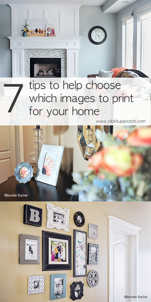
7 tips to help you choose which images to print for your space
These are not design rules, just suggestions from a photographer’s point of view.
1. Create a folder on your desktop where you save your favorite images. Be selective and only save the ones you absolutely love. Within this folder create other folders to break down the various types of images. i.e. macro, food, lifestyle, portraits. As you edit your photos, save your favorites to these folders. This will keep them in one organized place so they are easy to find when you are ready to print. And it will save you hours of time you would normally spend on combing your archives to find the right image each time you want to print.
2. Match the colors in your photographs to your décor. This is only a suggestion that may or may not be your style. I wanted the colors in my prints to compliment the colors of my decor. As you search your archives, either look for images that have certain complimentary tones in them, or you can change them in Photoshop or Lightroom to match!
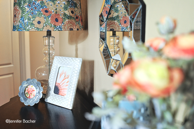
The flowers in these frames were actually more of a dark pink when they were photographed. I changed the tones to be more peachy and soft to match the lampshade they were next to. You can do this in Lightroom in the HSL and COLOR tab by experimenting with the hue, saturation, and luminance of the various colors in your photo.
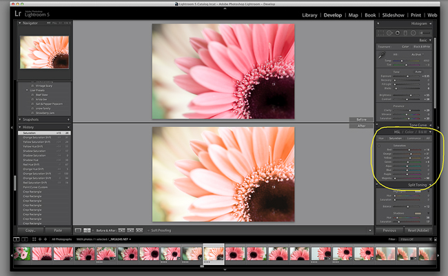
A quick way to change colors in Photoshop is by choosing Image, Adjustments, Color Balance in your menu. Then experiment with the color sliders for your shadows, mid tones and highlights. Make sure Preserve Luminosity is checked.
Another way you can match your prints to the colors in your home is to plan your next photo session with your display area in mind. What is the look and feel of your home? Choose a session location and/or clothing that will compliment the style of your home or the room where the prints will be displayed.
3. When using a collection of different colored and textured frames, choose black and white images to keep them from looking cluttered. Black & white images can also give the display a more unified look. I had my friend Kristen from Studio7 Interior Design help me choose decorative frames & art for a small gallery wall in my entry.
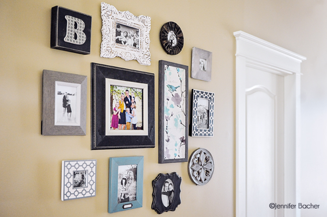
This was a wall that would normally go un-noticed. I wanted to turn it into a focal point. I kept all my images in black & white except the family photo in the center. The goal was to draw the eye there first, then to the black & white images in the outer frames. Similarly as effective would be to choose colorful images for solid black frames or solid white frames such as this wall, also designed by my friend Kristen.
4. Choose larger sized prints and canvases for areas where you can see them across the room. What’s the point in printing small 4×6’s and 5×7’s if you can’t see them unless you walk up to them?
The prints on my mantel needed to be big (at least 16×20) in order to enjoy them from across the room. The big one is a 22×27 inch size. I actually could have gone bigger for the space available, but I didn’t want to cover the decorative trim-work of the entire mantel. So, obviously, take into consideration the space you are filling when deciding how big you can go.
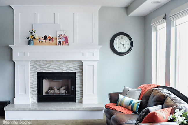
I also chose a more timeless, artistic image of my family walking, rather a huge portrait of our faces. This was a personal decision as I was going for a more artistic feel that went with the style and colors of the room. Even though our faces remain unseen, we are very well represented by the composition in the image as well as in the close up of the kids in the image next to it.
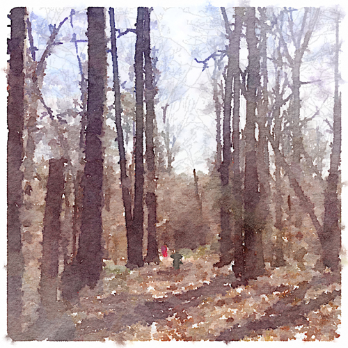
5. Too many portraits all over your home? Try converting some of your images into art using the Waterlogue app! This is a good way to use your images, but give them a different look. My interior design friend recommends displaying art or still life/food in your kitchen, rather than portraits. An image converted through this app might be a good alternative. Here’s an example of an image turned into art using the Waterlogue app. (Image by Liz Behm)
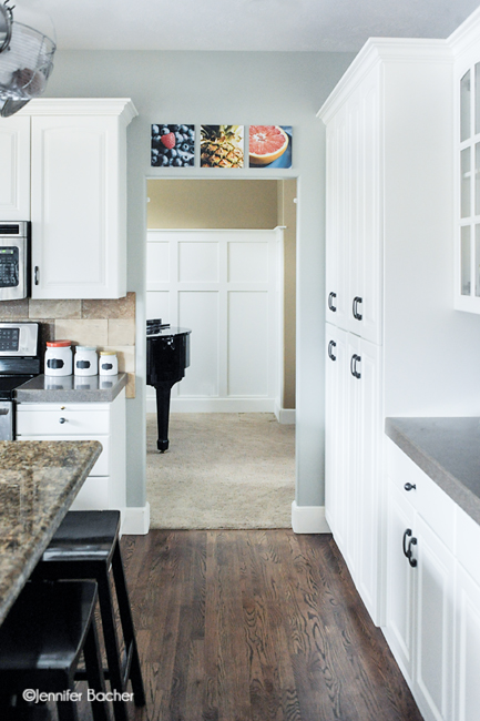
6. Choose photos to display that were taken in that particular room of your home. For example, food photography in the kitchen, lifestyle images in the family room, bath images of your kids in the tub displayed in the bathroom, and more personal photographs in the bedroom.
Last week I decided I needed to fill the space above a doorway in my kitchen with some food images.
Considerations I made before I took the images:
1. How much space I needed to fill and how many images.
2. Appropriate size for that space.
3. The style/colors that would go well in my kitchen.
4. How those images would look from across the room.
Because I couldn’t go bigger than a 10×10, I chose to use my macro lens and tried to capture close-up textures of the fruit vs. a more styled shot with atmosphere that might be harder to see from across the room.
7. Edit your photos to match the style of the space it will be in. For example, light and airy, rich in color & contrast, black & white, etc. Also, if you are displaying images together, edit them side by side in your editing program to make sure they blend well and the color is consistent from image to image.
I did this with my fruit images. I moved them around in Photoshop to help me visualize how they would look hung. I separated the blueberry image (mostly blue) and the grapefruit (blue background) with the yellow pineapple in the middle so each image would stand out and look balanced next to each other.
Thanks for hanging in there with me!
Tell us in the comments – Do you have any other tips for choosing which images to print?


This was great! One question….could you explain how you decide from all the printing and mounting choices? How do you decide between paper vs mounting vs canvas. Sometimes I just sit and stare at all the options from labs. Any tips for making those decisions?
You really just have to decide what look you are going for and how much space you have to work with. I chose gallery wraps for my mantel because I needed something with depth that would fill up the ledge. For my food images in my kitchen I went with standout mounts from WHCC because hey are light weight, thin (abt 1/2 inch depth) and come with holes in the back, ready for hanging. I didn’t want them to stick out so far off the wall so this was a better choice. I personally prefer canvas wraps for mantels and shelves and either prints in frames or standout mounts for hanging on walls. I always mount prints 8×10 and larger so they don’t bubble in my frames. Whatever you choose, I recommend staying with one option for the entire display. i.e. all wraps or all frames so the focus is on the photos, not the variety in printing/mounting, which can make it look busy. This is a good post idea! Maybe I’ll do my next post on how to choose finishing services. :)
Love this! So many good tips I’d never thought of or heard before.
Fantastic tips!! Thank you so much, Jen and Courtney!
Thanks Melissa!
We’re in the process of buying a new home, so these tips will definitely come in handy as we decorate our new space. Thank you! (I have the same turquoise and gray bird print, too!)
Amazing post. I love the knowledge you shared.
Thank you!
Hi Courtney, don’t know if it’s my iPad and connection or on your end, I’m not able to see all the photos in your post, is anyone else experiencing the same thing?
Thanks for letting me. I will check it out on my husband’s iPad.
Love these ideas! I have a big collage of frames in my dining room with pictures of my family. I keep them all lightly sepia toned for uniformity, (also goes with my color scheme). I also mount the frames with 3m velcro to make switching out the photos easy. I really want to do some food still lifes now after seeing your kitchen!
Great idea with the 3m! Have you ever used painter’s putty on the edges of your frames to keep them from sliding? My designer friend shared that tip with me too! I hope you will do those sill lifes, it’s a lot of fun!
I love the tip to use some food photos in your kitchen. I have a big wall that has always seemed bare and I have never known what to hang there. Great excuse to enjoy some creative time with the camera and some food this weekend to get some new shots.
Karen, yes, do it do it! I had so much fun doing mine! I’d love to see how they turn out!
I like the idea of food in the kitchen…interestingly enough, the prints I have in their are of a farm stand and a garden. I have some gorgeous florals that I should print too. Great post…very thought provoking.
wow! love this post- so helpful Jen! PS Your house is ahh-mazing!!
Thank you Liz!
Off topic, but what your paint colors in your home? They are beautiful and compliment each other so well. Thanks for these great tips!
Jennifer, I almost forgot to respond, so sorry! My paint colors are Benjamin Moore Huntington Beige (sand color) and Restoration Hardware Silver Sage (blue/gray color). The combo together feels soft and beachy and they are very versatile as far as decorating with accent colors goes.
These are great tips, love the fruit pics and the Waterlogue app. I hadn’t heard of that but I’m going to look for it now!
The idea of fruit and veg pics in the kitchen is really nice. I have some plastic veg on the walls. but after your post I got an idea of rather framing them for the kitchen.
where do you normally have your prints done (such as the 10x10s)?
You have a very good eye for making photographs into art. The color change on the flower looked really good. Thanks for all of the great tips.
Can you tell me who you would use for printing a picture (large like 11 x 14)? Is their a company online or should I try to find someone local? Thanks!
Awesome post…helped me a lot…thank you…and keep up the good work.