Remember:
-Read How to Critique a Photo
-Make a critique sandwich – something positive, something you would have done differently, something positive
-My rule: no improvement tip = deleted comment
-This will benefit the person leaving the photo critique just as much if not more than the person receiving the critique.
-If you would like to have an image critiqued be sure to read How to submit an image for critique.
Thanks to Annie at Lulu Mae Photography for submitting the following image.
Settings: ISO 200 | ss 1/800 | f/2.5
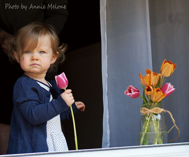


I love the framing of this picture and the splash of bright colors from the flowers. Her serious look is almost thoughtful. She is adorable. I would have probably edited out the drool on her chin though, especially if I was planning on framing it or printing it out. I always have a tough time deciding whether to edit out drool. . . or boogers. . . or dirt, because well, that’s real life. But I think I might have for this one. But this picture is beautiful! (Even with the the dribble)
This is a beautiful picture! I love the flowers. I would have probably put the flowers a bit closer to her, and followed the rule of thirds for this one. I love this also because her eyes are very blue. :)
I think there is a great use of light in this photo. The fact that the area behind your subject is much darker than the foreground really makes her stand out. Something about the image looks a little off kilter to me, but it’s hard to put my finger on it. I might have moved her slightly toward the center (while still placing her in the left third of the image) and used an editing program to level the window sill. I love that she’s holding one of the tulips — their colors add such brightness to the photo and this helps to balance both sides of it.
I love the colors in this photo. I would have adjusted the horizontal plane just a bit to straighten out the window frame and, as others have mentioned, followed the rule of thirds a bit more closely. Beautiful capture of a precious expression!
Composition looks beautiful. On my screen it seems the focus is on the lower part of the dress. Maybe it was the fact that you were photographing a wiggly 2 year old?
I love the colors, wish the background were darkened a bit so you couldn’t see the person behind her and had a little more space on the left.., also love the look on her face :)
This is adorable! I love her expression. I also love how both subjects are on the edges of the frame, I’m all for breaking the rule of thirds and often prefer the look of having the subject a bit closer to the edge of the frame. In post, I would have upped the exposure a tad and increased the blacks, to up the contrast and make the subjects pop. I would also burn or use the selective brush to hide the arm and leg of the person behind the girl, if the first thing didn’t accomplish that as well. Really gorgeous moment though, I love it!
I love, love, love the colors in this photo! So bright and pretty. My eye was immediately drawn to her hair, or is it a hand?, in the top right corner, and then the uneven windowsill. I would have straightened and cropped. I love the drool and how she’s holding the flower. Her gaze is awesome and seems to really let the viewer into her soul! I love the composition, the white curtain showcases the flowers, her dark clothing contrasts, just excellent. All in all, this is a great picture!
So adorable!!! Love the light, flowers and the background is darker so she and the flowers pop. I thought it was a great use of rule of thirds, I think the only thing I would change is straightening it a bit, the ledge is just a tad off and distracting. That’s all I would do to it, I think her focus and expression is perfect, great shot!
This little darling looks absolutely intense. The dark colors of her sweater and background contrast artistically with the brightness of the tulips and the sheers. My eye was drawn immediately to her eyes but then I had to closely examine the other elements to determine her setting and the man in the background left me feeling a bit unsettled. Annie, this is a stunning photo that would be wonderful to reproduce at yearly intervals to watch this sweetheart grow up! Happy Easter Monday!
I love this photo! I love the softness of the child, but with her determined look and the stark contrast of the black and white background. The texture in the little girl’s background is great along with the pop of color from the flowers. The simplicity of her dress, the simple white curtain and the raffia tie on the mason jar gives the photo a European flair. I absolutely love this photo. In my opinion, it belongs in a museum. Great job!
Meant to say “little girl’s dress”
Such a cute subject, I love how each object is to either side of center. And I love the vase, it really gives it a homey feel. If it were me, I would have boosted up the contrast a bit. It might help darken that background and help those tulips pop. I would also brush brighten exposure her face a bit, this will help it not look so dark and help those beautiful eyes pop as well. All in all, beautiful photo. Her dress is just beautiful :)
I love this picture for so many different reasons. Number one reason is the pop of color from the flowers, they seem to bring out her pretty blue eyes even more. I would have probably done a tiny bit more brightening in post processing to give it a nice crisp look. This is a gorgeous picture over all though! Great shot! :)
I love this photo the flowers are a great pop of color, love the lighting. I would have maybe moved the flowers a little closer. Great photo though.
I love the use of the dark background and the pop of color from the flowers! I probably would have flip flopped the subject and the flowers so the pop of color came out of the darkness an the girl in her dark clothing stood out against the lighter background. I also would have kept the flowers closer to her so that they aren’t drawing your eye so far away from the subject. Over all a beautifully exposed images and the concept turned out great!
I am in love with expression you captured on this sweet little face. Great use of light! I think I would try bringing her and the tulips closer together, for me the space between them with the curtain, it seems as if the photo is divided. I love all your colors, and she just pops against the dark background. Having her hold a tulip is adorable, and her eyes just sparkle!
I heart the expression on this little girl’s face! The dribble makes it real and in my opinion that’s what makes the picture unique! I agree with Lisa that the curtain creates an interesting diptych not sure if it was on purpose. If so I would keep it off the center. Fun way of framing the image as well!
LOVE the composition! I just love the contrast in the backgrounds! It really makes the photo pop! Personally, I would edit out the drool on her chin. Others may like the natural state of a toddler. Just my personally preference to edit it out as I find it a little distracting. But I just love this photo, the colors, and the perfect application of natural light!
Love the photo. I like the way both sides tie in together with that gorgeous child holding a flower from the vase. The contrast between the two sides is great! My only critique would be the crop. I may have pulled back slightly to get more of the vase and more of a rule of thirds look. Pedfect colors!!
Oh my goodness, this image has so very much potential!!! I love it, I think the exposure looks really good. First iI would straighten the image because she looks like she is falling out of the frame a bit. I’d also darken the background to get rid of the man behind her. The last thing I’d do is extend the canvas a bit frame left to balance out the frame a bit. Great job!
Beautiful photo! I love her face and perfect skin. Even the drool is cute. I agree with most of the other commenters to crop out the person behind her since it’s a little distracting. But that is such a minor thing the overall photo is beautiful
You know what? I lovelovelove both of these images, but I’m not sure they work in the same composition. The curtains kind of creates a natural visual divide and I think both images would be more powerful and striking alone. The other thing is my eye really wants the composition to be level so I would probably crop out the window sill. All in all, a great capture with tons of possibilities! Click on!
I love the composition of this picture-the person is the background was really distracting as was the slanted windowsill. I think I would have rid of those two things to keep the focus on the girl and flowers. Her expression and the colors are beautiful.
At first glance my eyes captured the lovely flowers on the right and then they went to the sweet child on the left. I wonder if its because of the white background for the flowers that my eyes wandered there first? There is an interesting contrast with the split down the middle with black on left and white on right; I see there is a balance but the angle of the window at the bottom fools my eyes a bit and convinces me that there is a tilt. If there is a story here, the girl’s worth outweighs the flowers for sure.
Very cute photo! I love her little expression and those blue eyes!! I love the bright pop of color with the flowers and contrast. The picture looks a little divided so maybe pulling the curtain so it is all the way behind her. Also I might have straightened out ad/or cropped the window sill in post processing so it would look more straight. Something little but I think it would make a huge difference. Overall it is a wonderfull picture, your camera settings are good, and I think the exposure and focus are right on. Good job!!!
I love the curtain because it gives a good contrast with the black/white. I would have straightened the photo the jar of flowers looks like it’s “falling”. I think it was a great idea to have the little girl hold the flower!
I think that this is a gorgeous image!! I would like to see that background slightly darker so that you cannot see the form. I also really love the space between the child and the flowers, but than again I am a sucker for negative space photos. Hope to see more images from you. Keep up the work.
I just LOVE her serious little expression. I prefer to leave the drool…it just fits her age. I would straighten the photo to be level with the windowsill. I would also try to remove the person behind her. I love that you captured her holding a flower! Mine would have been beating the flower into the windowsill! I like that she is off to the side of the photo, but I would have maybe tried to move the jar of flowers closer to her. I know that may not have been possible though. If I put a glass jar of water in front of my little guy it’s just asking for trouble. Great photo and love the colors!
Beautiful Photo! I love the girls expression. The white balance is spot on and I love how the colors of the flowers pop. I stared at the image for a while trying to figure out what was off about it… I would have burned (darkened) the background behind the child so that person was not visible. Besides that, I think this is a lovely photo! :)
There is so much to love about this photo! Love her expression and stance, and her grasp on the flower. I would straighten the photo or crop out the sill or whatever is in the bottom right of the frame. My eyes keep looking for something missing down there and the angle throws off my equilibrium a little bit. Other than that I love the colors, composition and subject!!!
Oh my the expression is so perfect. I think you have many options in this shot. One is you could have easily gotten two great pictures one with a cropped baby the other with the curtain and flowers. Both would be stunning. The focal plane is off on the window .. so definitely use distortion to put it on the same level as it stands it does not Co tribute to the photograph. I’d also blur the edge of the curtain a little so it’s doesn’t steal from the shot … I think it’s a great photograph and you can get much more out of it
I like this photo too. As someone else has mentioned, I too would edit the drool, but at the same time would question it because it is in fact, real life. I would suggest editing the background to either remove the person or darken the background some more. One other suggestion would be to add some color to her lips. I think it’s a good photo.
I love the simplicity of this photo and the look on her face. She is adorable. Her dress is a great colour compared to the wonderful popping colour of the tulips. I don’t know why but something in the white curtain keeps drawing my eye to it. I think it’s small because I can’t figure it out. I do like the curtain there though, the black behind her and the white behind the flowers is a great contrast. Love the white balance and exposure as well. Great Easter or spring picture :)
This is a beautiful shot! I love the vibrant colors and adore her pensive expression. The only thing I would critique would be the crop. Perhaps taking a step back would have allowed for a bit more room on her right side bc I feel it’s a bit close to her cute little pigtails. That step back gives you more wiggle room to play with cropping, angles, etc. I am completely drawn to her gorgeous eyes, even still. Love how you’re capturing her in the window from outside. Nice perspective :-)
I love this picture. Your use of light is fantastic and the bright colors from the flowers stand out so beautifully against the background. I however would have liked this photo so much more if it was more balanced. Using the rule of thirds i think i would have moved both the flowers and the child closer to the center but her being in the right side of the left window and the flowers in the left side of the right window with the line of the curtain panel down the center. It just seems a little off kilter. Such a great photo tho.
Okay, I adore this photo! Her expression is amazing & you nailed the exposure & white balance! I would crop out the window sile at the bottom right- it’s making me think the photo is crooked. I love the pop of color from the flowers & how sharp her eyes are. I personally adore the drool :) Way to go!
This is a beautiful image! Kinda reminds me of a Vermeer painting, with the tulips and the little girl :)
The colors are wonderful, and she is a doll! I find the angle of the window edge to be a bit distracting, since my eye wants to follow the line to the right. Maybe crop it differently, or perhaps line it up more when composing the photo. Other than that, beautiful photo and great lighting, and I love the simplicity of the image and the colors.
First of all, I love the elements in this photo…simple and beautiful. I think i would have switched places with the girl and flowers and brought them a little closer together…it seems like the navy color blends a little too well in the darkness. Also is that a bit of slobber i spy on her chin? Lol. Otherwise, I wouldnt change anything…it is lovely.
I love how you were able to capture the color of the flowers and her eyes. I too would have moved the case closet to her a bit and I would have moved the curtain away. Something about how it falls right in the center is distracting to me. Other than that, beautiful picture. I love her expression and gaze.
That should read “vase closer!” Sorry
I love this drool in this picture and would never edit that out. It is HER. :) the thing I think needs to be improved on is the crooked window sill and the hand behind her needs to be edited out. A lot of people are saying use your rule of thirds and while its good to do so, I also think its good to break the rules sometimes. lol Over all I think you did a great job!
I love this picture. The colors pop and the little one is adorable. I would have edited out the hand behind her head and would of zoomed in a little closer for more clear detail of her beautiful little face. I also like the drool! Great job
There have only been a couple of slightly negative customer reviews which seem to be related to having slight troubles getting it working right
out of the box. Dora Talking Kitchen reviews and store locator available.
Thanks to the advancement of technology advances,
the world at present is brimming with gadgets. You can also promote Amazon’s
affiliate sites such as smallparts. Most people who submit reviews will be very
honest and up front, and it is for that reason that you will be able to make the informed purchase choice when shopping over the internet.
I love the flowers in this photo! They add a color depth and add dimension to the photo. I think I would have tried to keep the flowers closer to her – and maybe with the darkened background they would pop out even more. I love the use of dark and light to frame the photo just wish it wasn’t quite so symmetrical!! Beautiful girl beautiful photo!
I know others have commented on the drool on her chin, but I kind of like it. It shows real life. I also love her pinchable cheeks, the way her hair falls messily into her face – so true to form for most toddlers. My eye is drawn first to the vertical line of the curtain, and it gives it a feel of being two separate pictures. Perhaps if you moved the tulips closer to the sweet girl, the curtain line would fall more on the line of thirds, or move the curtain even farther to the right to give it more of a framing look. I get the feeling that this girl was in the middle of something (smelling the tulips) and then her attention was caught by something outside. It makes me wonder what she sees ou there, which tells a cool story.
I really like the vibrant colors, but I probably would have gotten rid of the drool (unless she was eating the flower? :) ) and I think the curtain splits the picture in half, so I would shift the frame some. Great catchlights in her her eyes though and you did a great job keeping both the girl and the flowers very crisp!
There is so much I love about this photo! I love the pop of color with the flowers and I love the contrast of the light and dark backgrounds in the photo. I think I would have tried to move the girl one step closer to the light window sill as I find it a bit funny how the one side of her hair disappears a bit. It feels to me almost like chopping off a limb. I also agree with a few of the other posters that I think I would have edited out the drool on her chin. In some settings it is very appropriate to leave it because it is real life but that does not seem like the mood your trying to set her. I love how the girl is holding a flower to draw you into her side of the image! Really nice composition!
Great lighting and composition! I like the look on her face and the color that the flowers bring to the picture. I think I would have tried to crop out the little bit of white window at the bottom of the photo OR framed it so you can see the whole window. The little girl is adorable and the pictures is so sweet!!
I love this photo! I would of darkened the background a little more and brought her closer to the flowers. Well done!
This is a beautiful photo and there isn’t much to fix. I’m not so sure if I would have edited the drool on her chin. It depends what is the purpose of the photo. If it’s for a client, I would have edited for sure, but for myself I wouldn’t. (It can be also adorable). I would have rotated a tinny bit just for the vase and curtain to be very vertical. Apart from this, everything is great. Love the light, composition and vivid colours!
Thank you all for your input. This has all been most helpful!
How adorable is she? And tulips are beautiful. Love the light from the window. The only thing that I would do if I were editing would be to crop out the window sill and use the rule of thirds for the curtain’s edge.
What a beautiful little girl! I wish that her hair in her pigtail wasn’t cut off. I love how vibrant the colors of the flowers are and how sweet she looks holding the single tulip.
I love this photo and this little girl! Great use of the tulips! I’m not sure I would change much. I love the drool too as it makes for a real moment! Perhaps if the flowers were a little closer then you would have been able to zoom in a little to crop out what is on the other side of her.
This is a very unique photo. It almost seems that it is two different photos taped together. My one critique is that the left side of the girl is a little dark, so I would have either moved her a little closer to the flowers or just touched it up in editing. I just love that you caught the detail of the drool!