Remember:
-Read How to Critique a Photo
-Make a critique sandwich – something positive, something you would have done differently, something positive
-My rule: no improvement tip = deleted comment
-This will benefit the person leaving the photo critique just as much if not more than the person receiving the critique.
-If you would like to have an image critiqued be sure to read How to submit an image for critique.
Thank you to Kelly at Kelly Polizzi Photography for submitting the following image.
Settings: f/2.5 | SS 1/2000 | ISO 400
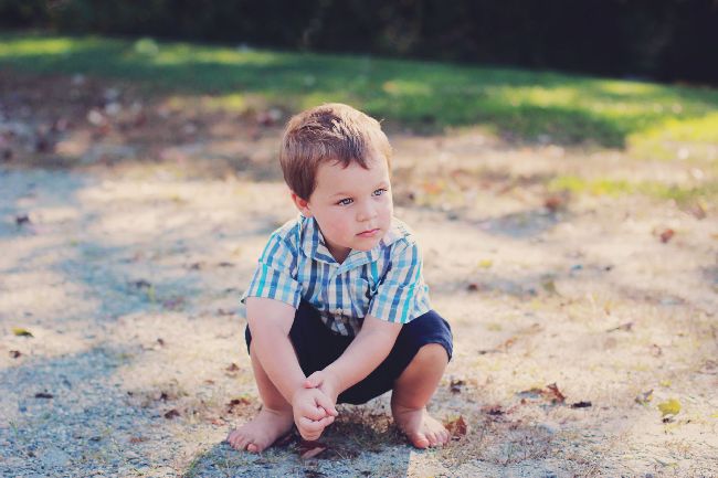


Cute photo of a sweet boy on a beautiful spring day. I love the serene expression on his face and that he is not looking directly at the camera but you can still see his beautiful eyes. Might want to follow the rule of thirds on this. There is a lot of empty space around him. Would look great as a black and white with high contrast and a closer crop to really focus on his sweet face.
Love the image and love the lighting but personally I would have got down to the child’s level probably lying on the ground on my tummy. Just a different perspective but love the image
Creo que es muy linda fotografía, yo hubiera dejado un poquito más de espacio a la derecha, pero así está como para enmarcarla y colgarla en la pared!
I love this photo! Your focus is tack sharp and I love the way his eyes pop. I think the rule of thirds would have been a good guide to utilize here. Putting him in the left side of the photo would have added a little depth and context to his gaze going to the right. The soft creamy color filter you added to the innocence and playfulness of it. Great job!
http://www.meredithleighphotography.com
Hi Kelly! I love your image. I love that we can see the boy’s expression and it makes me wonder what it is he is so intently staring at. I am wondering what this image would look like if it had been composed differently; if the boy was positioned in the left side of the frame so that there is more space on the right and we could potentially see what it is that he is looking at. I also love how he is crouched down. It really captures him being a toddler, as toddlers almost always sit in a crouching position. It just adds to the story. Great capture!
What a darling subject! The colors are great and the focus is spot on. The only thing I might change would be to offset the image, probably placing the child on the left a bit more(as if he is looking at something out of the image area)… or maybe get closer so he fills more of the image. Lovely photo, and the background blur is great while keeping the focus on him really sharp.
Great photo! I know how difficult it is to photograph toddler boys. :) Love his pose and expression on his face. I would have done a tighter crop and followed the rule of thirds. I love the lighting and love how the blue in his outfit pops! :)
Fantastic placement in the dappled light! You got great catchlights without having areas of sun and shade on him. To make the image stronger I would have shot this lying on the ground more on his level and recomposed using the rule of thirds. The edit is really nice though! I like that its soft…really enhances the overall mood of childhood playfulness!
I love the light, the focus and the bokeh. I would have used the rule of thirds and put him in the left corner of the photo. Personal preference would be to leave open space on the right side to allow for space for where he is looking. Expression is wonderful though, and I love the photo!
I love the lighting on the subject and in the back of the frame, I think following the rule of thirds would have added more to this shot, I love the sharpness of the subject :)
I like the boy’s sweet unposed self. His expression is deep and thoughtful. I would have done a tighter crop and bumped up the exposure and contrast just a tad to brighten his face. I like the blue stripes on his shirt that match his blue eyes..I would have chosen to add more color to bring out these blues. You captured a lovely expression from this boy.
I can hardly find anything upon which to improve this photo – I love everything about it, especially the dappled light in the background and how he is looking out of the frame. As others have mentioned, the rule of thirds thing, maybe positioning him a bit more to the left. But really, awesomeness just as it is.
I love this photo! I feel like your white balance is perfect- look at his gorgeous skin! I agree about rule of thirds now that I read other reviews, but when I was looking at it I couldn’t think of anything to critique you on :) It is beautiful! http://www.daniellegeriphotography.com
Cute pose and expression. I like that the photo is in the center, but follows the rule of thirds. It adds interest to the composition. But as someone else said, getting lower to the ground would put you more at his perspective. I think that would’ve been nice! Also it may just be your editting style, but it feels a little dark and dull. Maybe try boosting the saturation/vibrancy a bit and see how that looks? Other than that, it’s nice!
What a great capture! I love the (natural) pose, the focus, and especially the lovely bokeh. Aside from cutting off some of the empty space on the left and leaving the empty space on the right to follow his gaze, I’d try bumping the contrast a little and warming thing up a tad. The warmth is just my personal preference. Warmer out-of-focus background looks good to me. For the contrast part, I’d concentrate on his head and body and see if I could increase the blacks and whites without clipping anything. It really is a lovely portrait! If you were going for the matte look, ignore my comments.
Love the little guys expression.. it’s shot very high though… it’s better to see his face and expression than the top of his head. I like the tones
Beautiful photo, I love his pose & expression- so cute! The light & colours in your edit are really nice, I would have placed him more to the left of the frame and prehaps cropped in a tad tighter, but seriously great job!
I love this photo! You’re focus is amazing! I would have got down on his level…. But that’s being picky! I think the way you made his eyes pop,even when it’s not a close up of his face, is really beautiful. Great photo!
Cute photo! I don’t think there is too much to critique here :-) I love the way the light is touching his hair and the soft cool color tones. The only suggestion I would make is maybe composition. Since he’s looking off to the side maybe use the rule of thirds so he’s looking into some open space. Also maybe getting down so you are looking at him straight on instead of coming from above. Overall great photo, sharp focus, and good settings.
What a handsome young man!!! This is a fabulous image and I LOVE how he was caught just being a kid and hanging around. I always love images that have more negative space to one side, I usually always have the foreground of my photo more to the left and more space on the right side.I think that the vibrate colors and contract is wonderful. Keep up the amazing works. :)
This a beautiful photo! I love his natural pose and expression. I think there are always some sort of critique you can put on a photo but I really think this one is perfect for the most part. Even without the rule of thirds. I would move to see it in black and white!! We’ll done!
Great photo. Colors are great and the subject really jumps out. I like how the shadows look like they’re circling around him. If you placed him there on purpose to grab that – good for you. If not, happy circumstance, right? I agree with the other critiques on rule of thirds. If a subject’s head is turned looking at something, you usually want to give them space to look into. I love negative space and with all the other great stuff happening in this image, I think that would have clicked it up a notch – ha ha. :) Nice work.
Nice blend of colors. I would have gotten closer to the subject. Lighting is great in both the front and back of the photo.
I really like this photo. Very well exposed and sharp. I probably would have followed the rule of thirds and cropped him to the left third of the picture. I may have darkened your shadows a bit as well, but that’s just personal preference. You really captured a sweet and innocent moment. well done
I love everything about the image! I would have put him to the side (following the rule of thirds). I love the level, but if you wanted a unique second image you maybe could get it from even lower. You can be adventures and lay on the ground! I absolutely love the colors in this image and his skin tone!
Emma
Love photos of “littles” and this little boy is adorable. I love the expression you caught of his curious face and his eyes…I wonder what he sees.. The two things I may have done, may have been to just brighten his face a tad…just a little to accentuate it a little more and again to use the rule of thirds. I love when the object of the photo is set to the left or the right. Great shot of this little cutie patootie though!
Love the processing on this one. The muted colors are so serene. I would have composed so he was to the left of the image, and shot down lower, sort of looking up into his face. I know it’s hard with fast moving little ones though! Your focus is great and you’ve got great depth of field.
Look the model. I also would have utilized the rule of thirds, off center to the left. Otherwise, great job!
What an adorable little boy. Like everyone else, I would suggest the rule of thirds and put him to the left side so that he is looking into the picture. I love the way he is clasping his hands together. What a great capture.
Lovely moment, like many others mentioned. Great focus and sharpness, and I too love that he is looking off camera. The dappled (spotty) light / shadows behind him distract me, so moving forward, I would avoid spotty shadow areas. I know that’s SUPER difficult to do sometimes, especially when they have those adorable natural moments. Great job catching that moment; it’s definitely one to treasure!!
So many people have commented on the rule of thirds that I feel a bit silly reiterating it, but that is the only thing that really distracts me about this photo. I feel that his gaze is cut short because my eye is drawn in the direction he is looking and it meets the edge too quickly. I do love how he is squatting barefoot in the dirt – such a toddler boy pose. Do you also have any of him playing in the dirt, getting his hands dirty, or looking at a bug/stick/etc? Those would be cute variations of the same pose. I think my favorite part of this photo is the light – how it falls on his face without washing him out, and how it dapples the ground behind him. Nice work.
I LOVE the pensive expression and how his little hands are clasped. The only thing u would do differently with this is to put him over the left of the frame so there’s more space on the right where he is looking and I wod have crouched down a bit to get a little more on his level. Love the lighting as well. Good job.
He is so cute and I love that he is not looking directly at the camera. It looks natural! I’d have used the the rule of thirds and have him more to the left. The warm processing is great too!
I love the lighting. I love the wonder in his eyes…to me that tells the story. I personally would have moved him to the left, in order to more accurately stay in line with the rule of thirds. I also love the idea of getting down to have the camera line up with his eyes. The sharpness and tone are beautiful!
It’s a beautiful photo, love the bohek and the peacefulness of this beautiful photo. If this photo was a portrait rather than landscape you would have more emphasis on this beautiful little boys expression on his face and his character will shine through -more. The bohek of the background is excellent but if it doesn’t mean anything in terms of telling a story…. then I would prefer to place more emphasis on this little boy. I do think you have done an excellent job, by catching him in this pose- not easy with children :) Well done. http://www.littleoliveshoots.co.nz/main
I think it is a great photo! The lighting is really nice. Probably I would have gone down a little bit more, and left more space on the right. But I think it is beautiful! I love the details like the hands, the bare feet and his eyes. Great job :)
You did a great job of keeping the horizon line from running through your subject, and I like the use of negative space, but I feel it would have been stronger had there been more space in front of the subject’s feet. Also, I would like to see the composition shifted slightly so that it followed the rule of thirds. I love the way the light wraps around his face and that you captured his gaze, though. Very cute!
What a gorgeous little man! I love the serene expression on his face that you caught and the way his eyes sparkle.
However if you’d place him a little to the left (rule of thirds) of frame to engage the eye in the direction of his eyes your picture would have been far more effective.
But I really like the light levels and dappling behind him. Nicely done!
Kelly, you have QUITE a handsome model there! Your timing with capturing his expression, sharp focus and true to life colors help me feel like I know his personality, and I don’t even know him.
My first thought has already been shared by several others… and that is that I might have adjusted my framing to help place him along a crash point (even if it was just his eyes along the top horizontal line, though I’d probably have framed the center of his body along the left vertical line too). My second thought would be about off camera flash, roughly 30 degrees to his right, helping to brighten up his face JUST a TOUCH. I can’t tell from the device I’m using if you used flash fill, or not. If you did, I might have increased the power just a touch, again, to brighten his face ever so slightly.
I love the sweet moment you captured here. I imagine you’ll look back on this with such delight when he is older :-) I agree with perhaps changing your perspective ans getting down lower to see the world through his eyes. But I know how fast toddlers are! Once they’re mobile it’s harder to get yourself down and up ;-) I also would play with your crop. I navigate towards the rule if thirds and personally would love to see this one zoomed in more. Your color and focus is spot on! What a beautiful “every day” moment to cherish.
I love the photo, I think the rule of thirds, with your liitle guy on the far left, perhaps we would be able to see what he is looking at. I love the focus and background.
He is so adorable! Love the catch lights in his pretty eyes…as the others have mentioned “rule of thirds”…tighter crop, maybe even try to tighten up the “horizon line”/crop it out…otherwise, this is precious! Wish I could pose like that!! Yikes!
I like how he is positioned in the middle and his cute bare feet on the dirt like only a boy should be. I don’t want to see what he is mesmerized by because it leaves it to your imagination. He looks as if he’s day dreaming. The light is beautiful.
Nice capture. I looked at the picture, thought of my critique then read some comments. It led me to see it like this. Photo basics- focus, lighting, exposure, nailed it. The remainder comes down to artistic style. Rule of thirds was my thought, maybe subtle vignette, but that’s style. Then I read how someone liked the bare feet/dirt, I hadn’t though of it that others. Given that idea, another way to frame this would be with a shorter focal length from a low angle, looking up at the boy. This would draw attention and more connection to the scene. However, I have a two year old, and he would have no time for my idea :) I get the best pics I can, and in this case nice work, you definitely have a good knowledge of your camera and science of photography, the art side is up to you.
First..this picture is gorgeous, I love the editing. I agree about the rule of thirds, maybe try to crop it a tad to move him slightly left and see if you can tone down the highlights just a tad, but seriously gorgeous picture :)
What a cute little boy! Love the edit overall, but I would have to agree with the rule of thirds sentiment echoed above. I think it would definitely add more interest to the frame if you placed the subject more towards the left side. I’m also curious why you chose to shoot at ISO 400 in what appears to be bright natural light. I always try to choose ISO 100 in this lighting. Anyway, I still think it’s a very nice shot. Great job!
I love the lighting in your shot! I would consider cropping this photo square with the boy slightly to the left as the frame is looking a bit empty. I think your colour balance looks really good, it could maybe be a bit warmer, but that could be my computer, nice skin tones.
xR
What a great photo! Love the blurry background and the colors in the picture are so clear and bright. I’m a fan of close ups so I would love to see this cropped portrait size with the kid taking up the entire frame and his eyes in the top right or left corner. Just something different to try. Also good use of lines with the grass in the background.
I love the way you’ve captured this little boy in what I imagine was a brief moment of stillness and contemplation. The back-lighting gives him good separation from the background, and a bit of a halo effect. Compositionally, I would like to see his face in the upper left, gazing into the frame (could easily do this with cropping.) I also think I would have slowed the shutter enough to lower the ISO. I don’t see any graininess, but there’s more risk at higher ISO’s, and you had plenty of room to reduce the shutter speed. Great job with the depth of field choice, and focusing. I also really like the choice to shoot from a little above him, both because it maintained the catch-lights in his eyes even with your main light behind him, and because lowering the angle would have caused the horizon line to cut his body.
Wow! I am going to have a really hard time coming up with anything I would change about this photo! I absolutely LOVE it! So you know what? I’m not even going to try. In my incredibly humble opinion, it’s just about perfect! And honestly, I would even throw out the rule of thirds here because I think having him square in the center of the frame beautifully pulls you right in to him and the empty space in this case adds to the serenity and simplicity of his surroundings. Love it!!!!
I love his natural pose and how relaxed he looks. Great sharpness and detail, too. I would like to see him a little offset from the center of the frame – maybe place his eyes at the upper left, so he’s not looking out of the frame so soon. That being said, the lighting is perfect, wonderful exposure and beautiful catch in the eyes!
The light coming from behind your adorable subject is just beautiful. The right side of his face is a bit too washed out, in my opinion. I would try to edit the image if not the settings on your camera to avoid washing him out. I really like that you didn’t follow the rule of thirds, because this precious little one immediately draws the eye, regardless of his position.
This is a beautiful photo. I love the colors and how his eyes pop! I might like to see a bit more of the foreground, maybe even zoomed out to show his entire shadow. I would also crop it either to the rule of thirds, with him in the left third, or vertically, depending on where/how the final print would be displayed. Great job with the lighting and focus! :)
Great photo and subject is adorable. I would maybe include a little more foreground to see his shadow that is partially showing, and move him a little off center by cropping! Overall I love the outfit, his gaze off into the world and you did a great job, love the light in the back!
GREAT photo – love the pensive look on the toddler and the exposure. I’d add a little contrast in the sand, push him off-center, and darken the edges around the sand to draw more attention to the toddler. I think this would look great as a black and white too. :)