Remember:
-Read How to Critique a Photo
-Make a critique sandwich – something positive, something you would have done differently, something positive
-My rule: no improvement tip = deleted comment
-This will benefit the person leaving the photo critique just as much if not more than the person receiving the critique.
-If you would like to have an image critiqued be sure to read How to submit an image for critique.
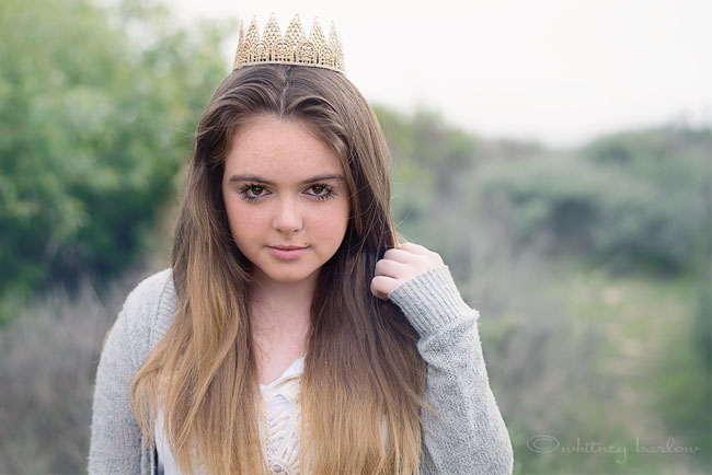
Thank you to Whitney Camacho for submitting the following image.
Settings: ISO 200 | ss 1250 | f/2.8


The focus looks really good to me as well as the catch lights and pretty bokeh. I think I would have tipped her chin up a little because it almost looks to me like she is leaning her head forward to keep the crown from falling off. I would also maybe brighten the greens and her skin tones a little because the image overall looks a little flat to me. I love the crown and I love her half smile expression! I also like her placement in the frame.
Beautiful shot. I love how her chin is down so that she can look up, directly into the lens. The composition is nice, with her off centered a bit.
I’d suggest boosting the blacks a little to add more definition between the girl and the background. And boost the greens in the background. It looks like there might be some lilac in the background as well, which would be nice with more saturation. Overall, I’d say “more” is what is needed. A little more color in the whole picture.
The crown is a nice touch–a little whimsy added to such an intent gaze. Well done. :)
Hi Whitney,
First of I love this image. I’m a sucker for wide apertures and this is exactly how I would have shot it. Perhaps I would bring her chin up a tad, have her shoulders pinned back more or leaning forward and her hand doing something, as it more looks like its just placed there lacking body language and I think this image really needs to be warmer in white balance. If you increase your greens just a tad it might bring some more life into the image, but overall it’s a lovely image great composition and lovely lighting and styling. If this were a competition image it would score well. Sue Bryce is a boss for learning posing to the tee, but again love the image you did a good job!
Very beautiful shot. I really like it. I’d add a bit more contrast. See if you like that. Try a different angle of the head next time.
The focus and white balance looks great overall. But to make the image more interest, I would have warmed it up just a tad bit by adding some brown and/or orange tones to the tall grass behind her. I would give her skin a little bit of warmth as well. The reason I say that is because she’s outside in a field but the photo lacks that warmth that lots of outdoor images have. I’d also add a bit of contrast to enrich the colors which will give the image a little more “pop”. But overall the image is sharp and appears to be taken correctly. Great job.
Great shot, great focus. Look into face contouring…adding oompf to hilights and lowlights. This needs more depth for some extra wow factor. More vibrance and deeper tones, a play on light by addinfg a bit of haze somewhere would prob suit this image, too. Graet overall shot!
Great shot! Loving the general composition and awesome bokeh here! The only thing I might do is boost the color temp a little bit just to add some warmth to the image, and maybe boost vibrance and contrast a tad too, but I don’t think it’s really necessary. The image is gorgeous as it is. Very well done!
Love this! The composition and focus are excellent! I would have had her turn her body/shoulders at a slight angle and have her chin up a bit more. I would like the background to have a little more contrast and the image to be a little more “warm”. Over all its a super shot!
This is a really beautiful image. I love the rule of thirds used in this picture, but I would like to have a little more space between the top of the crown and the top of the frame. I like the edit for this picture. I feel like it fits! Nicely done!
Great image! I love how she is staring straight into the camera. I also love the background blur. I would maybe try to warm the background up some, make it seem less dull. The image is beautiful, I love her serious expression. Good job!
I love how she is looking straight into the camera and brings the audience into the picture.
I am very new to the critiquing, so I might not be articulating this correctly, but I would have liked the colors to be more bright – such as the trees in the background and the crown on her head.
I like the composition of the picture – rule of thirds has been followed really well in this picture, as the subject is off center.
First of all let me say… your subject is a little beauty! As you can see from previous comments many people have opinions of what should and should not be going on in your picture. You have to ask yourself the question.. do you want to be a photographer that is passing through trending right now.. or do you strive to be the modern day Ansel Adams that stands the test of time. Personally, I am not for the soft wide open aperture and I think this picture would have been better off with a smaller aperature.there are very distinct things that are appealing to the human mind and when it ones to standard portraiture such as this … they must be followed unless you are looking for a dramatic look, which I don’t think is the case. The whites of the subjects eyes should be in perfect balance. That is to say your subject had her head tilted too low and you can see the whites of her eyes below the iris..so raising the head would have prevented this .. and also would have given the eyes more fill light. I love her solemn look… but I think you would have steered away from the passport look had you shot more of an angle with a dropped shoulder …good luck friend…
I like the chin down. Looking up always looks good.
Because it’s quite a pale shot she looks frozen. I would up saturate and boost the contrast just a little to give her a more sultry, rather than shivering, look. Also I’d crop to bring her even closer to the left and get rid of most of the small space.
She’s almost a Mona Lisa type of look, which did ok for the last one…
Hi, this is a great shot. The focus on her is great and I really like the composition. Her placement just slightly off center where the trees are getting a little higher in the background really works for me. I would try and boost the greens behind her a bit. I think this would really make you subject pop especially because she is wearing gray. I really like her pose with her chin down. I noticed some people dodnt really like it, but I think it adds interest. It looks to me as if she was walking around and something caught her attention suddenly. Overall, I really like this image!
The exposure looks great. Her eyes are sharp. I would definitely try black & white on this one. There is an edginess conveyed by the gray tones and the girl’s look also conveys a moody attitude.
Gorgeous picture! I love the idea of the crown..i read that it is a fun accessory that you can start when they are babies and use throughout the years til they are older. The only think that I might fix would be the colors..maybe a more vibrant background/shirt/etc. I love how her head is tilted down with more focus on her eyes.
great shot! I love the composition of this! great rule of thirds. I would have tried to not cut off her right arm, maybe bring it up into the photo somehow. I really love her expression and would probably convert to black and white as well! (cute crown!)
I love how the focus is totally on the young lady – it really draws the viewer in! Just my opinion, but a bit more contrast might help it be an even more stunning image – it would help her stand out a bit more, as the colors are so muted. Good positioning with the subject being off center – it really makes the viewer pay attention! Very nice shot.
Love the look in her eyes! I love a warm photo, so I would have warmed the photo up over all and probably increased the saturation. I like the crown to add some originality!
I love the simpleness in this image. Very gentle & age appropriate. Focus & composition looks great! The only thing I would suggest is making props & location cohesive with your subjects wardrobe. I would’ve loved to see this little beauty in a flowy dress or something a little more whimsical if you know what I mean. I like that she’s looking up at the lens. Just be careful with “suggestive” poses & gazes when shooting young girls :) Also try shooting from above, with your subject seated on the ground & looking up at you. You can get amazing catch lights this way! Overall great capture! Keep playing with it in post. Try warming it up some & boosting some of the colors to make it pop!
I would have brighten it just a bit. Her sweater color and back ground kind if run together. She is Beautiful and I think she is just right in the focus.
I love almost everything about this picture! The composition, the focus and depth of field, the crown, and right down to her ombre hair (which I think also adds to the overall feel of this picture). The only thing I can see if that I think the picture needs to be a little warmer. Overall a great shot!
Great composition. The setting is lovely, the girl is beautiful and has a great look. I am a fan of bold, vibrant colors, so I would have love to seen more pop in the color, but that is just my preference. Great job.
Great shot! Love her freckles. The model’s face and neck are two different colors so I would edit that and boost the green in the trees for added interest and it will make the model stand out. The composition is great and the model is really lovely.
LOVE the engagement you have with your subject – that eye contact is fantastic! I would’ve loved to see the shot in portrait as to not chop the ends of her hair or just pulled back a bit in landscape. I also would bump up the vibrance, clarity and blacks to really make it pop. The tiara is such a perfect touch showing her transitioning from girl to young woman. Great job!
Love love love! I “get” the hazy feel that you created here, but a little more contrast and color might really bring this image to life. The crown is placed too far on the back of her head and I feel like she’s stuck in an awkward position because of that, but without the crown I think I would love this pose! I like the flirty depth in her eyes by having her look up into the lens…. Love the rule of thirds. Great image overall. Well done!
Hi Whitney, all I can do is echo everyone who has posted. It’s a nice shot but feels a bit lifeless. I’d play with the temp (warm it up to 5 or 10), a bit of contrast to “deepen” it, try vibrance and saturation and if that doesn’t give you some oomph (or not the right kind) I’d use the levels and go by color. I like women to have a bit of a “chin to the camera” going on because it brings the eyes right into the lens (so to speak) but with that you have to watch the shoulders. I would also have a bit more space above the crown. However, all that said, it is a lovely overall composition. Oh…I would also have her move her wrist out a bit to her left to get more of the side of her forearm (thinner) and create a triangle of space there which is slimming and gorgeous. I’m sorry if that sounds like I’m ripping this to pieces. I know that if we’re concentrating on one thing..like composition…is she where I need her? Crown on? Staring at me? No hair in her face? Arm up…and shoot. We can’t always see everything. I’m not being horrible, really. :) I do love this shot.
I really love this shot. I love the head placement too, seems more regal, it has some attitude. Loving the crown. Her eyes look beautiful. I think boosting the colors would make this image pop. Maybe warm it up a bit. Other than that I really love it. She is beautiful.
I like the shot. I see innocence with a bit of challenge at the same time. I agree that the colors in the background could be enhanced but I also know there is a way to enhance her beautiful hair to give it a sheen,
I really like her skin tone in this picture. That’s the hardest edit for me! The composition is great as well. I agree with other comments in adding blacks and punching up the greens slightly to give the image al ittle more pop. Her expression is a little sassy as if to say, “Yep. This is *my* crown!” Super cute.
I personally like the colors in the background the way they are, I think it makes her pop out more. The only things that I would say is have her raise her chin a bit, and maybe bump up the contrast just a hair. Nice photo!
Great expression on the girl’s face. It’s cute with the crown. To be detailed, I would have zoomed out a bit to include the bottom of her elbow, chin up a tiny bit, and move the stray hairs out of her eyes, which is sometimes hard with the wind blowing I know! In the editing department, I would change the white balance to bring up the overall warmth and saturation, as well as clean up her skin a little and make her eyes pop. Your composition with her not in the center of the photo is good and your exposure is nice. This image has some good potential!!
I love this photo. I love how she is posed, the position of her hand, the little crown, and how she is looking at the camera. It is just gorgeous. The sharpness of the photo is dead on also; the focus is perfect.
For the critique, I would brighten the background more, and then add more of a color pop to the photo, to help it stand out more. Make it scream color. I would be a absolutely fantastic photo if it played up the color.
I would have shot with her hair back, her lips a bit more peachy pink.
I like the color composition.
Lovely image, a beautiful concept, I bet she was so delighted with seeing herself captured like this.
I have not yet read the other comments as I wanted to see what I thought for myself first, so might be repeating someone’s sentiments here…
I would suggest when framing your shot to allow more space above her head, especially with the crown,
The composition is good: rule of thirds – check. The focus is good as well. For me the problem is twofold. First, you need more contrast and color. I’d like to see the photo warmed up a bit. Second, the background, especially the blown-out sky, is not very interesting. In order to get the subject exposed properly and also not blow out the sky I would recommend exposing for the sky and using fill flash to light the subject. Good job though! Keep improving!
With the crown on I think she should have held her chin up as a princess would. The back ground is a little gray which kind of blends in with her shirt. I would have brightened the greenery to brush off the gray. Her eyes are directed perfectly at the camera.
I like the hand placement because it conveys movement. Also, I like the placement of the eyes draws you in. I personally would warm it up a bit.
I’m curious to know what time of day this was taken. To have such a fast shutter speed with a low ISO like that makes me guess this was a mid-afternoon shot. Either way, the exposure is very nice. I would have brought the brightness up just a tad in post-processing.
I would have brought the subject forward more and moved her to the left for some interesting composition. It could probably use a warmer color scheme and some post-processing lens flare. Other than that, great pose and great eye contact!
Well, what a beauty is she. She has incredible eyes behind those long beautiful lashes and the tilt of her head forward adds a sweetness to the personality. I love this picture. I would just add a bit of contrast and haze, and maybe set her a bit more off center with a diagonal gradient light from top right to left, with an increase yellow tone and tad of exposure. Very little needed. I really like the composition and how her personality stands out.
I love the catchlights in her eyes – and those big eyes are beautiful! I think I would play with the contrast a little bit – maybe play with a Levels layer and darken the sky a little – I think its a little blown out which detracts from your subject. I love the capture of the little details though – against a more subtle background – you can clearly see her beautiful long lashes, and the little freckle above her lip, and of course the cute crown adds a little fun! Nice job!
Whitney,
I love this shot. Nice expression in her eyes, love the soft smile. I would have dropped her left hand slightly and had her hold on to her hair so that her had would be turned a little more sideways and the viewer isn’t seeing so much of the back of her hand. More saturation would have been a plus. Love the bokeh and the composition. Good job!
This is a gorgeous shot. I agree with increasing the contrast to make it pop. More depth and warmth creates that wow factor, and right now the colors lay flat. I love her expression and pose. Would also love to see this in B&W :-)
First off, I love this shot! The bokeh is amazing and I am a sucker for those cute mini crowns. Her head angle does look a little awkward, and I agree with pulling the chin up just a bit. Would definitely warm it up a little and add more contrast. I agree and would love to see this in black and white!
Great shot and nice focus! I would have brightened it up a bit, made the green more colorful and her skin tones not so flat. Her chin could come up a bit as well. But overall great photo and composition! nice job!!!!
I like the picture, I think the pose is perfect and her make-up is spot on – muted but not flat.
But the overall impression does seem to be flat, and I think that’s the uniformity of the light. It’s fantastically uniform and, apart from under her chin, the only variation in tone comes from her make-up. I wonder if some sort of flash could have been used to give a little dimension (though the shot would have lost its spontaneity).
But the pose, the angle, the outfit, the freshness are fab.
First off I want to say your model is beautiful and I love that you have her chin angled slightly down i makes her eyes seem more piercing which makes it look as if she is starring at the viewer. I would however go play with white balance a little. And maybe punch up the contrast just slightly. The crown is a great touch and the composition is great I love her being slightly off center.
This is a great photo and the only thing I would suggest is to bring a white or silver reflector in as close as possible so you get some highlights in the face. Inverse square law and all we just need a little falloff left to right to make it alittle more interesting. But I love the pose, her expression is beautiful. lighting is spot on, lovely shallow depth of field, just a little highlight on her cheek and nose and you’ve got it.