Remember:
-Read How to Critique a Photo
-Make a critique sandwich – something positive, something you would have done differently, something positive
-My rule: no improvement tip = deleted comment
-This will benefit the person leaving the photo critique just as much if not more than the person receiving the critique.
-If you would like to have an image critiqued be sure to read How to submit an image for critique.
Thanks to Anu Durairajan for submitting the following image.
Settings: SS 1/400 | f/3.5 | ISO 200
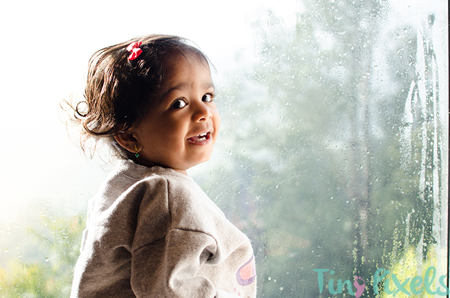


First of all, this little girl is stunning and I LOVE a great window image. Win-win from the start.
Personally, I would turn down the highlights (showing some of what is outside the window and make her little curls stand out a tad) and maybe lighten the shadow a tiny bit on her face (I want to see those gorgeous eyes). I adore the contrast and vivid colors in this image!
She is so adorable and the smile says it all. I find the left side of her face a little dark. In contrast it seems like the brightest light is coming from that same side top left corner. Think by lightening up her face a bit it would allow those to blend a little better. Great focus! Those beautiful eyes and long lashes really stand out!!
I love the detail of the wetness on the windows and the colors of the Trees outside! I think the shadows on her face could be lightened to draw more attention to her beautiful face. The sharpness of the photo is spot on and I love the way her curls stand out against the blown out area.
Adorable subject and you captured a really awesome expression! Congratulations :)
I’d tone down the highlights and highlight the shadows just a bit. I think it would balance the shot a bit and further define her as the subject matter.
I love the condensation as well. It definitely sets a mood!
Love the colors and skin tone. Love the composition. The little girl and her curls are adorable! I would reflect a little light onto the shadowed side to show a little more detail in her hair and face. Overall this image is pleasing to look at. Nicely captured.
I love it…wouldn’t change a thing!
This is beautiful….I wouldn’t change a thing!
Okay…c’mon!
You gotta submit a picture that needs critiquing! lol
This is a beautiful picture.
If I had any suggestions it would be to of put her in a different sweater.
Beautiful photo and I love the highlights and the shadows just the way they are. :)
I like your use of directional lighting. With the light and shadows I think this would make a stunning black and white. Since it is I’m color I would try to lighten some of the shadows in her face and maybe dodge her eyes a bit so you can see a little bit more of the catchlight. Overall great photo!
OMG she is gorgeous! I love the natural look of the pose and colors. I do find the brightness one one side of her Beautiful face a bit distracting. Consider lighting the darker areas and bring the lighter areas down a bit. I believe you will be able to see the features in her face better.
What a great shot! I LOVE the water effect behind her! The absolute only thing that I think would make it better would be if her sweatshirt weren’t quite so puffy… but really, that’s all I noticed that I’d change. What a cool picture – and SO adorable! The color and the focus are really good.
I loved the misty background. The little girl is beautiful. I feel that the little girl looks slightly fearful in the picture. I would try to get a more relaxed look, with a little more reflected light on the left side to balance the shot. The focus is really well done to show off her eyes.
I love the eyes and the highlights in her curls. The shadow on the side of het cheeck reaching to the corner of her eye is a bit to dark for me. Maybe next time use a reflector ? Love also the fact that the raindrops are visible on the window.
I love the composition. I would come around a little so you have more of her eyes rather than the white parts and bring down the highlights and bring up the shadows. Im a newbie hobbiest and I’m contributing because when people cc me it helped. Cute little girl and great use of window light. Keep sharing.
What an adorable little girl! I would love to see this as a dramatic black and white! And like many of the others commented, I would lighten up the darker side of her face. Love the composition!
What an adorable little girl. I truly like it as is, except lightening the dark side just a tad. I also agree this would make a great black & white.
Gorgeous little girl! Love the window light! The only thing i could change would be the shadows on her face, other than that this is a lovely photo! Great job!
I love the sweet moment you captured in this photo. It doesn’t feel forced, feels like you caught her just as she was looking at the window and turned back to smile at you. As has been commented before, I would lighten the shadows on her face. Other than that this photo is great. Love the composition and the setting (in front of a rainy window)
:) !
First of all, this picture and moment you captured is priceless. She is such a cutie! I love the shot next to the window, but i feel that if you would have taken the photo on a different angle you could have brightened her face naturally a little more. However, the image is extremely sharp and the colors are wonderful. Overall, the shadows are just a little too dark around her face.
I love the shadows and the detail of the rain on the window. You have captured a child’s curiosity so well! I think I might have moved a little more to your right in order to get a tiny bit more light to her right eye while still keeping the shadow on her cheek. I would just love to see more light in those beautiful browns! The composition is spot on!