Remember:
-Read How to Critique a Photo
-Make a critique sandwich – something positive, something you would have done differently, something positive
-My rule: no improvement tip = deleted comment
-This will benefit the person leaving the photo critique just as much if not more than the person receiving the critique.
-If you would like to have an image critiqued be sure to read How to submit an image for critique.
Thanks to Melissa at Unique Impressions by Melissa for submitting the following image.
Settings:ISO 100 | SS 1/200 | f/5
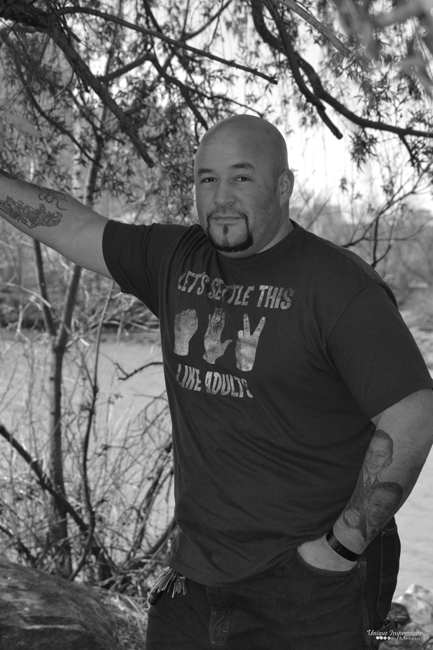


The black and white looks great. The cropping of his arm doesn’t work well. It would have been better to get his whole arm in the picture. Crisp, clear and sharp photo. Well done. :)
I love the pose, the black and white, and the branches framing the image nicely. I would perhaps increase the exposure a little bit, or play around with the tone curve in Lightroom (if you use LR), making the brights a little brighter and perhaps the darks a little darker too. I also wonder if I would have moved back a little so as to not cut off his arms. I really love the even lighting you achieved by placing your subject under a tree – no harsh lighting.
I like the pose too, it’s manly and relaxed, even if it would indeed (as the first comment mentioned) would have been better to not crop the hand out. The image seems a bit dark to me, and hence the b&w a bit too grey, more contrast would help him stand out better. I like the spot you found with the branches framing him, and the fun details (the tatoo, the fun shirt, the keys hanging from his pocket). This all gives a very natural, fun, “lifestyle” feel!
I like the choice of black and white in this pic. I think it contributes to the “tough dude with a soft heart” that comes through in his build (tough) expression (tough but soft) and tattoos (one tough, one soft). Although I like the pose against the tree, I don’t like the brush directly behind the subject because it makes the background cluttered and distracting. I do like the overhead branches, though, and in particular, the glimpse of out of focus branches in the top right corner.
I love the look on his face and those tattoos are fantastic. (I would have focused on a way to get them better). I think there are two things that bother me most. The first is the snapshot feel of the image – probably due to the busyiness of the branches. Maybe pick a less hectic-feeling location under the tree. The second is the fact that we can’t read his shirt. When a shirt has a message, we have to be able to read it. I do like the black and white interpretation and the masculine strength of the model and overall feel of the picture. Keep up the good work.
Ben O.
The pose and the look on his face is GREAT. I have to agree with others about the cropping. I would also try and brighten him up in LR or Photoshop. To me the branches are coming out of his head so I think I would have tried a different angle maybe got down lower and angled up. I struggle with this also. Keep up the good work :)
Great character, relaxed pose… Aside from the obvious arm-chopping, perhaps also lighten the shadows on his face, sharpen his face a bit? Otherwise, you’ve captured his persona in a good B&W image :)
The first thing I notice that takes away from the image is the b+w edit. It can definitely help the feel and mood of the photo when shooting men, but without contrast to make it pop a little, you’re making it look flat when it has that muted gray look. I would have pulled back just enough to not crop out the extended arm. As well, I always recommend having men stick only their thumb in their pocket versus their whole hand. Lastly, if the background is busy (like all the branches), simply have them take a few steps forward and if you’re shooting a low aperture, they will blur more the farther the subject stands from it. In the future, practice moving from side to side and moving closer and farther from the subject to get variety and see what looks best. Practicing will only improve your skills! Keep it up!
Melissa,
I really enjoy the expression on your subject’s face. It’s a hint of a smile, a hint of serious, but I look at it and think, he’d be a nice, fun person to know. I agree that the crop on your subject’s arm is distracting and I would love to see a deeper contrast (I’m a sucker for high contrast). I love that the photo is in black and white and that the focus is squarely on your subject.
I dont like that his hand is cut off, or that he is wearing a graphic tee or that he has keys hanging from his belt. These things make it look like a “snapshot” that anyone would take rather than a portrait or photograph that only you can take. The photo seems to be in focus though. I wuld prefer this to be in color with the limbs blurred.
I do like this image, firstly I think the man is very handsome, and secondly I do think B & W works. I agree with the general view that the cropped arm doesn’t work, the right arm not too bad, but it’s the elbow. A friend of mine recently submitted images in a competition and it was this tiny detail that cost him a place.The judges loved his image, except a small area of hand was missing. I think the subject is “removed” very nicely from the background. That is all I can say, I’m not much good at critiquing, but made a promise to myself that I would try..
Thank you everyone I am loving the comments, helps me see what I need to look at and improve. Thanks again.
This is a great photo. You did a good job keeping it manly which I think is sometimes hard to do. I would have pulled out a little to not crop the right arm. I also think making the blacks a little deeper and lights a little lighter would be nice. I really think this is great in B&W and that the subject would be proud of it too.
Love the pose, and black and white photos are always a favorite of mine! I would have maybe stood back alittle further to get his arm in the photo, and lowered the aperture to get a nice blurred background, but overall very nice photo!! Great job!
Great pose! I agree that a little more contrast would make it pop and maybe cropping with his hand in the pic. Minor things. Overall wonderful! ☺️
I like the black and white and pose but I think it would be better though if his hand wasn’t cropped out. His skin also looks a tad underexposed to me. If you increased ISO or appeture it would let more light in and you could get more of a proper exposure of his skin. I always use spot metering and meter of the skin I think that would help in this scenario since there is light coming in through the tree branches. Overall great job keep up the good work!
The black and white are excellent contrast in the photo. I would consider the verbiage on the t-shirt needs to be clear and including the elbow in the picture. Great job.
I agree with the pose, coming from a guy’s perspective, makes him look natural and comfortable. I might have opened up the aperture a little bit (mayble a f/3.0 to bring in more light). Keep up the good work.
Love the black and white, I never tire from it! He appears a little underexposed to me, maybe use a fill flash? I’m sure there are ways to do it in Lightroom post processing – just not my expertise, yet!!! Love the setting – water & branches in the background! Overall a great shot!
I like the b&w. Also like the relaxed pose, and facial expression. I would have perhaps gone for more bokeh, and pulled back to see his hand on the tree, as well as just past the tip of his elbow. Still – very manly, and love that it’s by the water.
Love the trees and the effect it gives! Would try to brighten a little and I miss the hand. Nice relaxed pose and great expression in his face.
Great posing for a guy!
My advice would of been to stop down to F2 (to let in more light and make the background a bit more out of focus) but that’s my personal preference. When it comes to portraits, I like shooting wide open to make the subject stand out. The hand should be in the frame and his skin is a bit underexposed. I like the distance you have (camera to subject) so I would of stepped a bit more to your right to include his hand. So, in a nutshell: try and get more light by either stopping down or ISO’ing up and be mindful of limbs (arms, hands, fingers, etc).
Great job! :)
I love the background of this photo. I’m all about using nature as one’s background. I would have avoided cropping the arm so close to the hand (as stated before) and added more contrast to the photo to bring more life into it. I do like how natural his pose is and how relaxed he looks.
I love the pose and the expression. My first impression was that the photo did not pop … needs a bit more contrast. The crop is distracting and is something I have problems with too – so frustrating to take a great photo only to find that you have chopped off finger tips …. or elbows! I actually love the keys and the print on the shirt – it shows his personality and character. Well done :-)
I love the photo, the tattoos and keys give character. I probably would have liked to see a shirt without words, my focus goes towards reading it other that the picture itself. The black and white is perfect for this photo and he has a great pose, Great Shot :)
The black and white does look great. I am curious, however, what he is leaning on. Cropping the arm out of the frame distracts me from what is going on within the frame. Still, nice photo. Hilarious t-shirt!
Like this picture! Very hard to get a man and have him “relaxed” in front of the camera, which you have nailed! I would have included his full arm in the frame, but love the black and white and how crisp and sharp this picture is. Great job!