Remember:
-Read How to Critique a Photo
-Make a critique sandwich – something positive, something you would have done differently, something positive
-My rule: no improvement tip = deleted comment
-This will benefit the person leaving the photo critique just as much if not more than the person receiving the critique.
-If you would like to have an image critiqued be sure to read How to submit an image for critique.
Thank you Felicia at Fel’s Photos for submitting the following image.
Settings: ISO 2000 | SS 1/50 | f/5.0
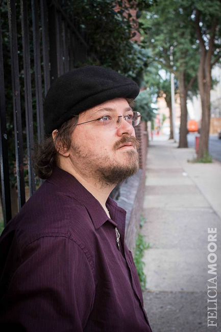


Felicia, I like the that you have your subject off to the left in the image, as it creates a nice area within the image for the subject to look into. I may have nudged him just a bit more left, to remove a few more of the bars from behind his head, as well as, possibly opening up the lens to blur more of the background. The strong contrasts in the image helps create strength in the overall composition. Nice image!
love the depth of field in this photo, I would have had your subject face you a wee bit more to get a glimpse more of his eyes ( as you see the glasses more in his right eye ) – The colors work well and the location is nice and quaint. I love the trees layering in the background – overall great photo.
Felicia, Your focus is spot on….perfectly crisp around the eyes! You also did an excellent job of showing his eyes through the glasses whereas I sometimes get a glare even without using a flash. My only critique is that the background has so many lines going in so many different directions. I probably would have opened up the lens and maybe tried a tighter crop. Despite these suggestions, the picture is really great :-)
I also like that the subject is off to the left and you’ve given him good lead room in the direction he is looking. I think the composition could be stronger if you were to take a step to your right…the sidewalk and the wall would create more of a line leading up to your subject. I think it would also bring more focus to him by eliminating some of the bricks that are right around his face. NIce framing and a nice image overall.
I like the trees framing/anchoring the the right side of the photograph. I might have repositioned him, pulling that shoulder forward to see more of his face and try to eliminate the bricks that look to be lying against his cheek. Otherwise, a very lovely image!
I like his expression and the lighting – very nice and even on the face. My eye, however keeps going to the bright area down the sidewalk and into the distance. Perhaps step around to your right and don’t include the distant background, but include the fence and storefronts only. And I LOVE your watermark!
Great job photographing someone with glasses on! The subject almost blends into the wall so my only suggestion would be to move him over to a section of the wall that is not black to make him stand out a little more. I also like the leading lines from the trees. Great job!
I love that you chose to take a street photographs vs. taking your subject to a park. The one thing I might have done differently is rotate the photograph so that the bars behind your subject were perfectly vertical. I also like that you did not shoot wide open so the background is still visible, but slightly blurred.
Wow! Great intensity captured in this image! My eye does keep getting drawn to the orange JLG (cherry picker) in the back, I think a quick clone out would be great there. Also, with such a good portrait feel, I would have opened up my aperture a bit and pulled down the ISO. I’m really impressed however that you have such amazing sharpness at 2000! There is no way my camera could do that well!!
For me; there is too much space and would suggest more a camoe photo.
You did a great job of avoiding glare on his glasses – that is a big problem in lots of photos. Taking the photo at an angle to the way he was standing probably helped with that and made it so you can see his eyes clearly. I am a little distracted by the background. Blurring it out using aperture and zoom while in the field would help, and you can also blur it a little in post-production if needed. A few others have mentioned cropping the photo somewhat, which could also help eliminate distractions in the background.
I like that the portrait pose isn’t your standard “head on, look straight down the lens” which has allowed you to get those lead lines into shot. I agree with the comments above – one step to the right and opening up his pose slightly would have meant seeing more of the wall as a lead line and simplified the background composition.
I’m impressed with the sharpness that you’ve got on this image with a shutter speed of 1/50 and ISO 2000 – good job!
This is the kind of photography I absolutely love. He looks real. The setting looks real. I can’t really describe it, but I know it when I see it. Fabulous. I did a pretend crop of your photo and I cropped out the first tree and about an inch off the bottom. It gave it just a bit tighter feel. Also, it got rid of his shirt blousing out a bit and the cherry picker. I really love all of the different textures in your composition. And I am amazed at the shutter speed of 1/50 as well!
Great use of lines! I agree that for me, the brick wall line is a little too close to his face. I may have stepped a little more to your right in order to both get a little more of his face, and to give a separation between him and the wall. Along with that, I think blurring the background would help a little more with that as well. I also think you did great with the glare/glasses issue. I can see that you have a talent for making your subject feel comfortable.