Remember:
–Read How to Critique a Photo
–Make a critique sandwich – something positive, something you would have done differently, something positive
–My rule: no improvement tip = deleted comment
–This will benefit the person leaving the photo critique just as much if not more than the person receiving the critique.
Thanks to Dana at Dana Elyse Photography for submitting the following image.
Settings: ISO 2000, f/ 1.8, SS 1/125
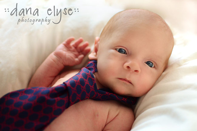


Okay, so this picture is pretty stinkin’ cute! The tie offers a lot to the photo and just makes it so adorable. The only critique I have is I want more; I want to see the whole baby [maybe in black and white because I am a huge sucker for B&W photos]! Again, super cute picture; great work!
Hi Dana!
First of all, I like the composition, which draws emphasis on the baby’s face. Personally I would convert to black and white, which will minimize the distraction of overly magenta skin tone, but even more importantly the black and white will draw your viewer in more and bring out the emotion of your subject, whose expression is quite captivating!
Great image! As Darlene said, b & w would look great but I think the color version is equally wonderful. Composition is good as are the idea and colors. Great shot!
I love photography and the way each photographer brings their own ideas to the table. I love the color. ;-) I’m not opposed to the B&W ideas, but babies are sweet in color. I LOVE that you have your focal point on his eye to get that tiny catch light/sparkle – it catches his innocence! I’d love to see even more sparkle, but I know babies are tough. I think I’d like to see the aperture closed a little – his hand and the tie being blurred are a toss up for me. That being said, I love your composition and that he is the only thing to fill the shot for my attention. Awesome job.
I really like this in color. I feel like it would loose something in B&W. I like that the blue in the eyes is similar to the tie. Might blur the area around him a little more so that it really made him pop. Perhaps emphasize the blue more. Overall, it’s a super cute picture!
I love the idea of using the tie! I really wanted some more catch lights in his eyes though. It is so great how the color of his eyes coordinate so well with the tie but I just want them to have a little more sparkle. Perhaps you could have spun the baby around (looks like it is lying on a pillow of some sort) until the light hit his eyes quite right. Overall I think the composition is good and I know photographing kids can be tough (I have a 2.5 year old who doesn’t want to cooperate ever) so you sometimes have to take what you can get. Thanks for sharing!
I love how the blue tie brings out his big, blue eyes! I feel the crop is a bit awkward, It may be better if you could see both hands. Or maybe I would crop it in close to his face so you wouldn’t see the other shoulder. Like others said, I would love to see this photo in black & white, the catchlights in his eyes may pop more that way. I like how the light is directional and not ” flat”. Nice shot :)
Simply precious photo!! The tie really adds an adorable touch! The only thing that I would suggest is pretty much what everyone else has said, and that is convert it to black and white. He has some uneven skin tones in his chest, and I think that by converting it you could get more of a “ideal baby skin” look. I might also try to enhance his eyes too. But it is a super sweet photo, and the expression that you captured is too cute!! Great job!
What an adorable baby! I love the composition. The only critique I have is may be correct the skin tone a little in PS and may be move the baby around a bit to get better catch lights in his eye. Love the tie…looks so cute on him.
Such a sweet shot! I’d consider using a smaller tie so the idea isn’t lost and it’s not too overwhelming in the shot. His eyes look gorgeous, great job!
This was a cute idea with the tie! I think I would try to get his little hand in focus too. Their little details are just so precious! His expression is priceless and I love the picture!