I think once you’ve been bit by the photography bug, it can really start to consume you. It does me anyway. The more I learn about photography, the more my eyes are opened to “seeing” more opportunities as they unfold in front of me. In the beginning, it was all about getting a tack sharp image, but as my technical skills have improved, I find myself studying things like composition and light. There are the obvious places to search for inspiration, like browsing favorite photographer’s blogs, Pinterest, Flickr, and books, but for the most part, I tend to find inspiration in other places. I notice the way the light is falling on our dinner plates through the window in the evening, or how it hits my hands as I’m driving down the road, or the dramatic shadows at night as we are putting the kids to bed. There are tons of opportunities to teach yourself about light and composition that don’t always involve actually spending time in front of a computer, or with a book, or in a class.
So, today I’m going to write specifically about how I find inspiration when two of my favorite pastimes converge. Television and photography. Now that’s what I’m talking about!
*Disclaimer! I have no idea how television sets are lit. I’m sure there are tons of different lights and reflectors, but as I talk about it, I’m thinking of how it looks to me in context with shooting in natural light, and angles of the major light source. I know nothing about artificial lighting scenarios. With that said:
1. Lighting
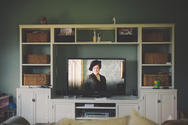
All kinds of lighting are used in television. Recently, I have been going through quite a marathon of a few shows so I can catch up for the upcoming seasons. The first of which is Downton Abbey on PBS. I LOVE this series. I can’t wait for it to come on this season. Anyway, because this show is set way back in the day, they lighting looks very “natural”. I’m sure they use lights and scrims and reflectors and all of that, but is doesn’t look like it. So, they are doing a great job. I noticed a lot of 45 degree lighting. And I can’t believe I’m posting this image. I took it back in April as part of a 365 that flopped. This is the kid’s playroom, so it gets messy in there. This is one of my favorite characters. The Granny of the show. The lighting is coming in from camera left at a 45 degrees. Three quarters of the face are lit, and the rest falls into shadow. This mimicks window light, which if you have seen this episode, there is a window camera left as well.
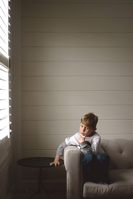
Here is my interpretation of light hitting the face at 45 degrees:
Another television show that I’m obsessed with right now is The Good Wife on CBS. They use a lot more dramatic lighting in this series. If you have ever had trouble nailing a Rembrandt triangle, this is a great show to check out the lighting. There are Rembrandt triangles everywhere! Their offices are in downtown Chicago, and of course the partners all have huge windows, so there are lots of opportunities to check out flattering window lit “natural” (as far as television goes) lighting. A good deal of the show is shot “after hours” at the firm, where there is a lot of opportunity to study low lighting. I love low lighting. Here is an example of both low lighting and a Rembrandt triangle. It isn’t completely closed, but you get the drift. Lighting coming in from camera left. If her head had been turned a hair toward her left (camera right) the triangle would have been closed. If the light had been coming from a bit more overhead, that would have helped too.
2. Composition
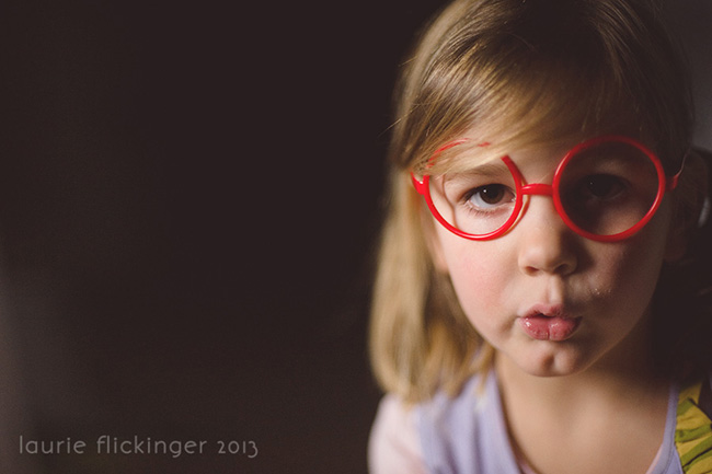
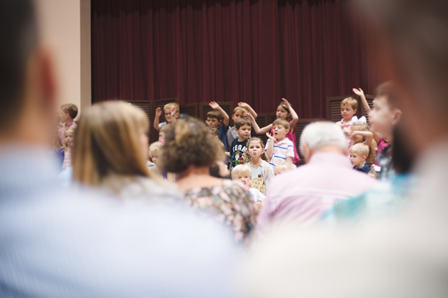
I’m always on the look out for framing or leading lines. Television is full of framing. Notice how often the camera behind someone’s shoulder looking in. The person closest to the camera is blurry and the subject of interest is sharper. It gives a sense of peeking in or peeking around someone to get a better look. It is also a good way to show a person’s point of view from his/her location. I used this technique when photographing my little girl’s Pre-K Spring Showcase performance. I was in the back, so I could stand up and take pictures without getting in anyone’s way, and this one is one of my favorites because the viewer is drawn to my daughter in particular. While an image of the whole group should be included for storytelling purposes, which I did initially, framing like I did in this particular image (and often in television) brings attention to my shining star :) She gets lost in the group otherwise. And yes, she is sticking her tongue out at me.
I tend to get distracted by the elements of camera angles. What is the depth? What other compositional elements are applied? Rule of thirds? Golden Ratio? Leading lines? Pay attention to how the characters are framed especially. “Through the glass” types of shots are interesting to study. Reflections. Study it all and think about how it can be applied to your photography. Let it inspire you.
3. Processing
Okay, back to The Good Wife. The processing changed to a matte processing in the last season. It is subtle, but is definitely there. It is easy to spot in the shadows. As I stated earlier, this series uses a lot of more dramatic lighting and low lighting in which matte processing looks more obvious. Matte processing is basically changing the point of which black is black using curves or levels. So you’ll notice how the blacks and deep colors are softer. Still rich and vibrant, but softer, if that makes sense. I noticed it mainly in the richer colors of their clothing, such as the deep reds, blues, and blacks. So, the popular editing techniques aren’t just in photography. It carries over into all types of media. I love matte processing.
My example of matte processing:
Another one of my favorite shows (that ended this past year) was Private Practice. The processing in this show really caught my eye. The colors are really vibrant. The processing is still really clean, but the colors have an extra pop of color.
4. Fonts
I LOVE Fonts. I have a board dedicated to fonts on Pinterest. I occasionally design a card or invitation, so studying fonts and how they are used together can really come in useful. I always notice the fonts used on the opening credits or titles of television shows….or anywhere really, billboards, magazines. Take note how fonts are mixed. Larger type for titles, same or different typography for bylines or credits. It is really interesting and there is always something new to learn and inspire you. And occcasionally, if you are lucky, you may be able to find a similar knock off on the web.
Well, I hope I didn’t totally ruin TV for you! It is a little distracting sometimes trying to watch a show and analyze it photographically, but it is a great tool that can be used to learn about lighting, composition, processing, and fonts. Bring on the new seasons in September :)

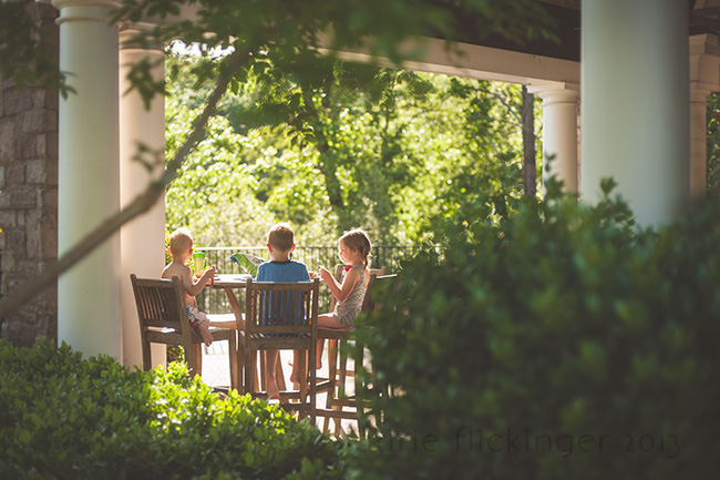




Those were GREAT composition tips! I’m really excited to try them out so I can get out of the rut of a lot of my photos looking the same :) Thanks so much for sharing! And I LOVED your matte photo, looking past the bushes at the kids on the porch – I’m going to try and incorporate the “peeking in” feel this week!
So glad you were inspired Nicole! That’s one of m favorite compositions. Try peeking trough doors and windows too :) between furniture pieces, there are tons of opportunities, just look for them :)
Thank you for this post! I have also been noticing light in new ways in everyday life and trying to incorporate it into my photography. Also, watching TV for photography homework is awesome but you might want to include a bowl (or carton) of your favorite ice cream too! To help with the analyzing of the light and compositional rules : )
Such a great post Laurie! I am always noticing split lighting in shows. And I LOVE Downton Abbey. :) Thanks for sharing.
My favorite show for great lighting and composition is the British crime drama Sherlock.
Nice analysis, I also like to pay attention to this while watching shows. I don’t know if I’m right but I thought I saw some tilt-shift effects in some Downton Abbey scenes! Did anyone see this, too? : )
These are great, simple ideas. I’m always checking out fonts, too, I love seeing combinations, colors, etc that I wouldn’t think of.
Howdy, Neat posting. We have a disadvantage in your web site throughout ie, would certainly check this? Web browser even now would be the industry leader plus a substantial component of others may omit your current terrific composing therefore trouble.
LOVE the Good Wife as well. Great tutorial