Anyone can take a photo using their camera or phone. But there are some photographs that your attention is really drawn to. That’s because the photographer probably used photography composition rules to create that beautiful image.
There are a few basic composition rules like rule of thirds, leading lines, and filling the frame. We are going to explore these a little more to help you create perfectly composed photos.
Table to Contents
What are the rules of composition in photography?
Photography composition rules are a guideline to follow to help you make your photography more interesting.
I remember just starting out on my photography journey and learning how to use all of the settings. It seemed that I would do everything right and my pictures would just come out very bland. Unfortunately I didn’t know that I was missing some basic compositional rules.
There are a lot of different composition rules in photography. We will dive into some basics. You have probable heard of rule of thirds, maybe framing your subject, or what about leading lines? All of these and more are considered rules of composition.
Do you have to follow the photography composition rules?
Photography should be fun! So the short answer is no.
The long answer is that once you know the rules, you can intentionally break them as long as you purposeful and know what your outcome goal is. After using them awhile, you will naturally start to use photography composition rules and not even notice it.
So while not every single photograph you take needs to have perfect composition, using these regularly will naturally change how you see and frame each photograph.
11 Essential photography composition rules
Rule of thirds
When you’re first getting into photography all the basic classes and books emphasize the importance of the rule of thirds. The rule of thirds is a great concept when you’re getting started, for avoiding center compositions, or when you’re lost on where to place the subject in the frame. Rule of thirds refers to subject placement.
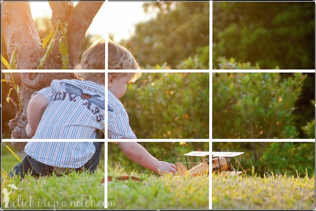
The golden photography composition rules
The golden compositions are based on a mathematical relationship such as the spiral, triangle, and ratio.
The spiral works great for images with curves, the triangle for limbs such as trees or arms/elbows, and I find the ratio composition works well for architecture.
The golden ratio does not put the subject intersection lines on the third, but rather in the center or near center. But it’s not the only theme to consideration, in fact, subject placement itself is not the only consideration.
Negative space
Give your main subject some breathing (or swimming) room. The photography composition rule of negative space happens when you purposely leave some of the image empty.
Place your subject somewhere in the frame, the bottom, far left, far right, or top. Try not to place them right in the center. Make sure there are not any distractions in the open space.

Notice how the turtle is coming in from the left side of the frame but there is nothing in most of the right half of the frame. That is negative space. Try to keep an area of your photo empty without distractions.
This is also really fun to use when doing Reflection Photography!
Fill the frame
By filling your entire frame, you can really grab the viewers attention by all the extra texture of the subject. You can fill the frame with anything, faces, pumpkins, candy etc. Make use of the image space and get closer.

Limb chopping
The photography composition rule of limb chopping is a pretty simple one to understand and start applying immediately. Basically you need to make sure you are not cutting off your subject at the limbs. I know that sounds harsh haha. Back up and make sure to get the entire subject in the frame.
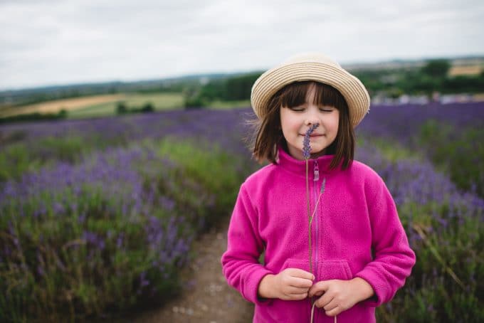
Or if you are trying to keep it a little closer and more personal, you just want to avoid cropping at a joint. This will help you still be able to tell the story without it looking so harsh.
Repetition
When you start to look for the composition rule of repetition, you will find it everywhere. Our eyes love it which is how it ends up all over our cities.
You can find rows of trees and flowers that were meticulously placed. Or maybe you’ll see a line of kids all looking at something through the fence.
You can also create it yourself, like it in the picture of the root vegetables. These are all examples of repetition. Using repetition will engage the viewer and leave them wanting more.

Read more: Photography Composition Series: Creating Balance & Symmetry
Leading lines
Using the photography composition rule of leading lines, is one of my favorites. Leading lines or curves are as if you were to draw a line around and through the image bringing the viewer to the subject.
You can use straight or curved lines, the only rule is that the line draws the viewer to the subject and not to something else.

Move the horizon line
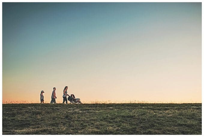
Changing the horizon line from the lower section to the upper changes the feel from vast to solid. Get down low and try to change the scene from your typical horizon shot. You can get really fancy and do this at sunset and create a fun silhouette.
Add depth and dimension
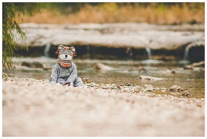
One way to elevate your photo is to make use of your foreground, mid-ground, and background to add depth and dimension in your images. Take the opportunity to frame your subjects with the environment. Notice how in the image below the rocks take up foreground, then there is the subject, and in the background the river and the grass. Step back and see what you can use to add depth and dimension.
Patterns and texture
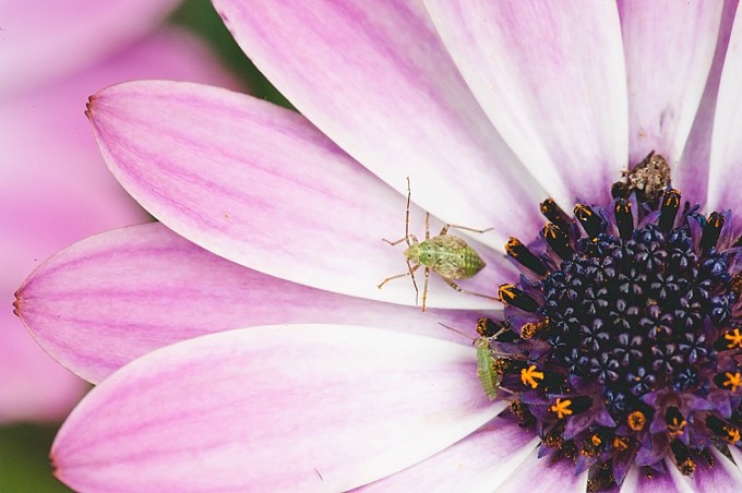
Another rule of composition in photography is patterns and textures. This will encourage you to really get close and try to find something a little more artistic. Look for texture or patterns—they make for interesting and dynamic images.
You will find this all over once you start looking. Make sure the lighting properly exposes the pattern or texture. You can also try out a macro lens or just get really close to the subject.

Framing
Framing is a fun and simple photography composition rule. Basically you take your main subject and you create a frame around it. This will immediately draw the viewer to the subject in a creative way.

You can use this rule indoors and outdoors. You will find framing all around you, you just might have to change your angle, or move around to see it.
And most of all, just have fun. Try new things, find what works, fix what doesn’t, but enjoy the process. If you’re not enjoying it, I truly believe you’re doing it wrong.
Go see some of my favorite post on composition:
8 Composition Mistakes to Avoid
5 Tips for Shooting with Composition in Mind
Storytelling through Light, Emotion, and Composition
8 Ways to Weave Intentional Design Into Documentary Photography



Excellent tips and examples! My favorite image was the turtle image because I love the use of negative space!
-Tia
http://retouchingblog.com
Great tips Courtney, your photos are just lovely!
Love your posts
Thank you
Thank you so much. Your articles are so easy to read and follow. It is very helpful. :)
Good tips. Thanks for sharing. Turtle image looks great.
Awesome pics, Courtney!
Very easy tips to follow for a beginner
Thank you for the great tips
I want to superimpose two shots How is that done