In my last post, I spoke briefly on the basics of color theory and the main pillars: hue, luminosity, and saturation. Now put those together into a harmonious color palette…. it doesn’t come easy to everyone.

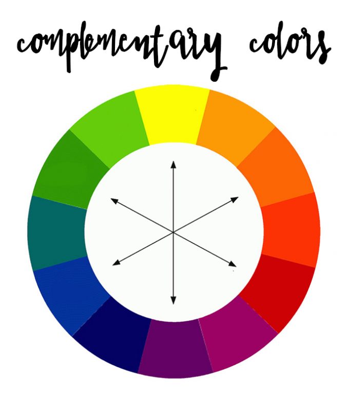
One of the most common types of color harmony is complementary colors. If you think of the color wheel, complementary colors are those that are opposite each other. See the image below. Yellow is the complementary (or opposite) color of purple, blue to orange, green to red, etc.
In photography, complementary colors work really well in small doses. That’s because when you put two opposing colors next to each other in a large format, it creates a very high contrast. When you put red and green together, for example, it’s distracting to the eye:
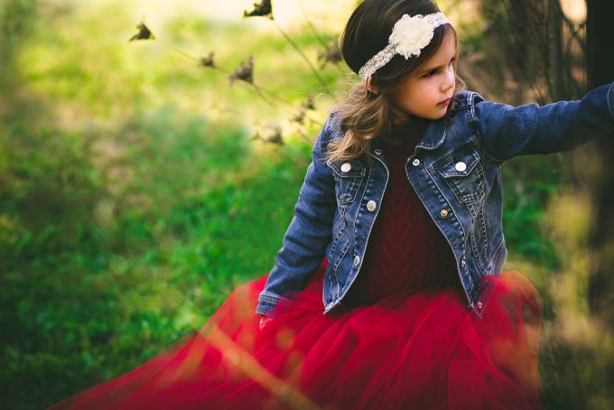
However, if you had a shoot outdoors with otherwise green background and you incorporate just a touch of red, that red is going to stand out and catch your eye immediately!
For one of our styled shoots recently, we put the child in a red tulle dress, knowing that the grass and the trees were green and we knew the red would stand out. Combine that with the knowledge that warm colors jump, while cool colors recede, we had a golden opportunity!
Let’s say you have a much more muted, calm, subdued style. Then you may want to opt for a more monochromatic color harmony. This means that all the colors are within the same hue range (varying shades or tints of the same color). Take a look at this image below, this image stays within the blue/gray ranges:
Let’s take a look at this family – everyone was in blue tones with a white background. The only one in a different color is the little girl in red…and as we already talked about in the last post, warm colors pop out at you!
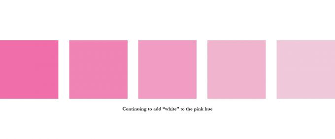
Another thing to remember about color is you can always add whites, grays, and blacks to a pure hue. What does that do? Well – it creates a tint, shade, or tone to your photo. When you add white to a pure hue (color), you’ve created a tint. When you add black, you get a shade of that color. Same for tone by adding grays.
Why is this important? Well, when you’re trying to create a cohesive collage of photos or perhaps a specific brand image, you want to make sure that you’re working in the same tonal range for your photos.
It creates a much more consistent feel as well as a cohesive look. This is why the family above creates such a beautiful range of photos – the colors work well together because the tonal range matches.
Now, of course, there are other factors that you need to take into consideration when creating a cohesive look: same lighting, same white balance, etc. And I encourage you to learn more about each technique. Just remember that color is a fundamental pillar to learning what makes your photography unique and stand out!







[…] is a combination of colors used in a photograph. Those combinations are called color harmonies. There are many harmonies, but there are a couple most often […]