Remember:
-Read How to Critique a Photo
-Make a critique sandwich – something positive, something you would have done differently, something positive
-My rule: no improvement tip = deleted comment
-This will benefit the person leaving the photo critique just as much if not more than the person receiving the critique.
-If you would like to have an image critiqued be sure to read How to submit an image for critique.
Thanks to Brad at Monnerjahn Photography for submitting the following image.
Settings: ISO 400 | SS 1/100 | f/5
**If you are interested in having one of your images submitted in the Critique Me Series, make sure you are signed up for our weekly updates as they get first chance to sign up.


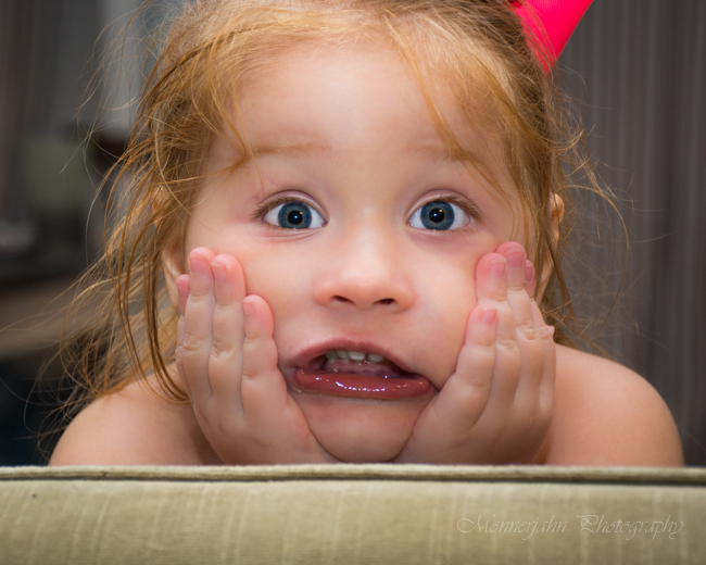
I love the expression in this photo. Priceless! I find the pop of red behind her head distracting. But her eyes look beautiful.
I love the catchlights in her eyes, they light up her whole face. The facial expression seems a bit tense for me, especially around her mouth (even though I realize the aim was to show she’ s sick). I wonder whether it would not have been nicer if she would have put less pressure on her hands (you can see the pressure in/on her fingers). The skin tones and the lighting on the little girl are great, it really makes her stand out from the background.
love the catchlights and her expression! i think that’s adorable. for age appropriateness…i’m not too keen in exposing bare shoulders (even though she was hidden behind what seemed like a couch), i would prefer she had something on – that’s just me (i’m sure different people have different perspective). that pop of red, i agreed – it was a little distracting.
overall, i love the focus, the lighting :)
I love how you captured the expression of her entire face. It reminded me of the “Home Alone,” picture of Macaulay Caulkin. Although I am sure it is a very innocent photo, I would have liked to have a suggestion that she was clothed in someway. I didn’t really get that distracted by the background, but the photo would be more enhanced without the red particle in the background. I do also like the way you captured the messy, beautiful red hair and beautiful features of her eyes.
Beautiful expression on her. Really captured her feelings. I would try to remove the red behind her as it is a little distracting. Nice close-up and good lighting.
What a great capture of the emotion.
I would have tried to get a bit more of her head, maybe the red in the background would make more sense then. (If it’s a bow in her hair or something like that)
I also like that you caught “real life” after all our hair isn’t always perfect and beautiful.
OMGOODNESS! Too cute! I love the expression on her face! The red in the back is a little distracting. Her eyes are beautiful, focus awesome and I just love her hair! So very natural for that age! Your photo brought a smile to my face as well as others this morning…. Thanks for sharing (hope she feels better haha)
Gorgeous! I love the expression on her face, her perfectly red lips and the crisp focus. The wild hair and her darling bare shoulders lend a natural innocence and spontenaeity to the photo. Would have loved to see more of the red bow on her head. The red pop of color would have been the perfect finishing touch.
The pic as a whole is awesome – the catch light in her eyes is good, the color is very good, about the only thing that I find out of place is the red thing that seems to be coming out of her head on the right side of the pic. If it’s a ribbon or bow then maybe there should have been more of it visible in the pic so we could tell what it was. Overall it’s a very good pic. Nicely composed and the facial expression is priceless
Great fun and real expression you captured! I agree with the other feedback that the red behind her head could be removed. If it was more clearly a ribbon or a bow, I think it could stay. I love the detail in her pudgy fingers. Very sweet.
I love her expression….a super cutie pie. The red behind her is distracting and I would clone it out. I’m sure any parent would love to have this shot of their child.
Very cute! I love the in the moment feel to this image. Your focus is sharp and you captured great catchlights in her eyes. Like others suggested the red in the background is a little distracting. I would have loved to see this shot pulled back. I think if the crop weren’t so tight and you could see more of her environment it would make an awesome lifestyle image. I also feel the white balance is a little off. Overall good job :-)
The look on her face is very expressive! The lighting seems a bit flat to me, and perhaps if you pulled back a little to where you could see her whole hair bow it wouldn’t leave the one distracting red spot. Overall, I think its an adorable candid capture of those special moments and faces we always want to preserve from our little ones! :)
I love this expressive shot, and wonderful catchlights in her eyes!
I think the only thing I would have done differently, is to make this B&W, rather than color.
The B&W would allow the expression to shine, without any other distractions.
Love the expression on her face! The red is distracting perhaps show more or less. Nice use of light.
To me, this is a tack sharp image, the one I’m always trying for! I actually love that her shoulders are bare and think that the skin tone is perfect, too. I wish her whole head was in the frame. Others have mentioned the red but I don’t automatically look at it because of that adorable expression. I agree with another poster about seeing it in B&W, but I love her skin tone too much!
I love her expression!! The lighting and tone are fantastic. I would have stepped back just a bit to get her whole head in the frame, which like another poster pointed out, may have helped to explain the red. And I do love her messy hair!
Great expression. The image appears to soft. Ensure if you are using a skin softening tool, to brush back off the eyes, hair and hands. Also, try removing the red thing coming out of her head and try lowering the opacity of the red in her finger tips. Also in the future try and diffuse the flash a little/ light source. Its a little much on her face. You’ve got a great connection with your subject and that is the main thing. The rest is just little things you can fix easily. Great work. J
Such a great moment caught in the little girl’s expression and the lighting really pops! I would have moved the shot up just a bit to get more of her head and less of the green foreground, and tried to move slightly to see if I could block the red splotch in the background. Depth of field is really nicely done!
I personally would have brightened up the photo a little bit more but that is just my personal style! I love the colors in this photo and the white balance is perfect! Everything is very sharp and in focus!
Such a fun and priceless photo! I love the expression you captured, and the color is beautiful! I did notice the red behind her head but only briefly as my eye was immediately captured by her face…I would say that would be my only change, to clone out the red. Otherwise I think it is just an adorable picture capturing pure childhood :)
Love how you captured her genuine personality in this photo. Nothing about it seems posed, seems like a funny moment in time you captured. The red in the background is distracting (as has been mentioned), but I enjoy the tight crop on her face so it’s a trade-off. I love how bright her eyes are in the photo.
I love the playfulness in her expression. I agree that the red object is distracting a bit however, it still doesn’t take away from the playfulness captured. The catch lights in her eyes and the sharpness of the photo are great! Love it!
love her expression! personally I would have not had that red thing in the background and the couch (I think that’s what it is),that’s at the base of the photo, in the picture. but overall im really liking this picture!
I think this is an adorable shot. Her hair, her expression…just perfectly a little girl full of life. Her expression reminds me of my oldest daughter when she was a little girl.
I think that the sofa at the bottom border helps to ground the photo and think that it is a nice touch. The big red bow wasn’t a distraction to me and did not confuse me. I think that it is great. I also think you did a fine job with the shallow depth of field, rightly putting the focus completely on the little girl.
Although I love black and white photography and agree this would be a wonderful photo in black and white focusing on her cute expression, I also think that red hair like that is well served by color photography.
Keep up the good work!
I love how close up this picture is, that her face fills the whole frame. I would have loved to see the red bow on both sides of her, that would’ve made it less distracting to me, but I’m also slightly OCD so that probably factors in to that. I do think this photo would have been stunning in B&W. I love the expression on her face, and that you can tell from it that she is enjoying being your model as much as you must enjoy taking her picture.
Love the expression! The white balance seems a little off to me. I would also angle her, so she has some nice shadows on her face. It looks like the light is right in front of her (or a flash?). Additionally, I would have increased the SS to get an even crisper image (though her eyes are beautifully in focus) and decreased the aperture. This really seems to capture this darlings personality! Beautiful!
http://www.daniellegeriphotography.com/blog/oneyear-child-shoot-buffalo-mn-lifestyle-family-photography
I love the catchlights in her eyes, they light up her whole face. The facial expression really shows her personality. I think I would have stepped back just a few steps. The skin tones and the lighting on the are awesome, it really makes her stand out from the background. Great shot!