Remember:
–Read How to Critique a Photo
–Make a critique sandwich – something positive, something you would have done differently, something positive
–My rule: no improvement tip = deleted comment
–This will benefit the person leaving the photo critique just as much if not more than the person receiving the critique.
Thank you to Ashlyn for submitting this image!
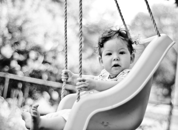
Settings: ISO 200, SS 1/1000, f/1.8


Overall the picture is pretty good. The background is blurred nicely and the child is engaged with the photographer. The only thing I could suggest is maybe a small amount of fill-flash to add some light in the eyes. Other than that great shot!
Thank you for the critique! Yes… you are right, the eyes are a little dark!!
What a sweet childhood picture! You did a great job on the B&W. The contrast looks great throughout. My suggestion would be that I would have included the bottom of the swing to improve the composition. Overall great job and wonderful clarity!
I love this shot! You did a grat job of capturing a fun moment. For some reason, the dark shadow at the top right is distracting to me. I think the shot would be great cropped differently- maybe less above the swing, more below it. Love the bokeah. Nice work!
*bokeh
Thank you for the critique… so funny how different people see different things- you are definitely right about that corner.
Cute shot and great moment captured! I always like catchlights (maybe if you’d taken the picture from the opposite side or wherever the sun was coming from), but understand that may not have worked with your surroundings. Her feet are just barely chopped, I would have liked to see all her feet and the bottom of the swing. Beautiful bokeh and a sweet picture.
Great picture, Ashlyn! First of all, thanks for letting us critique your photo! The exposure, contrast, focus, all look really good to me! I would have zoomed out/stepped back just a touch so that the bottom of her leg and the swing are in the frame and that she is more in line with the rule of thirds. The only other thing I would change is the dark spot in the top right corner, either by cropping or editing it out. I just find my eye being drawn there too much. I just have to say I am jealous of your black and white conversion! Did you do it yourself or is it a pre-bought preset/action?? Great job!
I Love that you are down to eye level with the subject , I also like that you chose black and white. I would have backed up a little bit to see more of those baby feet and engaged the baby a bit more …maybe get her smiling? I love the bokeh, action shots are tough but you did so good!
I really like how all of the different lines of the swing really capture her face. They frame her very well and draw the eye right to her face. One thing I would have changed is in the post-processing. There are some details lost in her hair (and a bit in the sky, too, but those don’t bother me). I would have lessened the contrast of the black and white on her hair to preserve those details, probably by putting a layer under the B&W filter to lighten just the hair with a layer mask. I probably also would have lightened her eyes just a tad. But overall, lovely picture!
What a great shot!! I love the expression of her face and the way to she is looking at the camera. The only thing I would change is to probably keep it in color, I love the effect the black and white gives, but I would love to see the vivid colors of the swing and the outside too! I love her little tiny feet and toes that you also captured in this photograph!!
Thank you all for your critiques, and thank you to Courtney for putting this photo up! I definitely appreciate it and love these Critiques Me’s!
What a great photo!!! Really, truely breathtaking! I love the bokeh! One thing I would have do differently is that I would include more of the swing at the bottom. Over all, this photo is, for sure, a keeper, Great job!
Love love the look on the babies face!! the only thing i don’t like would be the background seems a little too out of focus. i think the black and white effect really does work though with this picture. it make it more of a piece of art instead of a snap shot.
What a sweet picture. The baby face expression is priceless. Really great moment captured. The only thing I would want to change is to see more of the light in the baby’s eyes. You should have position her towards the source of light. And I would want to see the whole swing chair (not cropped like that) so this picture would look more professional .
I do agree with all the ideas you’ve presented in your post. They’re really convincing and will definitely work. Still, the posts are too short for starters. Could you please extend them a little from next time? Thanks for the post. IRRBUQJBKVFWMQJJTI