Remember:
–Read How to Critique a Photo
–Make a critique sandwich – something positive, something you would have done differently, something positive
–My rule: no improvement tip = deleted comment
–This will benefit the person leaving the critique just as much if not more than the person receiving the critique
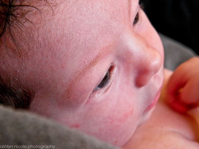
Thanks to Ashlyn at Discover Life for submitting the following image.


Great clarity! I would tone down the magenta in the skin tone, or the really red spots I would patch tool them out.
Love the angle! I would focus more on the center of the eye so the image has more depth. Depth seems to be good, just in a different focus length. :) Nice job!
Hi Ashlyn! I just took a look at your blog and you have a great eye for photography :) In this photo, I think I would have cropped by the rule of thirds to put more emphasis on the baby’s eyes. By that, I mean I would have moved the baby’s eyes more off center in the image to keep the eyes moving around the photo. I hope that makes sense! I really love the angle that you used! Great job!
I agree with Laurie completely! It is a great angle & I love the baby’s eyes open & staring off. I’d maybe smooth the skin with a LOW opacity & the clone tool or patch tool….boost midtones a bit & use CMYK to get the magenta out. Do you know about the CMYK method? I can send you an article link if not! It’s a beautiful picture :)