Remember:
–Read How to Critique a Photo
–Make a critique sandwich – something positive, something you would have done differently, something positive
–My rule: no improvement tip = deleted comment
–This will benefit the person leaving the photo critique just as much if not more than the person receiving the critique.
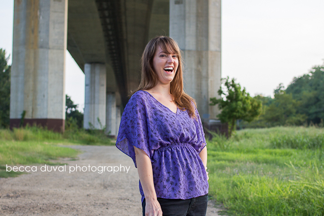
Thank you to Becca of Becca DuVal Photography for submitting the following image. Thanks as well to her model, Laura of Laura Karoline Photogprahy
Settings: f/2.8, SS 1/400, ISO 200


LOVE LOVE her smile! i maybe would have moved her more in the center of the building construction to frame her more. The colors are so bright and perfect! great photo!
I agree with the last review, love the facial expression. I might have taken a step back so that you didn’t cut the woman’s hand off at the fingers. What a unique place to take a photograph!
I love her expression in this photo, perfect! I would of centered her in the middle of the pillars to draw the eye in and turned the camera for a vertical shot. I love the pop of color in her shirt and green in the background, I think the two compliment each other well.
I think you captured her personality beautifully! I would have backed up just a bit to avoid cutting off her hand. (I am trying to be more aware of that, as it was one of my mistakes for a long time.) I think I may have moved her to the left a bit instead of centering her, and used a reflector to put a little more light on the shadowed side of her face. I really love the setting you chose.
I love the natural expression on her face! Great job catching an organic moment! I probably would have moved her over a bit so that more of the architecture of the bridge ( I think that is what it is ;) ) was in the picture and less of the brush on the side. I think that if she were centered in the center of those beams it would be beautiful and make for a very interesting picture. The lighting is fantastic and again, great shot of her having a great time!
I am in love with her expression, you can tell she was relaxed and having fun in the shoot! I would have probably centered her more between the two large pillars behind her, but I think the composition and lighting here is great. The sun kiss on her left cheek is perfect! For me, the expression alone draws your attention directly to her so no matter where she is standing the first thing I see is that bright smile! Awesome picture :)
I love this shot because her expression is so natural. I would have moved her either a little more left or right though. She seems to be a little too centered for my tastes. I also love that you used an overpass. I adore photos with a little juxtaposition in them!
The exposure is perfect on this one, and I love her authentic expression. I would love to see this as a vertical picture. I think it would really make her and the cool structure in the background work well together. That is a great location and I love the colors and depth of field. Great Job!
I love the way you have her positioned with the light. I would have moved her a little to her right, or moved myself so the bridge pillars created a frame around her. You caught a great, natural epression. Good job!
What a great expression and good timing on your part, I love that the background is slightly blurred good exposure. I too would have liked to see her a little to the left or right love the location nice mix of made made in the middle of nature. Great job!!!!!!
ooops man made
I love her expression. I think I would have used a wider aperture to blur out the background some and stepped back a bit to get her fingers in. The light is really nice too.
The subject has a nice bold color that contrast against the green grass very nicely. I think I may have also tried positioning the subject more on the left side of the bridge, which would also give her more “room to look” off to the right. I ‘d also cut off the sky and trees on the right side of the pic. The bridge provides some interesting leading lines.
I love laughter shots. They always cheer me up and put a smile on my face! I agree with the other commenters, that she should be more centered under the tracks so that the lines will draw the eye onto the subject. I also would shoot this vertically, which would naturally crop out the bushes on the side, and you’d be more likely to include her hand in the final version. A black and white conversion might also be interesting. Great job on the exposure – the sunlight frames her so nicely.
Love the expression, it just makes you want to smile. I may have moved over to the right about two steps so that you could get the bridge column in there and less of the brush. Great spot to take a photo!
Also love the expression but not so much the background or composition…Would had found a prettier background or used a shallower dof to blur it out…
I like the way her vibrant personality shines through in your photo. The color is nice and true, and I like the way her purple top gives a nice bit of color to the beige overpass. The purple also looks nice with the green grass. Good job. I would like to have seen the camera and the model positioned in such a way that the overpass framed her more. I also would have tried to frame it so that her fingers aren’t cut off–I’m guilty of cutting of limbs like that too–it’s an easy detail to miss in the excitement of taking pictures. I also agree that a vertical shot would have been a nice alternative. Thanks for sharing.
My first reaction was that this made me happy and I love the expression on her face and that it is fun and natural. My second reaction is that I would have edited it bit more. I like a bit more contrast, and I think that the cement bridge in the background lends to a “harder” looks, so I would have kicked up the contrast. Where as if it was just the tall grass (which I love and dream of) in the background, I would have created a more soft look.
I love the natural expression– it really lets her personality be the star of the photo. I think it’s a little distracting that the column comes right up out of her head, so I would have either moved myself or the model, or used a wider aperture to blur the background. Very pretty though, and nice light.
I love that her face has a light side and a dark side which adds dimension. The background is distracting as I am not sure if it is supposed to be an urban feel or a more natural/earthy feel. I would have moved her closer to the bridge, so the background was solely urban or completely into the grass. I would also have edited it a bit more adding warmth, a little more contrast, a closer crop (possibly vertical), etc.
Nice DOF and fun expression!!!
I LOVE this photo!!! Her expression is so cute! The only thing that I would change is either putting her in the center right under the bridge so that is frames her a bit more or coming closer to get less of the bridge. I l also love the light in this picture! Great job!
Great emotion! You really captured her fun personality! I agree with the others about placing her in a different area– it took me a long time to be aware of items “growing” out of people’s heads! Also, I might have warmed up the colors in post-processing, but that’s just me :). Last– what a great location! I love awesome, unique on-location places like that!
I love the relaxed, playful expression on her face and in her body language, and the lighting is great too. I might have moved myself a little left or right to place her in one of the thirds and the structure in the other instead of right behind her, but it’s a great location. :)
This photo makes me smile. Great expression capture. Using this image I would crop into the photo using 5×7 & rule of thirds placing your model’s smile in the middle of the second quadrant. Then tilt it a touch so her left hand that’s on her hip isn’t cut off and the right arm is not cropped on a joint. To my eye, this simplifies the scene and pronounces the leading line from the overpass to her. Love, love, love the vibrant model, color contrast & scene. This image just makes me feel happy.
I would have filled the frame with just her. Simplify, if it does not add to the story then get rid of it. The background does nothing for the shot, she looks out of place under a bridge or overpass or whatever it is. And last but not least the line coming out of her head is distracting. I was always told that if the shot isn’t good it because you aren’t close enough, get closer.
Love the capture of a natural smile or laughter! I maybe would have tried the photo in black and white to add more visual interest. I like how the subject is a little off center.
This is my first time doing this… so here we go. I LOVE her expression, you caught such a great natural moment. I love that is photography. I think this picture would be interesting vertical to play off the height of the bridge and to get her fingers in the picture. The location of your picture is so unique and the color of her shirt with the green grass play so well off each other. Great job!!!
I love this location and you picked a great time of day! You have so many opportunities for leading lines here!! Immediately I notice the path she is standing on. I want to see her more on that path and to camera left, so you would need to step back a little, eliminating the hand chop, creating a lovely leading line right to your subject, and placing your subject in the frame of the overpass…a win/win/win. I think the lighting here is lovely, but I want to see more of it. I think by repositioning her on the path and having you take a step to the camera right you would get just a little more light on her face without losing the lovely shadows. Lastly, shooting from below a subject is really cool for reducing background distraction but sometimes results in the subject having a double chin and you tend to lose catch lights. I think I would have stood up or tried to get a little hire than the subject to take the shot. If you wanted to eliminate background distraction, getting higher would have done the same thing as getting lower. I hope this helps.
oops…I meant higher…not hire. :o)