Remember:
–Read How to Critique a Photo
–Make a critique sandwich – something positive, something you would have done differently, something positive
–My rule: no improvement tip = deleted comment
–This will benefit the person leaving the critique just as much if not more than the person receiving the critique.
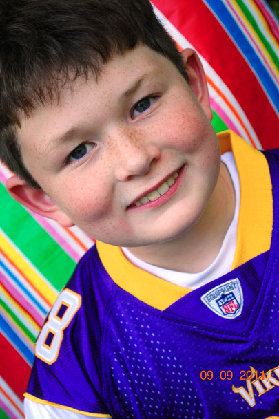
Thanks to Candy at My Balancing Act 101 for submitting the following image.
Settings: ISO 560, SS 1/100, f/5.6


Nice angle and overall a good shot, but I would make the background blurry so that it doesn’t distract attention away from the boy.
I love the vibrant colors and angle of your shot. You may open up your aperture to 2.2 to blur the background and let more light in. The boys personality seems to really shine through this shot!!
What a lovely shot! The expression on his face and the detail really makes the shot, I love the freckles :). The background seems to compete with the subject and the color of his shirt, but I love the lines. I think you could have blurred the background with a lower aperture number or you could make the background black and white with something like the adjustment brush in Lightroom. I might go with the second option to maintain the lines as I feel they add an anchor to the shot. Thank you for sharing such a great moment of his life that you captured!
LOVE those freckels! he is too cute! I agree with above, I would have opened up my aperture to blur the background, or even if you ahve photoshop to manually do it a little bit. Or I would do what Emily mentioned ( I tend to do this a lot) make the the background white or black, just to make the subject really pop. I also would use the adjustment brush and brighten up his eyes, you can see light in their, and lightening his eyes would really be stunning! The angle is very neat! Great shot!
I love the composition of the shot. I agree with others, setting it up to blur the background a tad would have made the boy stand out a big more. Opening up the aperture and distancing him from the background a tad would help with that. I love the bold colors and close up of the boy. Gives a great feel that you wouldn’t have gotten if you’d have zoomed out. Good job!
I LOVE how you cropped in tight on your subject’s face as well as the brilliant colors in the image. I feel like around the eyes are slightly too dark and my attention is drawn more toward the bottom of his face than his eyes so I might would have opened my aperature 1-2 stops more to let in a little more light. I think you did a great job of capturing his cute smile.
Sara
http://iamtheonewiththecamera.blogspot.com/
Thank you all for the kind words and wonderful suggestions! Thanks to Courtney for giving her time to maintain this awesome blog/learning forum. I have been practicing my composition and camera settings, but havevn’t braved the seemingly overwhelming world of editing more than to dip my toes (so far); this might be the push to dive in!
I bet this would make a really great black and white shot to take the focus away from the colors/shirt, etc. and focus on the adorable little boy!