Remember:
–Read How to Critique a Photo
–Make a critique sandwich – something positive, something you would have done differently, something positive
–My rule: no improvement tip = deleted comment
–This will benefit the person leaving the photo critique just as much if not more than the person receiving the critique.
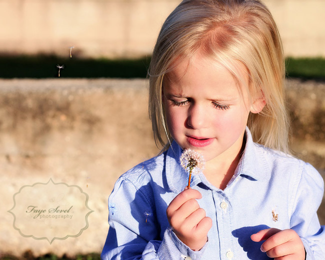
Thanks to Faye at Faye Sevel Photography for submitting the following image.
Settings: ISO- 200, f/5, SS 1/1600


Great capture of a classic moment. This has great feel to it!! I would include her whole left hand. It’s not that I don’t like the color but I’m not convinced that it adds to the image so I’d like to see what it looks like in black and white. I love the DoF and the bits of dandelion in the air. Great image!!
I love this! I always love images like this…images with kids that are just discovering something. The look on their faces is always so priceless. Next time maybe try to get a different angle so maybe the sun isn’t so blinding on her. And also get her whole hand. Although, I’m known to limb chop just to get the look on my kids faces or capture something they are doing. It’s a great image with what I assume are fun memories attached. :)
What a fun moment! Love the expression on her face.
I’d like to see the camera pulled back just a tiny bit so I can see more of her.
Such a classic moment to capture for a child. You are reminding me that I want to take this shot of my daughter and son! I love how some of the seeds are so clear and visible. I agree with another critique…it would be nice to see her hand. Great job..beautiful light.
I love the moment this captured, the pure, focused interest of a child. And since that’s not something you can pose or compose, you likely had to take the image as is – blinding sun included. Ideally you should spin around to be facing the sun so you can get a backlit shot (challenging in and of themselves!) and not have her squinting or have harsh shadows from the sun. Great warm tones as well — I really *feel* the sun!
I agree with everybody, the photo is beautiful, warm and priceless. I’d like to see the girl when she actually blows the dandelion, i think it would make the photo more dynamic. This way, it wouldn’t even matter that the girl has her eyes closed.
But i love that it has this natural feel to it. Great job, Faye!
I love dandelion photos! What a sweet moment. I personally would have faced her away from the sun so she isn’t squinting ,but otherwise – the photo is framed well!! :)
I love this picture because it captures the wonder of a child experiencing nature. I love that her eyes are closed because it shows her beautiful eyelashes. If I were to change anything I would like to see her whole hand like others have said and maybe add a little saturation to her blue shirt in editing to boost the color a bit.
Thank you so much everyone! Your critiques help so much! And thank you Click It Up a Notch!!!!
What a great moment to capture! I love that you put her off-center in the photo. It really helps to catch my attention and draw me in. I probably would have tried to find a softer light source though or used a diffuser so there aren’t as many harsh shadows on her face. Or maybe shot it later/earlier in the day. But I love the bokeh and your background. It’s nice and clean and doesn’t distract me from your subject! I love it!
Love this classic moment! Every child blows a dandelion at least once in their life. :) I may have not face her towards the sun as much, maybe have her back towards the sun. To me it’s kind of harsh on the skin & could have cut her squinting eyes down a bit. Other than that small thing, it still looks great! The skin tones are still good and not washed out or anything. Great job! :)
Aw! Love this! The clarity is outstanding! I would love to see this photo if she wasn’t facing the sun…That lighting seems a bit harsh. And maybe you could have tried to snap the photo when her lips were actually pushed out a bit more, like in a more emphasized blowing position. I’m stunned by the way the two little parts of dandelion are floating up on the left side of the photo! Well Done, Faye!! :)
What a sweet shot! The background is nearly as gorgeous in its blur as the clarity of the subject! Due to the brightness on the subject, I would love to see some of the red/pink desaturated and the brightness/highlights pulled back to give her skin a smoother, more creamy appearance. The focus is just perfect, and her eyelashes really stand out! Gorgeous!