Remember:
–Read How to Critique a Photo
–Make a critique sandwich – something positive, something you would have done differently, something positive
–My rule: no improvement tip = deleted comment
–This will benefit the person leaving the critique just as much if not more than the person receiving the critique.
Thank you to Ginger at My Life Just as it is for submitting the following image.
Settings: ISO 100, SS 1/100, f/5


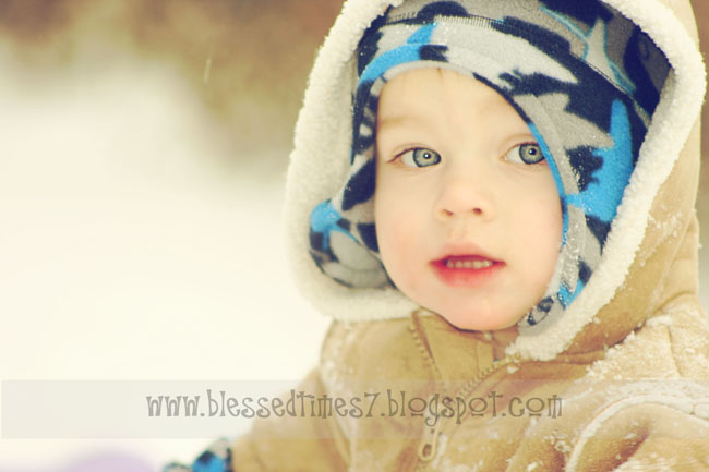
What a total cutie! I love the composition of the photo and the subject of the photo. The one thing that perhaps could improve this shot is if a flash wasn’t used. A flash will give the eyes that little pinlight. I’m guilty of it all the time! Beautiful capture!
The depth of field here assures that this little one is the focal point, however the face is a little softer than I like for such a close up. Perhaps just a touch more clarifying in the eyes to bring them out, and moving the face to the left side of the frame to open up what he’s looking at on that side. The color of the hat and coat really look nice with the blurred background here.
Wow, what an adorable subject you had, and I love the dof! My only suggestion would be to make sure the focus is on the eyes. Otherwise I love the shot!
This is a cute shot. I like the composition. The face has a soft focus. Would like to see the eyes sharper focused. Not sure what you did, but you could use a single focal point and place on the eye closest to the camera. You could turn off the flash and up the ISO for bringing in more light. He sure is a cutie and I also like the tones in the image.
I love the colors in the picture, very calming.
The only thing I would do different is focus. I would make sure the eyes are as sharp as it can be, but besides that I love it.
I love the tones in this shot. His face does seem to have a soft focus, but it almost looks like you came in post processing and tweaked the eyes. I could be wrong on that. But it makes the eyes look out of place because the lines of the nose are so soft and the eyes are so bold. I agree with the above comment about using a selective focus to focus on the closest eye. Great shot. The out of focus background is dreamy.
I love that cute little girl. She is undeniably adorable.
ah thanks..this made me giggle..it’s a boy =0)
What gorgeous picture with great colors! I feel like the face isn’t has sharp as the eyes, and would make the photo pop that much more. I would also not use a flash but instead open up to let in more light so that flash-back in the eyes wouldnt be there! Overall a great picture and one to be proud of, the colors and bokeh are amazing!
Beautiful photo, I love the snow detail on his coat. I would fade out or lighten the baby blue around his face, to help his eyes and features pop more. The blue on his hat stands out more than that previous face. This is a great portrait, you captured his eyes very well. (My biggest challenge is getting my kids to look at me with open eyes (: )
Cute baby! And those eyes, I envy those! :) The photo is perfectly shot. Good job!
I like the composition of this photo. The subject to the right draws the eye, and makes it interesting to watch. I also like the vintage style processing. The focus on the eyes is very slightly soft–looks like the focus was on the cap instead of the eyes, so the texture in the fleece is slightly sharper than the eyes are. Maybe for future reference you could try manually setting the focus point to the nearer eye. One other suggestions would be to try a fill flash or reflector to bring catch lights to the eyes. Catchlights would give the eyes a little extra sparkle.
Nice picture, and thanks for sharing!
you guys are awesome! thank you for helping me and taking the time to critique.. you all have been so helpful! Little ones are so hard to capture..he was standing about to run down a hill =0)
This photo is perfect, captures the young child playing in the snow, with it lightly sprinkled over his jacket. Little bit more of a focus to clear up face and eyes would make him stand out better. I like the background being blurred, it is a tad bit bright, but it definitely doesn’t compete with that adorable child. :)
Such a cute kiddo and great pic =) But, it looks like there is to much blur over the nose and mouth, I think that may have happened in post processing… Otherwise I love the bokeh and composition =)
I love the soft colors of this photo. I would’ve tried to make the eyes/face a little sharper. I Love the color of his eyes!
Gorgeous photo, he is placed well in the frame.
I think you should have focused on his eyes more to really draw your attention in.
I feel my eyes wonder around this too much and always end up at the blue at the bottom left of the frame maybe cropping this would have fixed that.
The brightness in the background seems to distract a little aswell, I have a feeling that this photo may have looked great in B&W, overall a cute photo :)
What a cutie!! Love the colors in the picture and how clear and bright his eyes are. I feel his face is a little over exposed, I can’t see a lot of detail.