Remember:
–Read How to Critique a Photo
–Make a critique sandwich – something positive, something you would have done differently, something positive
–My rule: no improvement tip = deleted comment
–This will benefit the person leaving the critique just as much if not more than the person receiving the critique
If you are ready to hear the good and not so good about your photos please read Submit Your Photo for Critique.
Thank you to Jessi at Life with Jack for submitting this week’s image.
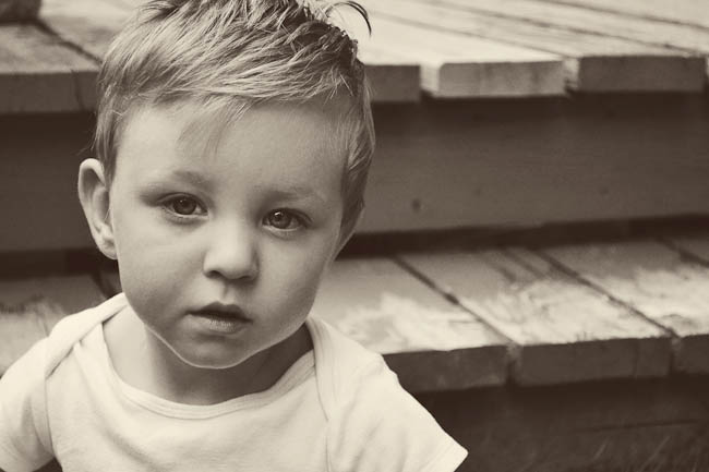
Settings: ISO 3200, SS 1/2000, f/5.6


This little boy is so cute! I love the color that was applied during post-processing. I would like to see just a bit more light reflected in his eyes. The eye on the left side of the photo does look a little dark and lacks a catchlight. Other than that, I love this photo and am a fan of the composition.
Love his “get on with it” look. I like his placement in the frame. I agree about the catchlights. The left eye is dark. If you could have gotten him to look up just a little you might have improved the catchlights. I don’t know if you were going for grainy look or not. I personally would have slowed the shutter speed so I could bring down the ISO to reduce the noise. But I guess that is kinda personal taste.
Way to go and get out there, Jessi! I love the light you caught and Jack’s expression. Might try a bit slower SS and lower ISO for smoother skin, unless grain is from post processing? I also LOVE his hair in this — if it’s cropped in you could go back a bit to get a more of the cuteness in there. Great composition, and nice background! Keep it up! Where’s that FB page? :)
I just love the strong eye contact he is making with the camera and his hair is too cute.
I like his off center placement, but since his shoulders are turned toward the camera’s left, I would have liked to have seen the negative space on the left side of the photo vs. the right. However, that may be a personal preference. I like for the body to be pointing into the negative space, because it leads me eye into the photo vs. out of the photo.
I also would like to see is whole head and all of that beautiful hair in the photo, along with a little more chest and both shoulders fully in the frame.
I would have also slowed the shutter speed down to between 160-300 which would allow you to drop your ISO down reducing the noise in the photo. An f-stop of about 2.0 would have made the background a little more blurry making that cute little face stand out all the more.
I really love the post-processing you applied here, as it compliments his serious look very well. It reminds me of a actor’s portrait back in the olden days where they wore plain white shirts, had gel in their hair, and that serious or maybe curious look on their face.
I love the composition of this shot and his placement in the frame. I do wish the exposure was a tad higher. I’d have brought down the ISO and slowed the shutter speed a bit. You could also open up the aperture a tad. I really like the post processing on it but wish the contrast was a bit stronger and his eyes showed a little more detail. Great expression and relationship with the lens.
What a beautiful photo! The expression is strong and really sets a mood. I also love the tones and how they add to the mood as well. I think the softness of the photo also adds to the overall effect, but I would have probably decreased the ISO and possibly increased the aperture to sharpen his face a bit. It looks like the left side of his face is a bit out of focus. I really like the way this image makes me want to know what is going on in his head at this moment. You did a wonderful job of capturing an essence of your subject. Thank you for sharing!
Great photo I just love photos that show a childs true emotions and not just a cheesy smile (even if that emotion appears to be get out of my face!) I think it might have been an improvement to pull back a little so as to not chop off the top of his hair and maybe turn him just slightly so that he is more in the light and so he doesn’t have such harsh shadows on his face. His eyes seem to sort of disappear into the shadows. I do love how his placement in the photo is to one side I think it adds a good dimension to the photo. I love black and whites a lot for portraits but I think going a shade or two lighter might have bee better for some of the details in the photo.
Overall a great photo of a super cute little boy!
This is a really great photo. I love the strong, natural expression. I love the off-center composition. I would love to see more brightness in the eyes and the left side is a tad dark. A little noise is present, but overall that doesn’t bother me much because it gives a little moodiness. I would pull back to not cut off the head. However, I really love the photo and you did a fine job.
LOVE this photo! I love his expression. I love the post processing! I would personally up the exposure a little bit, on the little boy. ( I tend to like slightly overexposed) I also agree with lightening up the eyes. I also might have moved a teeny step back to capture the top of his hair.
Jessi,
What a timeless image you captured! I love his natural look which is something hard to come by in photos of little ones sometimes.
I love the lines of the step! However, I would flip the image on the horizon. Do you have LR? If so, go up to the menu and choose “Photo” scroll down until you see “Flip Horizon”. This will put Jack on the right hand side of the image and the lines starting on the left leading to him. The reason I say this is because the viewers eye naturally starts on the left of the image and scrolls across to the right (like reading). When your leading lines are after your subject they loose some of their effect. I LOVE leading lines :O)
I would have asked him to turn his head a little more camera left so his eye (camera left) would have a little more catchlights. Other than that, the lighting is lovely. I like the soft shadows as it adds dimension and prevents his face from looking flat.
Are you using your kit lens? Does you lens go any wider? I would say you could shoot wider than f/5.6. Maybe try f/3.2 if your lens is capable. Also, your shutter speed is a bit high. I would have lowered that. For moving subjects I say don’t go below 1/125, some people say don’t go below 1/250 for kids. Either way, if you had lowered the shutter speed you could have lowered your ISO to around 800 which would help to prevent the grain/noise.
Overall, I think you did a fantastic job! Like I said, it’s timeless which is something I adore about images. Remember these are just our opinions and the ultimate goal is that your vision is shown in your image.
It a really great photo, and i love that is in black and white, but i would have taken thr photo as a portrait, because then u would have been ablr to capture his entire head and left out some disctracting background. The eyes r in good focus which is very important