Remember:
–Read How to Critique a Photo
–Make a critique sandwich – something positive, something you would have done differently, something positive
–My rule: no improvement tip = deleted comment
–This will benefit the person leaving the photo critique just as much if not more than the person receiving the critique.
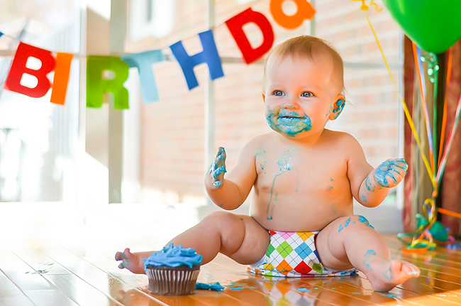
Thanks to Jessica at Jessica Faith Photography for submitting the following image.
Settings: ISO 400, f/2.2, SS 1/2000


This is a fabulous photo! I absolutely love everything about it including the blue frosting in the ear. :)
Perhaps the diaper is a little distracting and brings too much attention to an area that doesn’t need attention, but other than that, I would not have changed a thing!
Thank you Katy! I didn’t even think of that, but you’re so right, lol!
Very cute! I love how all of the elements in the photo are coordinated. What is throwing me off is the color of his face. It seems a little orange like it is picking up the color of something nearby. It’s still really cute and you nailed the focus, nice and sharp!
I can totally see that now! Thank you – might have to go back and cool his face down a bit in Lightroom. :)
I love this shot! The bright, bold colors are so fun! There is a bit of a color cast (I’m guessing from the table) on his face. While I really like the depth of field and the airiness of the shot, I do feel like the one side is a little blown out. But you don’t honestly notice because the little one is so stinkin’ cute! The composition is great that you fit so much of “the party” into the shot. Great job!
Great shot. Great composition – captured rule of thirds almost perfectly. Plenty of “look room” in the shot! Great color and not too saturated.
About the only thing I would have done / tried differently is to bring down the ISO to 200 and shot a little more open to defocus the background even further.
Overall, great shot.
Kudos from Detroit!
Ron
It’s hard to find something to change about this photo because it is so stinkin’ cute! I love the emotion and energy conveyed in the photo! The only thing I would have done differently is the placement of the cupcake. That far away from the baby, it looks obviously posed. Maybe a little closer so it could have been the actually cupcake the baby was “eating”. The catchlights in baby’s eyes and his expression are just perfect!
Well, I’ll tell ya!! I had to look long and hard on this picture to find anything wrong!! It is such a great picture. I love the bright bold colors and the adorable subject!! The only thing I could even think that could be tweaked a little ( which believe me, took a while to even find this ;) ), is maybe you could straighten the picture out just a tad. It looked like it was leaning ever so slightly. Again, I’m being super picky because this was so well done! Great job on the whole setup and what a great moment you captured :)
Aw, thanks Dawn!
I LOVE THIS SHOT!!! Catch light in the cutie’s eyes, sharp focus, vivid colors, fabulous framing… I had to start reading through the comments to even guess what could be better. The only thing I came up with is that the left side of the shot is a little blown out… maybe try to reduce highlights? But the rest of the shot is perfectly exposed. Your shot makes me want to snuggle and kiss this little one! After a bath, of course! ;)
Haha Thanks Sarah!! :D
I was afraid to lower highlights too much and darken things up but I can see where it can definitely use more editing!
How sweet! We didn’t do a cake smash with my oldest when he turned one and I always regretted it. I love the colors here! They are very bright and the editing is clean, which adds to the fun of the photo. The light is really good and you did a great job capturing enough elements to continue to give evidence that it’s a birthday. I agree with a previous commenter that maybe the diaper is a bit distracting. If you’d been against a solid white background or had completely blown out the background, I think it would have been a great addition, but there is a lot of color going on in the photo as is. And I think I would have liked to have seen the rest of the balloons. Overall a beautiful shot! Hope the birthday was fantastic!
I am not sure I would change a thing! I love love this! I love the fact that it’s not a typical studio setting it’s on their kitchen table and yet it works perfect I love the sign the balloons the icing the diaper cover his expression. maybe if he was looking directly at the camera but then again i like that he’s not looking right at it too. GREAT SHOOT!
I love the colors and the playfulness! I second the comment on the slight colorcast on the face. Love the composition with the birthday sign in the background.
I LOVE this photo! I love the diaper cover, the frosting (which matches his/her eye color), how baby reflects in the floor, baby’s chubs on their legs, the expression, the vividness of the picture, how the sign and balloons give the photo character but aren’t distracting from baby,
I love it.
If I had to give any feedback, I’d say the washed out area on the left is distracting, but I could live with it.
Good job!
This picture is awesome. You did a great job capturing that special moment. I love the composition and the bright bursts of colour. I’m not sure if there was an orange balloon close to baby but I see some colour cast off of his face. I would try to fix that. But great job! I love how the blue icing matches his eyes!
Oh my goodness! Cuteness overload! I adore babies eating their birthday cake- always makes for a good photo! If I had to offer suggestion, I’d say that his skin tone is a bit too red for me. I don’t know what editing software you use, but if it’s photoshop, you can use the eyedropper in “saturation” to pick a color from his face and desaturate it a bit.
Overall though, it’s a bright, colorful, fun photograph that captures the innocence of a baby!
I love love love the catchlights in muchkin’s eyes, and how fabulously you nailed the focus. I see how the diaper might be a bit distracting…but it’s so cute that I don’t think I can offer that as a criticism! If I were to change anything, I’d probably remove the cupcake – the amount of icing on the baby tells the viewer well enough what he’s been up to :)
Thanks Alexandra! The diaper went along with his “colors” birthday theme. Good thought on removing the cupcake, even if at least for a few shots… I’ll have to remember that next time!
So cute! Cake smashes are fun and I love the expression on the baby’s face. The only thing that stands out to me is it looks a little orange. But this is such a cute shot and a fun memory for the parents. Hope that baby got a bath :)
Love, Love, Love this picture! Love the diaper, love the colors, and love the cupcake… I have few observations to make after staring a this picture for at least 10 mins, and try to find things that I would have done differently. 1) The background where the balloon’s strings are is a little distracting to me; I would have tried to fade this area a bit. 2) I would have added a soft darken vignette to the overexposed area of the picture to bring some depth to it. 3) I would have adjusted his skin tone, just to mute the redness of some skin areas, as well as adding more light to shadowy areas such as the right leg, arms and neck. 4) I would have brighten his eye color a little more. This picture is adorable, there is nothing wrong, but I hope my observations help you see your picture from a different perspective.
The lighting in this picture is ABSOLUTELY AMAZING!!! I strive to get pictures of my kids like this and I have yet to succeed so I know what a challenge it is. I love the catchlights and the BEAUTIFUL colors oh I can’t stop Gushing!! Love the negative space in the photo. The only criticism I have is the blown areas on the right of the photo are a little distracting but could be lessened in post processing. I love love love the moment you captured here. Great Job!! I’m going to your website now…
Great photo, I love the bright colors and the sunlight. The only things I would change is I would have backed up a little to include the “Y” in birthday, and some more of the balloons, however that is just one of my little pet peeves. It is definitely a great picture of a sweet moment.
i love how the banner is blurred out in the background. and the colors are great!
I absolutely adore this picture. Your colors flow beautifully together. The photo is bright a cheery! Well done. My personal preference that i would have changed is have a matte floor instead of shiny.
What a cute cute image, I do wish you’d blocked the sun from the light with a sheer curtain as the highlights are a little distracting but it’s a pretty spot on image