Remember:
–Read How to Critique a Photo
–Make a critique sandwich – something positive, something you would have done differently, something positive
–My rule: no improvement tip = deleted comment
–This will benefit the person leaving the photo critique just as much if not more than the person receiving the critique.
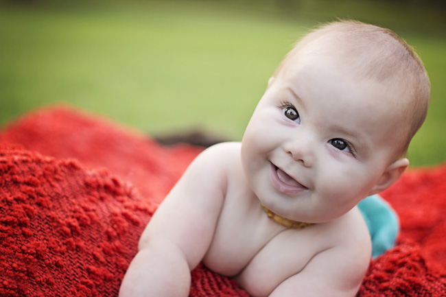
Thank you to Kacey Alchammat for submitting the following image.
Settings: f/2.2, SS 1/200, ISO 200


This photo is darn near perfect! I’m struggling to find anything to critique. Maybe remove the babies teething necklace or brighten up that left eye a bit? Otherwise, the bokeh is beautiful and the lighting and editing are spot on!! Great work :)
Those eyes are gorgeous, the way she caught the light is beautiful. I’m not a fan of the crop on the arms. Maybe pull back so we can see the hands or go in closer so it is just face….? The color is stunning.
The colors are perfect and photo is nice and sharp, great work!
Gorgeous baby! Really like the capture and edit, the only thing I would have done is pulled back a bit to include baby’s arms and hands or go in closer. Would be nice to see baby looking directly into camera, but I know that is not always easily achieved. Great job and lovely colours.
Wow! That really is a beautiful photo. The expression that you were able to catch was just priceless. From a technical standpoint the photo really is perfect. Its sharp, colors are great, skin looks pretty good. The only thing I would suggest is maybe watching the limb chop and framing a little differently. I would have loved to see her sweet little fingers. Really, though this is super tough to critique. Its such a sweet and endearing photo. You really nailed it! Great job! Great processing. :)
Great photo! I love the bright colours and bubs skin tone is perfect. I was a little put off by bubs amber necklace but everything else looks amazing.
What an adorable baby with beautiful eyes. Love the sharpness and twinkle in the baby’s eyes. I just wish I can see more of the baby’s arms and may be picture not tilted so much. I love the colors and skin tones. Overall a great capture!
What a priceless expression from an adorable baby!!! For that alone, this is a keeper! On my monitor, some of the red blanket looks blown … so watch for that. You also might dial back the opacity on the layer where you sharpened the eyes – they look a tad overdone to me. But I adore this image – from the rolls to the drool, it just screams happy baby! Great job!
Wow, this photo is hard to critique, because it’s so good! I love the soft tones and colors, as well as the blurred background. I would like to see more of her arms and hands. And, I KNOW it’s hard to work with babies, but if you could have got eye contact to the camera, that could have worked too. But overall, I’d say you’re a pro! ;)
I love the pop of red and blue…so the colors are perfect. Which means the white balance is right for that part of the photo. I feel a little like her skin could use maybe a little brightness and warmth. It is the problem of backlit photos. :) I think the parents will love that you captured such a genuine smile!
great picture, hard to find something to critique. Great positioning, colors, bokeh, gorgeous baby. Maybe I would desaturate the blue, becuase it kind of distracts from the baby. Besides that, great job!
I love this photo, and technically the color, clarity and composition are just about perfect! :) I might brighten the other eye a bit, take the spot of drool off the lip and clone out the brown at the edge of the blanket and the teething necklace, but I’m just nitpicking here. It’s fabulous!
This is a wonderful photograph! The colors are so rich and the I love how crisp everything is. I think that the baby’s expression is so adorable….kinda mischievous. :) The only thing I think I would do differently is pulled back a little so you could see his hands or more of his arms. Other than that, GORGEOUS!
What a sweet looking baby! I love the lighting in this photo so natural and perfect. The things I would suggest to improve would be: don’t tilt the picture, I feel like I need to catch the baby, it feels like they’re going to fall over, second, the necklace makes me feel like she’s choking, I know she’s not, there’s no way anyone would put a tight necklace on a baby, but it gives the appearance of too tight. Also it’s not very flattering the way her little chest is creasing in the middle, maybe waiting for her to move a little, posing her differently, or having a pretty shirt on her would have been better for this picture. But taken as a whole this is a gorgeous picture and the lighting is absolutely perfect, the catchlights in the eyes are beautiful as well. Great photo that I’m sure will be adored for years to come.
Love this photo! Perfect lighting. I like that your editing kept the photo “real”. For improvements…maybe remove the necklace around his neck & pull in closer or farther to avoid the “chopped” limbs. I love the color the bright red blanket adds!
What a happy baby! I love the expression and I must say that I love the blue diaper color with the reddish blanket!!! The crop on this one is a little awkward. Normally, I am not a huge stickler for not cutting off limbs but this one is bugging me a little. If the limbs were included, I bet there would be some interesting lines. Also, his/her face is all the way on the right. I understand why it needs to be that way because he/she is looking to the side so maybe again it comes down to needing to see more limbs. Also, I feel like his/her skin is a little muddy. Was a dark object or someone wearing dark clothes in front of the baby? I always try to wear white so I am a natural reflector. I am so jealous of the sharp eyes at F2.2 and only 200 SS. I am so shakey it is tough for me to ever achieve this. Nice work!!!
I absolutely LOVE the expression captured…I might have played around a bit with the cropping to avoid the limbs looking cut off at the joints….the colors are bright and LOVE the catchlights in the eyes….GREAT JOB!!!!
I am seriously having a difficult time finding anything to critique in this image! This baby is incredibly adorable- I just love that happy grin! I had to sit and study the image for awhile to find something, anything to say, and the only thing I could say is that I wish the crop was a bit different- either pulled back a little so we could see more of the baby’s arms, or cropped in closer to focus more on the expression. Overall though, it’s such a great image with wonderful color, depth and texture (especially in that gorgeous blanket!)
Love the colors & the great focus on the eyes!! I would remove the necklace, I find that distracting. I love the colors and the genuine expression you captured! Great Job!
EXCELLENT focus and depth of field! The only things I could possibly suggest would be to somehow get even just one hand in the picture. Maybe having someone run in and just fold one little arm across the other elbow or something so you can see a hand. But in reality, sometimes when we get a smile like that, we don’t have time to rearrange anything, and parents would rather see that smile than anything! Only other suggestion might be, if he is smiling at mom or someone off to the side, have them quickly come behind you over your shoulder, or otherwise position themselves closer to your lens so baby is looking in your direction. Really great photo! Love the smile you captured and the baby cleavage. :)
Love this sweet little lovey! The focus is impeccable! I was a little distracted by whatever is black/dark in the far back edge of the blanket – maybe edit that out? But otherwise, his chubb and smile stand out beautifully! Well done!
What a cute and adorable baby. I really love the bokeh in the background. Only change I would have liked is to not be cutting off the arms on the baby, but that is easier said then done. I am always cropping off body parts on accident. The eyes are very sharp. Love the picture, great job!
I love the composition, the angle, the bokeh, awesome focus on eye. I miss baby’s arms. It could be great if the baby looks the camera directly. The red color is a bit distracting to me. Overall great job.
I love that catchlights the focus and the expression that you captured. The red, green and blue colors really compliment each other. The light coming from the right side of her face is beautiful though it leaves a slight shadowing on the left which could be lightened with the use of a reflector, but when capturing a baby you could loose the moment trying to perfect the lighting. I think that this would be very capturing as a black and white photo. The brown in the background is a little distracting because I am not sure what it is. I know some people are bothered by the limb chop but i’m all about breaking the rules and if you had to crop in that close to get that expression and capture that moment I think the limb chop was worth it. Good photo.
I also love the baby’s look and smile and the colors are fantastic. Probably prefer to have that little necklace off the baby. The expression is priceless and I know how difficult it can be to catch it.
Wow! Amazing job!! I think the only thing that threw me was the necklace, but otherwise just awesome!
Great framing! You just got the right moment! I love the shallow depth of field, but I would close the lense down to f2.8 or even further to get the head sharp!
This is the sweetest! The only thing I might change would be to remove the teething ring but I understand when the shot is perfect sometimes you don’t have time to fix the little stuff.