Remember:
–Read How to Critique a Photo
–Make a critique sandwich – something positive, something you would have done differently, something positive
–My rule: no improvement tip = deleted comment
–This will benefit the person leaving the critique just as much if not more than the person receiving the critique.
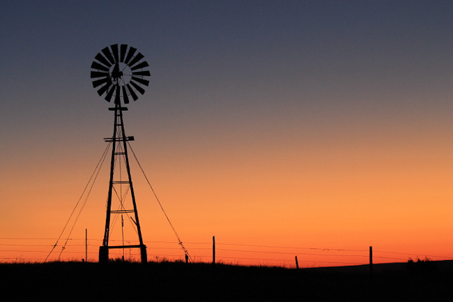
Thanks to Kay at A Ranch Mom for submitting the following image.
Settings: ISO 1000, SS 1/100, f/5.6
In case you are wondering how to submit an image of your own, I wanted to let you know I will be accepting entries again in several weeks. However, I am requiring that you have critiqued at least two images here in the “Critique Me” before you submit one of your own. I’ll keep you posted!


First of all, I love the color gradient of the sky! It really sets a tone for the image. The stark contrast of the wind mill against the sky also adds to the tone and feeling I get from this image.
In the lower right corner, the ground has another swell in it, however this seems a little odd to me, maybe because I’d like to just see the fence slide out of the picture. The hill seems very sharp in comparison to the rest of the ground because there is no grass on it. Perhaps if this hill matched the rest of the ground, especially the ground around the windmill it would seem to fit a little better.
I do love the sharp quality of the windmill creating a contrast to the soft grass silhouette beneath it.
I love the color! Such a smooth gradation and the orange at the horizon is perfect. The composition is great, too, but the windmill seems to be leaning a little. . . I might do a slight crop to straighten it. Your exposure was spot on for the sky and a silhouette! Nicely done!
This image has lovely color and composition! Well done! I do find thebottom right corner distracting with the bald hill, trees peeking slightly above the hill, and the sloping wires. I would love to see the wires straight to give a look of infinity, and continuity to the image. The windmill is also leaning slightly. Overall, this is lovely and has nice contrast.
Lovely colors indeed, how the black-blue-orange-white mixed into one perfect photograph, we can see the grass in the ground. Had to be taken by a really great camera, and of course, a great photographer.
I have to agree with Kim C. I love the color gradient and the placement of the windmill. Maybe cropping out the bald hill, just past the 3rd post so it wasn’t quite centered, and straightening the windmill slightly would do the trick. Love the exposure of the windmill, it’s a great contrast to the warm sky!
What a lovely sunset and silhouette, Kay! The color is beautiful and it looks like a painting. I love the mood you captured as well, peaceful and inspiring. I think the photo could use a bit more crispness in the blacks and colors. I might have used a lower ISO number around 800 or less and a higher aperture number of at least 9.0. I find that these work well for sunsets and maintain a large depth of field to bring more of the scene into focus. By doing this though, your shutter speed might be too slow requiring a tripod. I love all the lines in the photo and like that they are not perfect as it adds visual interest. Along with the color range and framing, the lines help to create a beautiful photo of what I am sure was an amazing moment. Thank you for sharing your photo and letting us learn with you!
I just read on your blog that this was a sunrise, which makes it even more impressive to me :).
This photo is lovely. I really like the leaning of the windmill with the lines for support. It has a story of strength and balance. I also like the imperfections of the hill and the fence. It is so organic and rustic. I agree with the suggestion of the higher f/stop and compensating your other settings for that. The only other thing I would like to see is that sun peeking over the hill in that dip. Maybe if you waited just a little longer you could have captured the rising sun.
Nice photo! I really like the color gradation from the warmth of the lower horizon to the relative coolness of the upper part. I also like the silhouette of the windmill. I would have liked to have seen a little more sharpness in the lines of the fence and the foreground, and more shadow detail in the grassy area. I agree with Emily that a smaller aperture than 5.6 would have let more of the scene be in sharper focus. The uneveness of the ground and the imperfect fence posts also add interest to the shot. Whew! Thanks for listening. This is my first critique.
I love this picture – the texture that the shadowed grasses/fence create against the soft sunset is great. I think if there was a little sharper focus everything would have perfect! As it is – it’s a beautiful shot and I love how the windmill is framed off to one side allowing the sunset to be a focal point as well and a storytelling point in the photo.
Thanks to everyone for all the helpful tips! I am so honored to be able to get helpful tips from you all. I feel like I have seen my photo through your eyes, and that is great. Thank you.