Remember:
–Read How to Critique a Photo
–Make a critique sandwich – something positive, something you would have done differently, something positive
–My rule: no improvement tip = deleted comment
–This will benefit the person leaving the critique just as much if not more than the person receiving the critique.
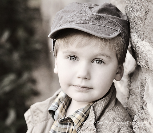
Thank you to Kim at Little by Little for sharing the following image.
Settings: ISO 400, SS 1/160, f/3.2


Ok, I honeslty really like this image so I’ll be anxious to see how others would change it. I like how the little boy fills the entire frame. And I like how the lighting hits his eyes. It makes his eyes seem like they reflect him. The only things I might change are I might have slightly more (like a 1/4 of inch) more empty space above his head. And his eyes seem like they could be slightly sharper. But like I said I really like this image. I really like the black and white conversion as well.
I wouldn’t change a thing, it’s beautiful! He fills the frame perfectly, his eyes grab you the first second you see the pic, love it!
Your comment is very kind. I challenge you to find one thing you would improve though. Part of the reason I host these weekly critiques if for the viewer to really challenge themselves on what they would improve. Would you change the composition? Processing? Angle? Crop? Not only will it help you figure out your own style but it will help Kim to hear other’s opinions. She may or may not agree with but it’s always nice to hear what other’s think. So, like I said my rule is to find at least one thing to improve or I may, dare I say it, have to delete the comment :O)
This is my first shot at feedback (gulp). I agree that his eyes catch the viewers attention immediately, and it is wonderful. My suggestion would be some stronger contrast between the lighter 3/4 of the background and the subjects clothes and hat. Along that thought, the very dark left side sets up a nice frame, and the right side rocks have some great texture. Does that make any sense?
He is an adorable subject. He seems to be a serious little man for his age. Cute!
Micele
Oh my word. I am in love with this picture…I think it may be one of my favorites ever! I love the sepia-ish wash, the colors are so clean. I love the catchlights in his eyes. I don’t know if you dressed him or not, but the outfit/hat is adorable and, from what I can tell, seem to suit his personality. I love the rock wall he’s leaning against as well as the out-of-focus tree on the left – both these things fit so well with the whole feel of the photo…the outfit, the coloring, the lighting, the backdrop all dovetail so well together. It is a challenge to find something to change. Even though I’m a sucker for shooting wide open (especially now that I got a new lens! Hooray!), it may do the photo good to click the f-stop up a notch or two so the rest of his face is in focus. On the other hand, I do think it brings out his eyes to have some of his face a little less crisp…so I think that’s a call you make based on personal preference. I think I’d also like to see a shot that’s REALLY pulled in to his beautiful little face, like even cutting off his chin and the top of his hat. I think that would really showcase those eyes. That kind of close shot might lose some of the cool ambiance you’ve got going (outfit/backdrop), but it’d be interesting to see. Finally, I love the half-smile that plays at his lips. It is so hard to get kids to smile for pictures, and this is a priceless expression.
Well done! I’m probably going to head over to your site and pin this one to my inspiration board on pinterest :)
So…Kim, could you provide the permalink to this photo on your site, if it’s up? I’d like to pin it from your site instead of a secondhand source so you get the credit (and the traffic!).
Thanks Courtney for hosting these critiques. I’m learning so much.
Kim was having trouble replying so she sent me an email with the link for you :O)
http://kimmyskids.wordpress.com/2011/10/19/jasper/
Wow, Kim this is just gorgeous and a hard one to give critique. I really love the composition and the soft shadows camera right. The catch lights are gorgeous and I love the textured wall he is leaning against. Where I like the sepia tons, I would love to see this processed as purely sepia or purely BW. The slight hints of color are a little distracting to me and take away from his clean, beautiful skin and eyes. If I am really digging for something, I would say bump up the f-stop so his full face is in focus. However, I really like the focus solely on the eyes and would have used a similar f-stop.
Absolutely stunning job!!!
First, I am new to this critiquing thing :-) so I will remember the sandwich…
I love how his eyes pop! I would have maybe left a little color in his eyes like in the shirt, to make them pop more! I love the angles and contrast!
Amazing shot. Love the angle, sparkly eyes, composition and sharp focus on his face. Really quite perfect. I think the only thing that I would change is maybe increase the blacks a little bit so there’s just a touch more of contrast. Super sweet picture!
I love love love this shot, really something I would do myself of my kiddos. the eyes are gorgeous and perfect and really it’s hard to pick something to change in the photo.
from a personal choice I may have allowed more color in the eye/edit, maybe increase the blacks just slightly but I would be afraid to loose some of the detail in the eyes from doing that. but this of course is being nit-picky. really lovely photo.
i’m in love with this photo..he is so cute and those eyes o my goodness! i think it’s pretty perfect. the one thing that i would have changed…..hmmmm it’s tough.. when i first look at this photo my eyes are drawn to teh color in his shirt and away from those beautiful eyes. not sure how you edited this one, but may instead of fading/taking away so much color from his face i would have left a little more color in his face! I had to dig deep for this one! beautiful job!
this is a great picture with a really cute kid, I really love so much about it. The coloring you choose for the picture ( I personally really like it, yes you could change it, but I also really like this one), how the eyes pop, He looks so natural yet he has a perfect lean on that wall that makes him look like a pro. The only thing I would like to see, is more of the picture on the left so he is set in a third of the picture. I think that it would add a lot to look at. Beautiful job.
This is a great shot… not much to critique in this one. The eyes are super sharp and I would have liked to see the beautiful colors of his eyes! Congratulations!