Remember:
–Read How to Critique a Photo
–Make a critique sandwich – something positive, something you would have done differently, something positive
–My rule: no improvement tip = deleted comment
–This will benefit the person leaving the photo critique just as much if not more than the person receiving the critique.
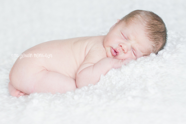
Thank you to Kristin of McGowan Monkey’s for submitting the following image.
Settings: f/2.8 SS 160 ISO 400


Honestly, I love this shot. Maybe tone down the color a little or not so pink. But even that I feel that I like in some sense. I love the depth that I see. and that it isn’t the normal straight forward shot. I am always trying to invent a new angle and that is what this does. I def love it!
Love it! Great Shot.
There is nothing better than a sleepy baby shot! I love the blanket’s texture. It’s a great contrast without taking over the subject. I would have loved to see the cropping pulled back a little. It seems a little too close to the baby’s bum. I’m very impressed with the skintone and smoothness you’ve achieved!
Hey! I think this an adorable image! I loooove the squishy face! Idk if it is my monitor but the contrast or shadows could have been bumped just a bit to bring out the texture in the blanket or sheet whatever the baby is laying on! But other than that, soooooooo cute!
Beautiful photograph!! The expression on the baby is priceless!! The only thing I might suggest is a different blanket to provide more contrast between the baby’s skin and the white of the blanket. But everything else looks amazing!! The focus is sharp, and again, the expressions is adorable!!!
I love this shot and the squishyness of the little face!!! Since the picture seems muted without a lot of color, I would have changed the picture to b&w. But I love the texture of the blanket too and he seems so comfortable :) which is important!
First of all good job on keeping this baby so cozy and sleepy. That was probably the hardest part! I love this baby’s skintone so soft and natural. I maybe would play with the contrast a little to bring out the texture of the blanket (not the baby though, the baby’s perfect). Overall this is a great pic. Newborns are tricky and you just made it look easy!
It’s hard to look at a pic of such a cute little baby and critique it. Great shot although the bottom and bottom right seem just a tad washed out. The only suggestion I would have is to put your watermark in a corner and with all the whites in the photo, change the text to a darker color. But the captured expression/pose is great and overall an awesome shot.
I love sleeping babies and you captures this moment very well. I may have angled the photo with the baby’s bum back a little farther and pulled back the cropping a little. Overall I love the look of this picture, this lovely little one looks so cozy!
I absolutely LOVE this photo and would hang it in a huge size in my living room if it were my child. The mom must have loved it! I have studied this photo for a little while trying to come up with a “critique” and have struggled to come up with one. I love the angle of the baby, the baby’s squishy face, the composition, the blurriness of the blanket. Love it! The only thing I would change possibly is that I would have cropped it just a little more. I would have taken off about 1/4 inch on the right side and a 1/4 inch on the bottom, but that is really just being picky!
What a beautiful shot of a beautiful baby! I love this shot. This photo works in everyway from lighting to composition to the way you’ve captured her beautiful skin tones, to the post-processing. Finding a critique here is a stretch, but here goes–I agree with Jawn’s observation about the watermark–the white type is difficult to see since the photo is so high key. I also would suggest making it a different color and putting it in a corner–pink would be a nice color for the font! As beautiful as the photo is in color, it would also make a lovely black and white one too. High key black and whites would also convey that lovely airy feel that works so well for this picture. Good job, and thanks for sharing!
SO sweet!! I absolutely love it. Honestly I have a hard time coming up with a critique. Maybe not such a close crop but that’s being nitpicky :) I would love to see this in black and white. Great image! I know the parents will treasure it.
I love this photo! The image is so crisp and sharp. The only thing I may have done differently is used a blanket with a bit more color for more contrast to baby’s light skin. I’m sure Mommy and Daddy are thrilled with this picture that captures their sweet baby looking so sweet and peaceful. Great job.