Remember:
–Read How to Critique a Photo
–Make a critique sandwich – something positive, something you would have done differently, something positive
–My rule: no improvement tip = deleted comment
–This will benefit the person leaving the photo critique just as much if not more than the person receiving the critique.
Thanks to Laura at Super Sweet Life for submitting the following image.
Settings: SS 1/125, f/2.5, ISO 100


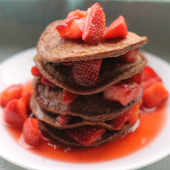
Photographing objects instead of people is sooooo out of my comfort zone but I love this! First of all, I haven’t had breakfast and it makes my mouth water. I like how the focal point shows the rich texture of the strawberry and the pancakes. But the wide aperture lets everything else blur away. Nice! The only improvement I can think of is that maybe that focal area is a bit dark. Possibly could have been tweaked a bit in editing?? But honestly, that is a stretch for me to find something “wrong” with it. Great job!
What a delicious image!! I’d like the photographer to back up just a SMIDGE so we can see a bit more. Otherwise, I love the height of the food and the focal blur around it. Mmm!
Okay, this looks seriously delicious! I really like the centered composition, it works very well here. I think backing up just a little bit might have been good, and perhaps getting a bit more light on what is the front of the image. It seems that the light is coming from above and maybe slightly behind the food, which makes the front of it seem a bit dark. I would suggest playing around with the angle of the light here. Oh, and include the recipe :) The way that you captured the different textures here is amazing, and I really like the use of the shallow depth of field. Beautiful!
This looks fantastic. The details in the first two layers are great. I really like the sharp focus on the second layer. The brownish, blue-grey background doesn’t do justice to this great photo. A sunny yellow or brighter blue color would really make this image pop.
First up, it makes my mouth water! The two things I would do would to lighten it up just a tad to make the strawberries really pop and maybe change the background color, is seems just a little dark. That said, I really love the composition and the blur in the background. (Now I need to go find some strawberries.)
This is a gorgeous dessert. The shallow depth of field is perfect and the layering of the cakes with soft curves adds texture. The centered composition works, but you might considering backing off a little to add some context for the photo – maybe a few stray berries in the background, a silver fork, or a simple napkin. I think a little light added to the front of the image would enhance an already lovely picture (a reflector would do the trick). I also agree that the grayish background doesn’t do the photo justice – a simple white tablecloth often works well. You might find this book helpful, Focus on Food Photography for Bloggers, by Matt Armendariz – great resource. Thanks for the inspiration and the chance to share in your work.
This looks delicious! I am not into food photography, but this is certainly a great image. The only thing I would change is that it looks a little too close and dominating for the space. I would just zoom out a bit, but overall I think lighting looks great.
I second everyone’s coments – the dish looks delicious and I really want to eat it! I would probably have backed up a little more & adjusted the light more to the front. I like vivid colors in my photos. ..perhaps changing to a brighter background would also lighten it u p. Overall it is a terrific photo!!
This looks yummy! Pictures like this should come with the recipe :). I like the composition, I think I would have shot this with a different color background, and I would have included the plate in order to showcase the food and create the wow factor. Also, I would have projected the light from different angles instead of just from above; this creates a shadow in the middle of the layers preventing the strawberries from standing out, specially the one in the middle of the picture. All these can be corrected with some photo editing as well. I encourage you keep up with the good work!
Honestly I think this is a pretty great photo, the only things I would change are: I would back up some, it’s a little too close up, this is one of those cases where a little background adds more to the picture. I would also have cloned out or just wiped off the seeds on the plate, looks a little messy with them on the plate. A little more lighting would have been nice as well.
Over all this is a great pic and it makes me hungry!
I like the angle of the picture. I try to get a different angle and it never comes out right. Great color. Maybe a little more light to the background (behind the food). Not much though. All in all i think its a great shot! Good Job!
Yumm! Love the colors in the image, I would back a little more and focus on the strawberries on top, but the angle is great and I love the blur.
I think this looks so delicious and I’d love to try to make it. My only suggestion would be to brighten up the middle part of the dessert so that the colours appear a bit brighter. Maybe a slightly higher ISO and shutter speed. The depth of field is perfect.
I like how this image reminds me that it’s lunch time and I’m starving! The photo is great in communicating the “scrumptious-ness” of the item. My only suggestion would be to increase the DOF a tiny bit , maybe by 2/3 of a stop. It seems the focus point is on the front of the top layer, so closing down a bit on the aperture would bring a bit more of the strawberries on top into focus. I’d suggest that rather than backing up from the item because your composition is perfect. The way you have the plate positioned within the frame makes it act as the perfect border. The eye is usually attracted to the brightest part of the image, which in this case is the plate, and because it’s circular, it contains the viewer within the frame and his or her eyes will always circle back to the main subject. A deliciously wonderful photo!