Remember:
–Read How to Critique a Photo
–Make a critique sandwich – something positive, something you would have done differently, something positive
–My rule: no improvement tip = deleted comment
–This will benefit the person leaving the photo critique just as much if not more than the person receiving the critique.
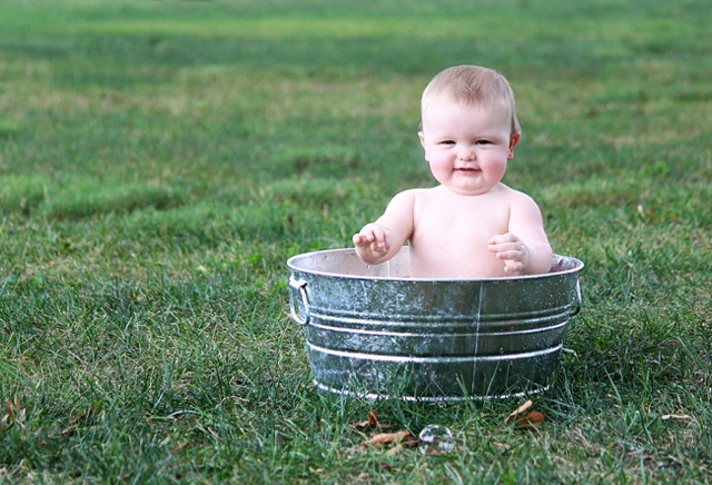
Thank you to Lynn of Lynn Guthrie Photography for submitting the following image.
Setting: ISO 100, SS 1/100, f/4.5


Love the chubs!! How could you not want to squeeze those cute cheeks?!? The first thing that I see that I would change is one lonely little bubble. I would have loved to see a bunch of bubbles floating around. Also, I like the confirmation of this photo. Very cute kiddo!
Thanks for sharing!!
I love the picture! You captured this sweet baby having a good time. I like the way you didn’t center him in the photo. I wonder how it would look if you were closer to the subject. I think the color looks good in the picture. Nice work!
Adorable! I just want to squeeze those cheeks! I was surprised that the ss was 1/100 because the subject looks to be in perfect focus! Maybe a tighter crop? I might move the leaves in front of the tub before the shot next time too. My eye is drawn to them for some reason. I love the staging and I think it is a great shot! Nice work!
I love the fun captured in this picture! I would take out the leaves, either before taking the shot or in post editing. I may also add some vibrance to the grass in editing. I love the composition in the shot. Beautiful! :)
Well it all depends on what the photographer had in mind when the photo was taken. Was this a parent having a bit of fun on a hot day and a way to cool the baby off or was this a planned photo shoot? Compared to the overall photo, I think the baby is a bit overexposed (lighting that is). I know this is a trend having overexposed photos but in this shot, just the child is, so that would need to be edited. Then if one is looking for opinions on setting up a shoot like this, I would have added a garden hose somewhat coiled up around the wash tub and it turned on with the nozzle sticking up so the spray of water is captured, maybe a box of suds, scrub brush and a rubber ducky placed near the tub and a wash cloth draped over the side of the tub. Then write something in the upper left area like “Rub-a-dub-dub” or something?
A setting like that would be cute for a child’s 1st Birthday invitation if they were having a rubber ducky theme party.
Precious baby and great photo! I like the composition of the photo and the focus is great. Here are a few tiny suggestions, but really this photo is wonderful! The tone of the photo is a little cool, so I would suggest trying out the custom white balance setting in your camera before beginning a photo shoot. As other’s suggested, I like the idea of more bubbles and I’d clear the area of distracting items like the leaves. The baby’s skin looks a little over exposed in spots so I would suggest using your camera’s light meter and set your exposure for the baby’s skin. Keep up the great work!
I’m just starting out as a photographer so I’m going to give it a shot on with input. The picture is super cute! It gave me ideas for my own photography. One thing that keeps grabbing my attention is the hair above the babies left ear. Maybe edit that or even try to tuck that back before taking a shot. Love the idea of more bubbles. Hadn’t thought of that until I read the other comments. One of the first things I thought when I saw the photo was how a colorful wash cloth would look. Even letting the baby play with it. And maybe just adding a little to the seen since there is so much space around the photo. Either try a closer crop/shot or put a stack of towels next to the tub with some soap and a cloth flung over the side of the tub. Hope that helps! You did a great job and I love the concept.
Hi Lynn,
What a cute shot! I think I would crop it a little closer and a little more off center (so that sweet babe is a little more to the right of the frame. I do think you nailed the skin tone! It looks very realistic and not pale or “plasticky”..
Kellie
There’s very little visual interest in the grass, so I think if you decide to crop it you should play around with a vertical orientation. If that cutie makes up the bottom 2/3 of the picture I think it would make a strong composition. I’d warm it up a tiny bit, and you’re good to go! You should be proud to have captured such a sweet picture of this kid :)
I love this photo! This chunky little baby reminds me of how chunky my little one once was. The only thing that jumps out at me is the one lone bubble. I think there should be more or none at all. It kinda looks weird there all by itself. Other than that, for me, this image is fabulous!
What a fun moment! The overall focus and idea is great! I would love to see it warmed up a little bit color-wise, especially with that chunky little baby. I prefer warmer photos in general, but definitely with kids. In addition, as others have mentioned, the skin on the baby is a little overexposed, which ends up making him/her look very flat against the background rather than three dimensional. You might try opening up your aperture (setting it to a lower number) to give a blurrier depth of field OR closing it up some (higher number) and then you’d be able to raise your shutter speed a bit. Overall, fun shot; great job.
You did an excellent job with keeping the baby slightly off center in the shot! What a cutie! My recommendation would be an even tighter crop, just to keep the baby as the main focus (it would remove the distraction of the leaves/bubble in front too) and maybe bump up the midtones a bit in post processing. Your focus looks spot on, which isn’t always easy with quick moving kiddos.
I’m loving these comments- isn’t it amazing that you can look at the same picture 50 million times and never see what someone else sees?! Here’s a question for everyone- when you shoot on location, by yourself, how do you handle all the props that you may want to bring, especially if you are going to be moving around a lot? Please keep the comments coming- I’m learning a LOT!!!! Thanks to everyone, especially Courtney for letting me “have a shot”, pardon the pun!
Adorable picture, Lynn! Thanks for being brave to let us critique it :) First of all I love the set up, but I would like to see lots of sudsy bubbles in the tub with him (not necessarily bubbles floating around like someone else mentioned). I would have tried to get lower to the ground to get some of the sky in the shot behind him so that you have a little more visual interest other than all the grass. The baby’s skin does look overexposed and on the cool side to me. This would also look awesome in black and white! Great job!
What a great photo! Babe looks like he or she is having a lot of fun :)
To answer your question about props, I often shoot by myself, but the parents are more than willing to help out if I need it! Otherwise if you have an older child they can come with to help too. My daughter loves to come along and help out and she started tagging along when she was 4!!! She’e really good at getting the subject to smile and giggle as well as move props for me if I need help :)
For the photo above I would suggest:
**either use a shallow tub so you can fill it up with bubbles and have some spilling over or put the babe up on towel covered blocks, again so he could sit in it but still have some water and bubbles spilling over the top
**I’d also have some more bubbles on the grass. Those bubble guns in the toy ilse are awesome!!!
**It looks like there are some hot spots on his skin. Maybe use a reflector to shade him?
**rotate the babe around a bit so his eyes have more light in them or use a reflector to reflect some light back in them. Otherwise shoot from above so he’s looking at the sky–that might get more light in them :)
You did great!
What a cute composition for this shot! I love the tub, that he is off center, and that he looks engaged in something. For me, the one thing that I would like to see in this picture is to adjust the overexposure of the baby’s skin. The way his skin is reflecting on the inside of the tub keeps grabbing my eye. Other than that, maybe just some additional props as previous posts mentioned (garden hose, more bubbles), but nothing to much because I think the simplicity goes a long way in this image. I really like the color of the grass in this photo. Paired with the tub and happy baby, it definitely makes for a clean feeling!
What I like most about this photograph is the way you have captured the baby’s personality. If I could offer a little advice it would be that the temperature needs to be a little warmer overall. The tones are a little flat and if you worked on it in Photoshop for just a bit that would really make it pop! I do love your use of bokeh in the photograph; it helps you focus on the baby.
Cute expression and setup, good using the rule of thirds. I would suggest increasing the warmth in your photo. The babies skin looks really cool (or whitish blue). Next time you could set your white balance setting to shade if you are in a similar setting, or you can add warmth in post processing. Cute photo!
Beautiful capture, composition & baby! I think the exposure on chubs is a bit bright. The leaves at the bottom of the tub are distracting (perhaps clone them out, in the future maybe brush ’em away b4 you snap?). I love the babe in the tub, outside & can’t believe how awesome the capture is @ 1/100! Great Job!
I adore baby pics. And this one is awesome all by itself. If I were to change it up at all I might or might not crop it down just a bit to the left. Possibly angling the shot more from the left would allow for less exposure. It never hurts to have extra props around just to see what works best. I will usually do a variety of shots with the same theme. This would make an excellent canvas.
The wash basin prop is a really cute idea for an infant shot. Nice use of natural lighting–no stark shadows on baby’s face. I think cropping it a bit to focus more on the baby might make this photo pop! I might also remove the leaves in front of the wash basin. Very cute pic.
Oh, what a cutie pie!
It’s a great shot, but I think I would like to see this one of two ways.
Either you could move him/her more down to the extreme lower right corner and play with some really great negative space, or you could crop it in and get a tighter shot. I think, if I had to choose, I’d prefer the latter (the tighter/cropped shot). I also think it’d be great to bring in some more contrast to make it pop. This would be a fun photo to saturate – not overly saturate to the point where it will be overwhelming and distracting, just enough to bring out some of the green tones in the grass. I’m a newbie with photography so I’m not sure I’m quite qualified to give sound advice and I’m sure my opinions will change, but that’s what I would do to improve the shot.
It’s an overall great photo, though! I love the intimate feeling and that he’s/she’s posed without it looking forced or OVERLY posed.
It doesn’t hurt that he’s/she’s adorable, either. :)
That looks similar to my own shower my family and i got a hold of recently,
incredibly happy about it for someone on the fence about purchasing one,
do it, you wont be sorry