Remember:
–Read How to Critique a Photo
–Make a critique sandwich – something positive, something you would have done differently, something positive
–My rule: no improvement tip = deleted comment
–This will benefit the person leaving the critique just as much if not more than the person receiving the critique.
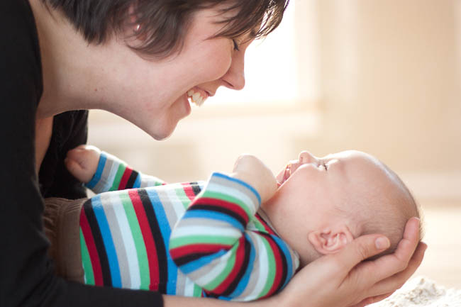
Thank you to Martha at This is Our Gypsy Camp for submitting the following image.
Settings: ISO 400, f/1.8, SS 1/160


Being a new father, there’s nothing like saving the memory like the fleeting moment I see here. As far as a small changes are concerned, there seems to be an abundance of backlight, which causes that beautiful boy’s head to reflect too much light and get washed out. Also, a bit faster shutter speed might freeze things a little bit better.
As far as composition is concerned, I would never change a thing. You two look so happy. Great family!
I love the angle and the backlight that the window (maybe door?) is giving behind. It seems to be a tad bit blurry and out of focus, possibly due to a slower shutter speed? Not sure. Maybe even it was on manual focus and didn’t hit the right area. I am sure once the blur is fixed, it would be a stunning image. I just can’t get past the fact that nothing is sharp for my eye to draw in to. However, I love love the smiles and laughter, truely a perfect capture!
Beautiful composition! I love the back lighting coming though between mom and babe., I think I would have processed a little different maybe with a softer haze to bring out that back lighting, and not quite cut moms arm off so much at the bottom. A gorgeous image and beautiful moment caught. Natural beautiful expressions :)
This is a wonderful moment to catch! I agree with a lot of what has been said already. The composition is wonderful — I really appreciate your use of negative space. As for improvements, I would agree that I would like to see a little more focus so that there is one sharp point to draw your eye. I personally would have really liked to see the baby’s face in super sharp focus (they’re so wiggly, though, I know!). The backlight is beautiful, but I also agree that it’s a bit bright on the baby’s face. Overall, though, very beautiful. I love how in the moment and seemingly unposed it is.
Such a sweet moment! I love how both of them are smiling and giggling! Definitely a happy and priceless moment. :) I do believe that the backlight is a little bit too bright, but it works well! Maybe bump the exposure down a notch or two in your editing, at least in the background. It’s also a little bothersome to me that the top part of mom’s head is cut off. It’s not a huge deal, but I feel like it’s missing something without it. Great job capturing that moment! Wonderful photo!
I really like the emotion in this image. For me, the crop is just a little tight, but the composition is lovely…I am a fan of some negative space. Thanks for sharing!
Question for above photo: How about changing this beautiful photo into black and white and filtering it through with some soft layers in lightroom or photoshop?
I really love these types of photos. As a mom, that’s exactly what I look for in my pictures. Capturing light for me is still new, but it becomes I think harder since I have mostly (South Florida) sunlight all the time outdoors, my problem is the shadow at times in my subjects faces. I still can’t have the nerve to put up my newbie pictures for fear of getting too harsh a critique. So far your forum is so critique friendly and I have learned so much in 2 weeks time without breaking the bank account with classes. God bless you. =)
Great capture! I love your aperture choice – it blurs that neutral background to allow the focus to be solely on the subjects. I also love the natural lighting, although like many here, I would play it down a bit, as it seems to have created an overexposure in your shot. Maybe play with editing software – increase saturation or shadows? Otherwise, wonderful composition and the colors on the little one’s shirt are a great mix. I DO love the idea of the b&w image too though! Decisions, decisions … =)
This picture has wonderful composition! I love the backlight and the smiles on both faces. I also think that there seems to be a lack of focal point. This is also something I run into often:/ I would also do some post processing and darken the darks a smidge, and bump up the saturation and contrast a tad. Over all, this picture is great. Nice job!
That’s so cute! You’ve really captured the moment! The photo really speaks so much.. Thanks for sharing!
My favorite images of families are the ones that capture a moment and evoke a feeling. This photo does both of those things! Martha, I love how you were able to capture the joy between a mother and baby. You can see that they only have eyes for each other in this moment and that is a beautiful thing. In terms of improvement I feel that some of the photo lacks focus and I would like to see all of mom and baby’s face in focus. I might have used a larger aperture number to get sharper focus on both subjects. I also would like to see more of mom’s head and arm. With such a tight crop there is a feeling of intimacy which I like, but at the same time I feel as though my eye keeps coming back to the things are cut off. As I said, I really love the moment you have captured. I also love the light coming through in the back. I love the softness of it and the effect that gives the photo as a whole. I also think it makes you feel like you are watching a real moment. Thank you for sharing your photo Martha and for letting us learn and grow with you!
aaww i am crazy about this capture! what a beautiful moment :) i am a sucker for backlight too. sorry dont have too much to add…
I really like the connection between mother and baby. I think that the tight crop enhances the capture of that moment in time, I wouldn’t change a thing about the compostion either. The light on the baby’s face is just a tad bright, but not distractingly so. I like Jacqueline’s suggestion of trying a version of the image in black and white, which would be lovely too.
Nice photo, and thanks for sharing!
I love this picture. It seems like they were both laughing with such abundance they were closing their eyes. Unless the mother’s eyes are open and it is just hard to see. So, it makes it quite different without the mother or child’s eyes being visible. Mainly, a moment in laughter, that can never be recaptured! :) I like how more of the infant is in the frame than the mother. The faces seem a little soft focused, and I am not sure if that is due to the bright lights in the background making it appear that way on their faces. Either way, the mothers hands seem the most focused part. I like the angle of the mother, I just wish I could see more of the baby face, so it doesn’t look as if his part of his cheek is a bump coming out of his mouth. All in all, it is perfect because it captures a mother and childs bond and love!
I love the lighting in this picture and the creamy yellow color gives more to the happy cheery feel! I would have tried to use a faster SS to reduce the blur and maybe pulled back a little bit so that Mom’s arm and top of Mom’s head weren’t chopped. The expressions on Mom’s and Baby’s face are wonderful! Such a sweet tender moment.
I love family photos, especially when they involve precious babies like this one! I would possibly do some vignetting on the image to focus more on the baby, and the smile of the mother as I feel that is the most important part of the picture. The light in the background is great, but it almost seems too bright and almost matches with the skin tone of the mother and baby, so possibly turning down the exposure would help bring the mother and baby more to the front. Great picture overall. There’s nothing like a baby being able to express themselves, it brings so much joy! Can’t wait to have little ones of my own someday. :)
Happy Shooting!
I love this photo. So precious. I don’t know what I would change. I guess I’d like to see more of the babies face. They are just so adorable. The light is wonderful. I was drawn to the colors in the babies outfit… Very bright while the rest of the photo had more muted colors. Wonderful photo. A treasured precious moment.
love. this. capture.
It is so natural and wonderful and intimate.
The llack of sharp focus doesn’t other me in the least because the whole essence of this photo (both in light and in emotion) is one od softness.
The only thing that is a tad distracting to me are the colors on the baby’s shirt. They are so bod and bright and are in sharp contrast visually to the rest of the picture. As was mentioned by a commenter above, I would love to see this in Black and White. It would focus the eye on the emotion , rather than the color.
This is so worth printed large. What a wonderful image to hang in a nursery.
Perhaps, aldo add (dare I say it???) a light haze layer to further emphasize the softness.
Please forgive the spelling errors in my post above.
*Hang head in shame*
: )
Heehee I’ve made my share of typos–I understood you just fine ;-)
beautiful! is this a selfie? i know trying to capture selfies with my little guy is so fun! i love how you captured his sweet sweet smile as he laughs with his mama :). i think it is an excellent image! it took me a while to be super picky and figure out some feedback to share. my best ideas are to slightly straighten the horizon, soften the skin a bit, and perhaps a bit of contrast would make it even stronger. i love the way you frame the baby with your arm. if this is a selfie i know it is nearly impossible to get the composition the way you want it, but i think it would be ideal to capture a bit more of your arm on the bottom of the frame.
great job!! :)
It’s not a selfie–this is my sister and nephew. I wish I could take a selfie this decent!
Thanks so much for the input, everyone! This was really helpful!
Beautiful photo, such a precious moment. It seems a tad blurry, maybe would have used a faster shutter speed. And with the baby’s face is a tad blown out. Beautiful emotion and precious memories.
Great job by the way ;-)
I think it is a great picture, althought it does seem a bit out of foucus. I think it would be nice to see more of each ones face. Does seem to be alittle out of foucus. But its a great picture. Mom seems so happy.