Remember:
–Read How to Critique a Photo
–Make a critique sandwich – something positive, something you would have done differently, something positive
–My rule: no improvement tip = deleted comment
–This will benefit the person leaving the critique just as much if not more than the person receiving the critique
If you are ready to hear the good and not so good about your photos please read Submit Your Photo for Critique.
Thank you to Mary Beaty for submitting the following image.
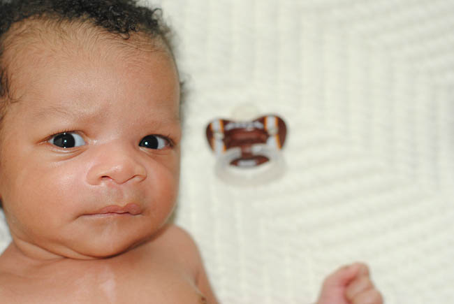
Settings: ISO 800, F/3.2, SS 1/200


What a cutie! Great expression you’ve captured.
I’d probably clone out the dummy as I find it too distracting, but I think the focus is great on the eyes :) Well Done
Such a cute expression! Absolutely adorable little one! I think I would have included more of his head instead of such a close crop. The focus is really good, though! Great job!
His expression made me giggle! I agree, good focus on his eyes. I think that I would back up a little, so that his whole arm and the side of his head are included. The creamy comforter is a nice compliment to his skin tones.
The quizzical expression communicates so much, wonderful job capturing that. Having just part of his hand is a bit distracting. I would have either removed it entirely from the photo by going closer or pulling back and getting his whole arm and his ear. I think the second option might fill up the frame a bit more and add to the composition. The contrast of the blanket with his skin tone is very nice and I think the pacifier helps tell a story about why he has that expression :). Thank you for sharing!
Great shot! Lovely focus on the eyes and the expression is priceless! I think I would have tried to pull back a little to get more of his head and arm/hand in the photo and maybe get rid of the paci since it is a little distracting. The skin tone is perfect and over all it is a great photo of such a cute little one!
Nice focus on the eyes of this cutie!!
The paci is distracting and pulls my eye away from his sweet baby face. I also agree that having the whole hand in the photo or completely cropped out would strengthen the photo. I would also love to see his right ear in the photo.
Did you use an on camera flash? If so, I would try this shot with him positioned close to a window or door, so that you can use natural light (no flash). This would add more dimension to his face; therefore drawing the viewer’s eye to focus more on his individual features. The current light is flat and washes him out a bit.
I think the cream background is great for a newborn and I like the negative space you used.
Mary, he’s adorable!!
I like his inquisitive look! My guess is he was sucking on that pacifier and then it fell out in some images. If you have time in a shoot, I would just throw that out of the frame so it isn’t distraction. You did a great job removing all other distractions though by putting him on that solid colored blanket. Good call! As far as the crop goes, in the future I would try to include all of his head, however, depending on what lens you have that may be hard if you are taking an image above him. For this one, I would crop in a little tighter to crop out his hand that is trying to creep into the picture. I agree with Amber and if at all possible, I would position him by some natural light, a window or door next time. Natural light adds some nice soft shadows. I like that you took this image above him to show how little they are and the cute little details of babies! Thanks for sharing!
Remember, these are just our opinions. You want to make sure your vision shines through in your image.
What a cutie! I’d get rid of the pacifier and probably crop it differently. But his little face is so crisp and I think the blanket was a good choice of backdrop. Thanks for sharing!
I love that expression. You captured it beautifully! I agree about removing the pacifier and backing off just a bit to get some more of his head and an ear. Your background choice is great also. Love the negative space in the photo! Great job.