Remember:
–Read How to Critique a Photo
–Make a critique sandwich – something positive, something you would have done differently, something positive
–My rule: no improvement tip = deleted comment
–This will benefit the person leaving the photo critique just as much if not more than the person receiving the critique.
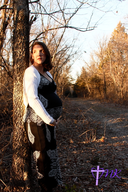
Thank you to Melissa at Creations Captured by MK for submitting the following image which is a self portrait.
Settings: ISO 200, SS 1/60, f/6.7


I like the pose. I wish the background was a bit out of focus and also may be turn your face a bit and use fill light so you don’t get the harsh shadows on the face. Beautiful location.
Great job using the rule-of-thirds to add visual interest to this image. The “golden hour” light – while beautiful – is dappled and very distracting, though; it makes her face too bright and squinty and her beautiful belly too dark, almost so much so that you barely notice it. Next time try moving her into full open shade to get more consistent lighting while still getting catchlights in her eyes. Beautiful location and love the neutral brown-to-cream tones throughout the entire frame.
I love the composition of the photograph! I think I would change the location of where she is standing, as its casting a shadow across her face. I love that she chose what appears to be late in the day, with the warm glow from the sun.
Beautiful belly mama! You look amazing! I love the composition of this photo with the line of the path on the right of the photo. I would have worked with the lighting a little better and watched the shadows on the face and other parts of the body and put more focus on the belly with a pop of color in the clothing. Again, congratulations on the pregnancy. You’re a beautiful mama!
*blush* -thanks. =)
This is a LOVELY image! I would have moved her slightly more to her left, around the tree towards the shade a bit more, so that her face wasn’t as well lit by the sun. I love the warm trees and the pathway in the photo, but I may have saturated the sky a bit more (mostly because that’s my style, not because there’s anything wrong with the sky as-is). Good Job!
I like the serious expression on her face. We don’t always need big cheesy grins on our models! :) I would turn her body a little more towards camera (about a 45 degree angle). Be careful too, about cropping the body at the joints. I would include her feet in the picture and a little more ground. I would also either keep her in complete shade or put her fully in sunlight. The mottling from the sun/shade on her face may not be the most flattering light. I like the framing of the tree branch over her head.
First of all…great self portrait. they are so tough to get the shot you want when you are on the other end of things. Everything is in focus and that’s half the battle. I agree with the other ladies, the light on your face is kinda harsh and dappled. It distracts me a little. Other than that , I love the leading lines of the road and the how the tree you are leaning on frames that side of the picture. You look like a very happy momma.
That is some fabulous composition! I couldn’t have framed it better if I had tried! :) I definitely agree with the other posters, that the contrast in lighting is really harsh from one side of the face to the other. You could shift so that the light is more even, or what I occasionally (not always) do is to add a fill flash with my speedlight — I have a diffuser cap on it so that it’s not harsh. This could help smooth out the contrast. I’d also recommend a more wide open aperture to create more background blur on the path (or just blur it out in post-processing, hehe). Other than that, this is a beautiful shot!
I like the composure and love the lines drawing your eye down the road (i.e. to the future). This works great, given that it’s a maternity shot. The shadows on your face are very distracting. I understand it’s difficult to have known this though, since it was a self-portrait. I would have opened up the aperture more. I love the lighting on the right side of the path (it’s got more of a golden glow). I probably would have stood on that side to help eliminate shadows and give more of a warm glow.
I love the pose and what a beautiful baby bump! I wish the background had a bit more blur and was brighter but what a gorgeous self portrait!!
I like the composition; the line of trees on the right and the path give a lot of perspective and are well placed.
I don’t like the shadows that are cast over the models face and belly, both from the direction of the sun as it croses her body and the branches of the trees. I would like to see this same photo taken again with either some fill flash, or a reflective surface placed to the right of the photo to bounce some light back into the frame.
I like the facial expression and the gaze. They give a feeling of emotional depth.
I love the way she is posed and her facial expression leads me to wonder what thoughts she has about becoming a new mother….I might have tried the image in black and white and moved more towards the road and looked down to avoid harsh light on the face…the road is a great way to tell a story of the road ahead…good luck mama!!!
I love the expression on your face while holding the baby. I feel like there are too many splotchy shadows on your face–perhaps turning the head more would fix that. I like the path in the picture because it gives my eyes somewhere to go!
I like the pose and the lighting. The branches behind the mom are a bit distracting. Maybe a shot from a distance would help here. The lighting on her face is nice.
This is a beautiful pose, and I love that she is looking away from the camera. One thing I would do differently is put her in open shade, so the light on her face is not as harsh. Other than that, it’s a great photograph. Including the pathway in the image was a great idea :)
What a great self portrait, and a great moment in time to capture. I agree with the other posts that the lighting is distracting in this picture. I would have tried maybe a different position or angle to get the shot. That being said I do love the compostion though.
I personally like how the shadows and sunlight fall on your face–I think it frames your eyes nicely. I also like the touch of bright white from your sweater–I think it helps draw the eyes to you
I would like to see the sunlight kissing that adorable baby bump instead of the bump blending into the background. The overall feel of this photo to me seems sad–there is no smile in your eyes, the trees have no leaves, and the bump is away from the light. I think re-positioning the bump to be kissed in the sunlight would change the tone of the photo to be one of hope (as in, the hope of springtime after winter, which would go nicely with the surroundings of this photo).
However, even with that said, I think this is an adorable self-portrait of a momma-to-be. Congrats on the baby! :-)
Nice composition. The trees frame the subject nicely. I would have liked for her face to not be so full of bright light and shadow. It’s hard to see her face. Maybe have her turn more of her face towards the sun, or experiment with backlighting.