Remember:
–Read How to Critique a Photo
–Make a critique sandwich – something positive, something you would have done differently, something positive
–My rule: no improvement tip = deleted comment
–This will benefit the person leaving the photo critique just as much if not more than the person receiving the critique.
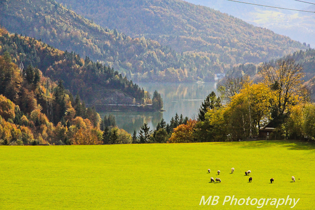
Thank you to Monica at Adventures of M-Squared for submitting the following image.
Settings: f/10, ss 1/2500, ISO 2500


I LOVE the composition of this picture – it is absolutely picturesque. The only thing I can find to improve upon is it looks a little over saturated to me. But like I said – picturesque! I love the mountains in the background, the water and the beautiful field with the sheep.
Thank you! I don’t think I edited the saturation on this picture at all, but I honestly can’t remember. Normally I just run an HDR type preset in Lightroom on my landscapes, but I agree, it does look neon-ish green. =)
I love your composition with the sheep and that you followed the rule of thirds. I find the neon hue to the grass a little distracting as well as the powerlines through the top right corner. The powerlines are a simple fix but I’m not sure how to go about changing the grass. I do love love love the depth you caught with the layers of the hills and river though! You were able to capture some lovely natural haze that gives the effect of chiaroscuro like in renaissance paintings.
I agree about the power lines, and if I was better at Lightroom I would try to edit them out, but all of my cloning looks pretty horrible at this point so I just left them in. Thanks for the critique!
I love the depth of field, and my eyes are drawn to the center lake and beautiful trees, in this very beutiful nature photo the grass looks a little not natural- but great photo, little sheep in the forground give it a great sense of how big the rolling fields of trees around the lake are!
It was a BEAUTIFUL area near Salzburg, Austria. I went and took pictures of that lake closer up on our way home and they were amazing too. I’ve decided that the fall is my favorite time of year to travel because of the amazing colors!! Thanks for the critique!
I love landscapes and would love to have been here. I like the composition as well. I didn’t notice the green until it was pointed out in the comments but I will agree that it does seem a little unnatural. It might be more effective to decrease the saturation but to bump the contrast a bit. Would love to see more depth of colors in the trees in the foreground. My initial reaction was that it feels like it’s tilted a little bit, like it might help to rotate the image counterclockwise just a smidge so that the line of the grass leads your eye into the image. I think this is really pretty and love the feeling of serenity it gives you, I like how your eye travels to follow the water.
Your ISO and shutter speed seem to be at high settings, just curious at why? I have trouble with noise when my ISO numbers start getting over 800. I think you could lower your shutter speed too, it doesn’t appear anything was moving (unless there was wind?) and not have to have your ISO so high.
I was taking pictures out of a moving car window, although my husband stopped for me to take this photo. We were driving through a fairly wooded area on a gravel road, which is why I had the ISO and SS so high. I just didn’t adjust my settings accordingly. I’m not sure how it would have turned out – if you could have seen the far distance as well – with a lower ISO and SS. I didn’t notice the tilt before, but I do see what you’re saying now. Thanks for the tips! I’m still pretty new to this!
I think this is a beautiful picture. The sheep tell you how big everything really is, they give perspective. I do think that a more narrow strip of grass would be better; now there is too much green for me. I love how your eyes get drawn to the middele of the picture where the water is. And how yor eyes go search the way the water goes…
The electricity wires distract a bit, but they were there, so I wouldn’t ‘shop them away’.
The sharpness is just right: sharp in the front untill about the middle and then fading away.
I hope you understand everything I am saying, because I am Dutch and finding the right words in English to say exactly what I mean is a little hard.
Thanks Brigit! I understand what you’re saying! Your English is much better than my Dutch, so no worries! =)