Remember:
–Read How to Critique a Photo
–Make a critique sandwich – something positive, something you would have done differently, something positive
–My rule: no improvement tip = deleted comment
–This will benefit the person leaving the critique just as much if not more than the person receiving the critique
If you are ready to hear the good and not so good about your photos please read Submit Your Photo for Critique.
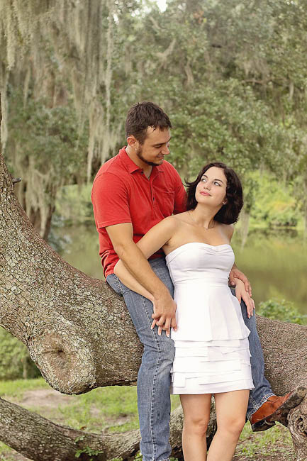
Thanks Selena for submitting the below photo!


I love their interaction. You can feel the emotions between them. Next time I would be careful to not chop his foot off or crop in a lot more. Love the location and placement of subjects.
What a sweet intimate scene. I think I would have used the rule of thirds and placed them farther to the left of the scene so the line of the tree could lead you through the photo. The DOF and the sharpness of the photo really makes them pop against the background
Wow..I too LOVE their expressions-it draws you in to the moment. If you follow the rule of thirds i’d be sure to get as much as that tree in as I could…it adds so much character. I wouldn’t chop their feet off though. The colors, surroundings and crispness of the photo are perfect.
This is lovely! Beautiful girl, beautiful location! To avoid limb chop, I would either zoom out or zoom in (to above her knees maybe?). I would also either center the couple in the frame or move them up and to the left. I might also play with saturating the greens in the background just a tad. The expression on her face is priceless–cute, clever, and intriguing. Nice capture!
Agreeing with everyone; I think that you captured a wonderful moment. Love it.
I love everything about it; the lighting is soft and there are no glares.
All I would have done is not chop off her feet. That’s about it.
Just love this!
Love the softness; I would have filled more of the frame with the couple. The main focus should be the couple and their expression. Would have liked to see a little more of his expression. Beautiful setting.
This really is one of those photos that tells a story. It seems like they have some secret they are sharing and you were able to capture and communicate that with your photo. I think I would have taken a step or two back and framed the photo so you see his other foot and her feet as well as get a bit more of the trees at the top. I really like the softness and color of the lighting on the subjects. I think that the trees in the background need a bit of cooling to bring out more of the green. I love the line of the tree branch and the depth of field. Beautiful work and a photo I am sure these two will treasure forever. Thank you for sharing!
What a beautiful couple to photograph! I like your use of the tree and the lines to use a prop.
I agree, I would have taken a step back to prevent from chopping off his foot. It also looks like her dress is blown. This is super hard when someone wears white for photos. White is so easy to blow. Maybe you could try and dodge just her dress to bring back some of the details.
You captured such a sweet moment and it feels very natural. Great job on having them keep all their limbs bent to prevent it from looking to posed and stiff.
The image looks nice and sharp with a great DOF. Thanks for submitting the image. Remember these are just critiques and the main purpose is that your vision shines through. Thanks!