Remember:
–Read How to Critique a Photo
–Make a critique sandwich – something positive, something you would have done differently, something positive
–My rule: no improvement tip = deleted comment
–This will benefit the person leaving the photo critique just as much if not more than the person receiving the critique.
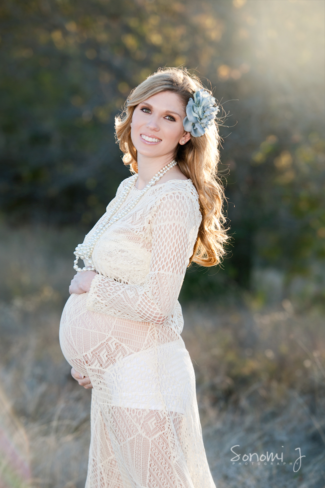
Thank you to Sonomi at Sonomi J Photography for submitting the following imaage.
Settings: SS 1/250 ISO 200 f/4


Such a beautiful image!!! Your use of backlight is perfect, and it makes her hair look like gold! Honestly, the only thing I could suggest is composition-wise. Rule of thirds is always my go to rule, and it’s the easiest! Maybe turning this into a horizontal, cropping midthigh so that the focus is the belly, yet adding more of that golden light in the image. But that’s only if you had another image with more background in it. You did a great job on this image, and it’s really hard to find something that I would fix – I love it as is!
The back lighting really brings out the gold in her hair, and gives this image a great quality. You may be able to do some post-processing to add some warmth into the background – also, the hand above her belly is a little “cool” Just some little tweaks in your editing program, but other than that, I’m sure your client will cherish this image – so sweet!
I love the sunflare, it really ” makes” the picture. The only thing I can think of to improve would be to warm it a little ( just a personal preference). Beautiful picture, great sharpness & bokeh!
So beautiful! Love her outfit and you nailed exposure with gorgeous skin tones. I might have tried to touch up some fly-away hairs? I do love the sun in her hair!
dang! Hard to add to perfection!
First I love her skin tone and amazing eye contact. Such a sweet capture and so well done!
I might love it even more (is that possible) if her belly was more centered and or there more negative space to the left of the model.
But really, this is very nice! No need to change a darn thing.
I LOVE this image! The only thing I would do is warm it up ever so slightly. Otherwise it’s such a great picture and the lighting is magnificent!
I love her facial expression, and her styling fits with the style of the photo. The backlight on her hair is beautiful, and just right–no blown highlights! The lens flare is just right too–very subtle. It is beautiful in color, but I think it would also be nice in black and white. This picture works in so many ways. Thanks for sharing!
Wow!!! I love this image!! The mama is so gorgeous, you would be hard pressed to take a “bad” photo of her!! I would just warm up her hands. They look blue to me and clone out the fly away fiber from behind her bum. I really love the outfit she has on too!! :)
This is a wonderful picture!! It’s really hard to come up with a critique when it is so great. Feels like we are picking at it :) I agree with some of the other posts on warming the image up a little but that is preference more than anything. There is the fiber showing on her bottom but that is an easy fix. You might change the composition some as the photo is really long and unless it was printed in a very large print then it might not have the same impact. Focusing more on her belly would give it more impact as a pregnancy photo. Overall wonderful job!!
This image is beautiful!! I love her natural smile and pose! I would have warmed the image up a bit in post processing, but the back lighting is great, I love the way it hits her hair! Nice job!!
I honestly have to say that I had to think long and hard to think of a critique for this photograph! This is such a stunning image of a stunning woman, I absolutely love the position you placed her in! If I had to critique anything, I would say I would like to have seen her placed a little bit more to the right of the frame so that there was some negative space in front of her. But like I said, it was hard to find fault in this picture – the backlighting and bokeh is absolute perfection!
Such a beautiful image!
The back lighting is just lovely.
I agree with everyone, such a hard one to critique!
A little more space to the left of the image would be good and I would love to see a little more warmth.
The little hair at her backside caught my attention too so I would clean that up.
Over all it is just a stunning image though and I am sure it is loved by your client.
This picture is so beautiful! I love the backlighting. I have been really practicing with backlighting and you really nailed it beautifully. It’s really hard to find anything wrong with this picture. The one thing my eye is drawn to is how her shirt puckers out at her back a little behind her elbow. Her dress and flower compliment your setting so well. Looks great!