Remember:
–Read How to Critique a Photo
–Make a critique sandwich – something positive, something you would had done differently, something positive
–My rule – no improvement tip = deleted comment
–This will benefit the person leaving the critique just as much if not more than the person receiving the critique
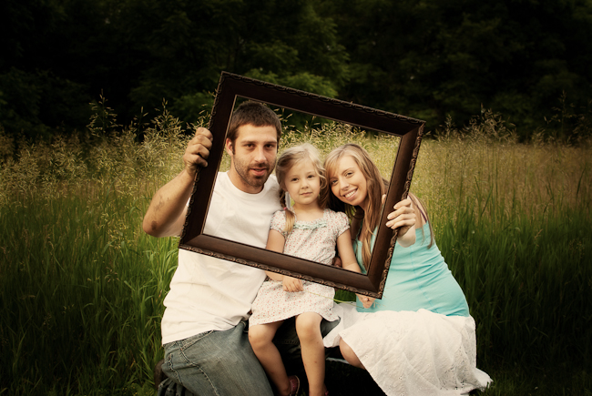
Thank you Tara @ Tugboat Photography for submitting the following photo.
ISO 100, SS 1/80, f/3.5 – 35mm
If you are ready to hear the good and not so good about your photos please read Submit Your Photo for Critique.


I love this idea of using an empty frame to FRAME the peoples’ faces! I wonder if the focus is too much on the frame and not the faces and that it looks a smidge dark. I love the scenery and the pose and the idea of using that frame!
I also love the use of the frame in this shot. I wonder if filling the frame (of your photo) more with your framed faces would make a more dramatic statement. I also love the field as a backdrop. It is so breezy and natural.
I like the use of the picture frame and think this is a fun family shot. However, the picture frame seems slightly sharper than the faces and I might crop in just a little tighter. I love the setting and the colors.
This is my first time doing a critique, so…
I Love the idea of using the frame and also how you broke the rule and placed the subject in the center of the shot. I believe that either the picture is underexposure or it has too much vignette.
I love the use of the frame and the fact that it’s tilted a bit :) The little girls foot is chopped off so I would have either taken a step back or came in a lot tighter on the subjects. Love the field with the tall grass growing up over their heads! BTW, I end up chopping a limb off too often, something I need to work on!!
Great critiques! Love them! It really opens my eyes to see different things! Thanks guys!
I really enjoy the use of props in a photo (when appropriate) and this is no different. I think the angle adds character to the photo; however, I would have liked for the frame to be a little higher and shifted camera left, so the father’s head was not cut. A closer crop would have also drawn my eye to their faces more easily. The photo is a little blurry which is probably due to the SS. If you up the SS to 160 or more that will decrease the blur. I really like the vignette and the warm of colors of the field, but I think the photo could be a little brighter overall.
Overall, this is a super cute shot that I would love to have of my family.
Tara, I LOVE the frame in this shot!! This is definitely on my list of things to try and I think you nailed it! I love that the frame is turned a little on it’s side. It adds a little more to the image. Like mentioned above, watch out for chopping limbs at the joint (daughter’s ankle) It is something I still struggle with an am constantly telling myself to step back. You could just do a tighter crop to make it not so awkward. I’m a lover a vignetting but I think it’s a little heavy in this image. Since you have the frame I don’t even know if you need the vignetting to draw the viewers eye in. However, if you do want to add it, I would add until you can see it. I try to stop as soon as I can notice it. The dad and daughter look a little uncomfortable. This is so hard when working with clients. I know sometimes showing dad what the image looks like on the LCD can help him get an idea of what’s going on in my crazy head so he isn’t wondering “Why am I holding this frame?” :O) As far as your settings go, I would have upped your ISO to about 400 so you could increase your SS to at least 1/125 and maybe even close down your aperture to f/4. Mom and daughter are really sharp but dad doesn’t look as sharp. I am in LOVE with this location!! Can I come shoot with you there?? Seriously!! Wonderful eye!! This would always be an amazing shot for some warm backlight and hazy photos! Yum!! Is mom pregnant?? Since you had a frame it would be fun if you had her stand up and you only got her thighs to the top of her belly and had her hold the frame horizontally around her belly. Do you know what I mean? Oh, you could have some fun with that!! I know this is a photo the family will cherish!! Wonderful job!! Remember, it’s your vision that is most important and needs to shine though so read our critiques with that in mind :O) Thanks for submitting a photo!!
Thanks so much! LOVE your comments!! and I couldn’t agree with you all more! I totally see what you all are saying and some things I missed! I really appreciate the SS, ISO, aperture suggestions too! I definitely struggle with changing my settings often enough!