Remember:
–Read How to Critique a Photo
–Make a critique sandwich – something positive, something you would have done differently, something positive
–My rule: no improvement tip = deleted comment
–This will benefit the person leaving the critique just as much if not more than the person receiving the critique.
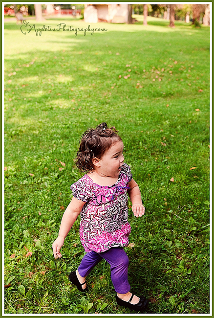
Thanks to Tiffany at Appletini Photography for submitting the following image.
Settings: ISO 200, f/2.8, SS 1/800


I really love the colors in this photo…and I think the expression you captured on her face is wonderful. Maybe try to get down a little lower…a little closer to your subject’s eye-level…(I know that’s not always easy when your subject is on the move…).
I also like that your subject is right out in front and the background extends out behind her…darling photo!
I really like the vibrant colors in this photograph!!! The only thing I would probably change is the angle. Get down on her level and start snapping away. I know that isn’t always easy when the kids come running right passed you. The expression on her face is great! She’s obviously excited about something!
I would agree with both Maggie and Mama Monkey, the colors are wonderful and the expression of the girl is face is pretty engaging.
I know how difficult it is to take pictures of your kids when they are excited, but getting to their level and using nature, objects, toys or shadows to create leading lines towards your subject or towards the direction they are moving will help in the composition of the picture.
Love the sharpness you were able to achieve with “baby on the run”. Keep on shooting ;)
Editing and color are great! I think the only thing I would have done differently is get a more direct face shot. Toddler are so hard when they’re running around. Try making a scrunchy monster over your lens or a hat on your head, or wear a mark, or put a pez thingy where your flash goes and give out candy or fruit snacks for smiles! Otherwise great photo! Have fun chasing!!!
I like everything about this photo but I would have cropped out the building in the background. They are distracting for me. I love the colors!!!
Thank you all for the critiques and kind words! And Courtney, thank you so much for posting my image and having this segment on your blog, it really helps me to grow as an artist! Your blog is one of the best resources a growing studio could ask for!
You captured the action of a busy toddler very well and like the others, I love her purple outfit against the green. I’d suggest cropping the photo to eliminate the buildings at the top and also a little from the left so that she’s not centered in the shot but appears to have more room to “run out” of the photo. Your focus is excellent so her little face is sharp and crisp – hard to do with moving toddlers!
I just wanted to say I love how you used a higher angle to eliminate a distracting park background. I also like the used of empty space at the top of the photo and the texture of the grass. I agree with Terrie, I think I would like to see her cropped more to the left so she has more room to run on the right. I think if her body was on the left third line it would feel more comfortable to me. My eye also wants just a little more room by her feet so we really see those sweet shoes.
She’s adorable… the colors are fantastic, I agree its a few tweaks to the composition and this shot would be spot on. Dropped down a little to give her feet a few more inches of green. This would drop the buildings out without a crop, also having her off to the left more. Running room! Must be tough to catch her!!