Remember:
–Read How to Critique a Photo
–Make a critique sandwich – something positive, something you would have done differently, something positive
–My rule: no improvement tip = deleted comment
–This will benefit the person leaving the photo critique just as much if not more than the person receiving the critique.
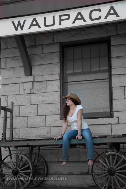
Thank you to Tina for submitting the following image.
Settings: SS 1/80, f/5.6, ISO 400


love the emotions captured in this picture. i would level it out so that the angle is not distracting. great setting.
Thank you…great eye, appeciate the comment
The Location,prop, model all are good… But I have used them a bit differently….
I should have opted for two pics to represent the whole scene instead of just one pic
1. The upper portion with “WAUPACA” & the background bricks(which looks good) & so have took a shot in which would have cut the image right below the knees along with the plank…. & would have experimented a little with bokeh…
2. A picture of Cart Along with the legs & hands… from a different angle… maybe from near the right wheel…
To give the image a new perspective… from near the right wheel from a lower position so as to establish a impact on wheels & hands at same time…
& the center positioning of the model Doesn’t suits much… maybe would have changed that too.. ( or maybe not)… :-)
Thank you…interesting idea, but I was “taught” to not cut off at a joint/extremity, thank you for your perspective on this!
I really like the feeling you captured here with her cowgirl attitude and the old wagon. I would have liked to see her sitting a little more to the right to use the frame of the window to frame her. I find the frame part running through her head a little distracting. I love that you included her bare feet in the picture. I think it adds more to the overall story of this photo.
Thank you…you are right, I could have stepped to the left or shifted her
I really like the feel for this picture. I would have chosen either the sign or the cart as my emphasis though. I think both of them together is overwhelming. I really like the laid back feel of it though :)
Thank you…I wanted to capture the entire sign as that is the hometown of this senior and tried different approaches for both her and the sign…thank you for your comments, much appreciated!
I love the lady on the wagon and the setting. I am a little distracted with the blue color still left on the wagon between/around her legs. Was the wagon blue to begin with? If it was, I would have loved to have seen the color of it. I do really like the overall mood of the picture.
Love the rustic surroundings and how they give an “old” feel to the image. However, the selective coloring throws me off – I’d love to see it in pure B&W. Great use of the location and posing to evoke emotion!
Great photo, love the expression!
I would warm the photo up a little bit and perhaps added a little light. I like the overall frame of the photo though- very nice!
I really like the location with the wagon and the texture of the background. I would have stepped back to get more of the location/background in the frame. I really think the wagon could tell more of a story with how she is dressed! She looks so comfortable & relax in the photo too :) Nice job!
Very cool setting! Was there some kind of color conversion done on part of the pic? It might just be the colors of the scene but it almost seems like everything was converted to black and white except the girl and the small part of the wagon where she is sitting. It distracted me a little. Great shot overall. Looks like a movie set!
I love the feel of this image, the model and the location. I think it’s a little too desaturated. I would like to see it in full color or in black and white. I think it would make a great black and white image! There is a bit of color on the wagon and a “halo” of color on the screen behind her head. Personally, I would have left the sign out entirely (cropped closer) but that may be a personal preference. Overall, good feel to the image and the location looks fun! It gives a good mood.
I do have this with my personal portfolio in B&W as I LOVE B&W photo’s…the family of the this senior wanted me to do this with ALOT of her photo’s….and, I gave them what they wanted…thanks for the comments and yes, after you pointed that out…there is a halo, yikes!
I’m sure the family was happy with the images, as they should be. It is a nice photo and captures her personality well!
I like the idea of this photo shoot. The wagon, cowgirl and “Waupaca” sign are interesting, and I like the position of her head, legs and torso as it leans forward a tiny bit. **1. Move her a little more to HER left; 2. Move her left hand away from between her legs (crotch), and bend her left arm at the joint. Possibly give her a prop to hold; 3. Keep her left arm from pressing up against her torso; 4. Change the horizon by either backing up and shooting the location straight on to get more of the wagon, building and sign in the photo OR maybe by moving more to YOUR right to get a more creative angle with the background blurred; 5. Edit the photo either all in color with a little bit of a warmer skin tone or all in black and white. No selective color!** Again, I like the location of the picture. It has a lot of interesting elements – the wagon, sign, and shoeless cowgirl. The picture draws me in and I’m curious to know the rest of the story as I wonder why she is there and what she is looking at. It’s easier to critique someone else’s work than your own. :) I’m not anywhere near perfect in my own art.
I love the setting for this picture! So fun. I feel like the focus is more on the sign than it is on the girl. I might have shot it from a different angle, capturing her more and the sign in the background a little more. Love that she is barefoot in this picture and sporting a hat. So cute!
Beautiful photography!! I love how you incorporated the Rule of Thirds. Your eye is drawn to the rustic wagon wheels, then your model, and finally the vintage sign at the top of the photograph. You photo still doesn’t quite pop though…with all the grey (which I love!) and some white elements, your model’s white shirt doesn’t really bring attention to her, and she sort of gets lost. Also, one of my pet peeves is hair elastics on the wrist–or anything that’s not a “obvious” bracelet! I have always found that to distract from a photo. But, I LOVE the location, and your photo really shows a lot of emotion!!!
Nice image, I like wagon a lot. I’d maybe like to see it 100% black and white or 100% color – it seems there is a mix of both and it may be distracting to me. Instead of looking at the image as a whole and understanding what it is, I am trying to figure out the color. Again nice shot, I noticed I was trying to hard to figure it when it would be ideal to know right away. Thank you!