Remember:
–Read How to Critique a Photo
–Make a critique sandwich – something positive, something you would have done differently, something positive
–My rule: no improvement tip = deleted comment
–This will benefit the person leaving the critique just as much if not more than the person receiving the critique.
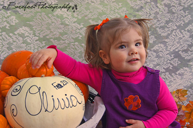
Thanks to Victoria at Barefoot Photography for submitting the following image.
Settings: ISO 100, SS 1/30, f/5.6 – taken with a Sony a33
I am now accepting new submissions for Critique Me images. If you have one and you are ready to hear the good and the not so good about your image read how to submit your image for critique me. I will accept the first 12 images. Then it will be closed again for several months.
***Critique Me is all full again. I will open it back up in a couple of months. Keep critiquing each other so you will be eligible to submit an image.***


I personally think that The subject is a little flat, I would have done a bit more to contact between the colors. The idea behind the photo itself is great though!! Very Adorable!!
Let me revise that a little, Contrast the colors in the subject itself. Not really the entire photo.
Hey Victoria! The catch lights in the little girls eyes are fabulous. I love a good catch light, but who doesn’t? For me this photo has a lot of distractions. The lettering on the pumpkin, her fingernails(which is quite possibly just my OCD with short nails;)), the background doesn’t do it for me as does -what looks like- food on her mouth. But her expression is soft and completely relaxed. And that right there is the best part:)
She is soooo cute first of all!. I love how you tied the colors in with the touch of the orange bows and the little orange flower on her dress! It seems as though maybe someone was helping you get her to look.. (if this is the case) have the person stand behind you at the camera’s level. that will help the “subject” appear to be looking at the camera. The pumpkin is a distraction simply because the little girl is facing away from it, but i think if you would have turned her just a little toward the pumpkin you would have gotten the feel that it all fit together. One more thing that i love about this photos is the brightness, it screams fall!
What a sweet little face! Love her pigtails and how the pumpkins, leaves, the design on her shirt, and her hair ties all match. I think I would have opened up my aperture a little more to bring in some more light, and that may have helped remove some of the distractions like the background. It would also allow you to increase your shutter speed, although I’m really impressed that you got such a relatively sharp image at 1/30. My own daughter would have just been a shapeless blob at that speed ;-) I love how relaxed she is and her natural but happy expression.
First of all she is darling and as a previous commenter noted so still for a ss of 1/30! My son nor daughter would have been that clear at that speed. ;-) I like that she is not framed dead center and that you are capturing not only her but her pumpkin for the year. However, I think if you had taken the shot from her left side, she would have caught more of the light and the pumpkin would have been what lost a little light. I love that little bit of fall leaf she has next to her there! Gives some depth throughout the whole picture. Overall, super sweet picture!
I love the bright colors in the photo. The photo seems a little dark to me, so I would have lightened it up a bit in Photoshop or tweek your camera settings to let in a little bit more light. The pumpkin with her name on it, is a fun idea. :)
I feel like she should have been directed more towards you. So in a sense you want her gaze to be directed towards the larger opening of the frame – if that makes sense. I would have liked to see her fill the frame more, I do love how she is looking up and away, it makes the little one’s eyes scream ” I am the cutest girl ever!”. The contrast of the colors (purple and orange) makes the picture pop. Since the basket of pumpkins is the same size(not to be exact) it competes for attention with the subject. Especially since the pumpkin seems closer to the camera, making her background to the pumpkin. If the props (basket of pumpkins) were smaller or perhaps laid on the floor it would have made the subject more dominant. Unless, that is what you were trying to achieve – the pumpkins and the subject are of equal photograph value. If the background was darker I believe the whole scene would have “meshed” better. I think the personalized pumpkin idea is really cute and special. :) She is precious!!!
She’s an adorable little girl, her cheeks mirror the plump-ness of the pumpkins! I would change the background, it’s distracting and takes the focus away from your subject, maybe try to find something solid colored? I like that the little girl is connecting with the pumpkin, by putting her arm on it. It’s more a part of the photo than if she were just sitting next to the pumpkin.
I love the idea behind this picture, I really love her name written on the pumpkin. My eyes are more drawn to the pumpkin initially, than the little girl. I would have the girl and the pumpkins switch places so that as her face is turned towards the camera it catches more light, whereas if she had been looking at you in this picture her face whole be shaded. It’s amazing she is as clear as she is with the SS at 1/30! I could never get my kids to do that! The photo is a bit dark. I would bump up the light by shooting with the aperture at f/3.0. This would open up your lense letting more light in and also allow you to set a faster SS and create a sharper image. You could also shoot with an ISO at 200 if your lense won’t allow the aperture set to f/3.0. I love her positioning on the pumpkins, she looks so relaxed.
I am pleasantly surprised by the girl’s pose. She makes it seem so natural, even when it is a more mature pose… she is a natural model! One thing I would have done differently is reduce the distractions… I would change the background to a solid colour, since there is a lot going on in the photograph. The pumpkins and fall theme are natural, while the backdrop is unnatural, so they don’t jive very well. In the background, you can also notice the artificial fall leaves, which would look more realistic if the undersides were not showing. Also, the angle allows the catch lights to distract rather than add to the photo. Some more things I love… her outfit and hairstyle – so cute and something she will look back on and say, “I was such a cute little girl!”. The basket of pumpkins are so festive, and the big one with her name on it is adorable.
This idea is so cute! I love the way you included the name and year (I think) in the picture – makes for great memories. I’d like to see the girl looking into the rest of the picture – make her eyes look left (into the rest of the picture) instead right (out of the picture). Also, using a more plain background or wider aperture to blur the background will help draw more attention to the girl. My favorite part – having the subject interact with the props, not just sit near them :)
I love the pigtails and the the catch lights in her eyes are awesome however I would move the focus to her eyes. :) and would try to compose the whole image in a way that it includes her other little hand. I LOVE little hands I can’t tell you how many pictures I have of my boys little hands. It’s hard to capture kids because they move so fast.
I’m a sucker for little girls with pigtails! :D
I love the idea of this photo. Next time, I would try to get both of her hands in frame. Limb chops are distracting. ;) Also… as a general rule, try to keep the shutter speed no slower than 1/125 when shooting kids. Don’t be afraid to up that ISO! :D I love the catchlights in her eyes. And I love how you tied the colour orange in throughout the photo.
I love the name on the pumpkin next to a very sweet girl. I think that the background is a little too busy for this photo to really focus in on the little girl. I may have had just orange pumpkins to keep just a couple color themes.I love the orange in the photo and how it ties to her ribbons and her cute dress!
I really like the choice of props here. The leaves and the pumpkins really give a nice touch to the fall theme of the photo, as well as the orange pops in her little jumper and bows. Nice job. What I would have done differently is to bring her a little bit further away from the backdrop and used a smaller aperture to give it a different depth of field and create more focus on the little girl. I may have even changed up the placement of the props to having the leaves and pumpkins all around her and pulled back the frame. Although I do like the placement of the pumpkins for a younger child, possibly a one year old (one that is not walking yet) this way they could pull themselves up to a standing position using the basket and pumpkins. Nice job, she is such a cute little princess!
I love the colors, the background and the composition of this photo. All it needs is a little work in LR or PS. I would take the exposure up and bring up the contrasts as well. The Unsharp Mask tool in PS is a great toll to get a extra sharpness.
I really like the idea of the photo and how you took the time to not only set up the pumpkins, but use one with her name on it. Very cute!!
First, I would love to see her making strong eye contact with the camera vs. looking out of the photo. If not, looking straight into the camera, I think it would be a stronger photo if she were looking toward the pumpkins.
I would also love to see a solid background. The pattern takes away from the subject and overall theme of the photo. It also appears to have a greenish tint camera right and darker tint camera left which doesn’t blend very well with the rich fall colors of the photo.
I think in post processing I would increase in the exposure a little, increase the contrast (but be sure to remove it from her skin), and soften her skin just a bit.
I do love the catchlights you were able to capture and nice job with the lighting overall. It really adds dimension to her face.
What a cute little girl! You’ve really captured a nice facial expression, and a relaxed, natural looking pose. I also like the catchlights in her eyes. Here are a few suggestions:
On the front end with the camera–her eyes seem a little soft to me. I’m not sure how Sony cameras work, but if it was possible I would have tried to select a focus point on the eye nearest to the camera. The pumpkin is in sharper focus than her face, which draws attention away from her face. I would have tried (if possible) either a larger aperture to blur some of the pumpkins, emphasize her face, and brighten up the picture a little. Or, if your lense doesn’t allow a larger aperture I might have tried a higher ISO (200 or 400) to brighten it up a little.
On the back end with your processing software: I would increase the brightness to lighten it up a bit, and either do a levels bump or a curves adjustment to add a little more contrast.
The color, props, subject and her pose all combine for a fun picture. Thanks for sharing!
What an adorable little girl! I really love her expression and the light in her eyes. I find the background distracting. There is an awful lot going on that competes for attention. I would suggest having her farther away from the background, and using a lower aperture, so the background would be taken out of the composition. I think I would also try lightening up the photo by tweaking the levels or curves adjustment. I know how hard it is to take photos of little ones and have them in focus and sitting still, etc. You did a great job of getting the shot.
What a cutie!!! She is adorable and great photo. If I would have done it differently, I would have bumped up the vibrance and brightness/exposure.
It entered before I was done typing, I’m on my phone! This should go at the end of the previous comment:
Great job at getting the shot. I love the backdrop and the idea is super cute!
Thanks everyone for the critiques! This was a shot from my FIRST job as a paid professional back in October, and still one of my favorite shots. :) I will definitely keep everyone’s ideas in my mind as I shoot more. Thanks again everyone!
Such a cute little girl and love the pumpkins as props. I feel like the backdrop is a little distracting and doesn’t fit the fall pumpkin theme. I would love to see barnwood, hay, or trees behind her with and lower the f-stop. It may have also been cute to have her hold one of the small pumpkins.