Photographers always start with the mechanics of the camera. Of course, how could you take a picture if you didn’t understand how a camera worked? You learn about the exposure triangle and the three pillars: ISO, Aperture, and Shutter Speed. Then you might learn about composition and the rule of thirds. You might even start to dabble in a specialty such as portraiture, fashion, or landscape.
You start to curate your photos and you realize you don’t have a common theme. You start to do research and you see that branding yourself and consistency is key. When you look at photographers’ Instagram feeds, the most successful ones have a clear, consistent brand style. The style is like a photographer’s fingerprints: each one is unique.
But what no one ever talks about is color. How does color affect the mood or make your photos pop?
As a photographer with a degree in Interior Design, I know a little about color. One of the first classes I was required to take when I attended my great alma mater (Michigan State, GO GREEN!) was Color Theory. Color Theory is so important in the arts, but it’s rarely discussed in photography.
Color Theory the practice of mixing color and the visual effects of a specific color combination. Did you know that the basics of color principles first appeared in the notebooks of Da Vinci? Color Theory has been around for centuries – but it’s still a mystery to many.
When you go to the doctor’s office, what color are the walls? Many of you won’t even remember, because we never focus on it. But I guarantee you next time you go, the walls will be light green or blue. Why? Because blue and light green are cool colors, and cool colors tend to have a calming effect.
The effect a color has on you is subconscious – I bet you never really thought about the color on the walls. But color has a profound effect on each and every one of us.
In nature, blues and greens are abundant (the sky, trees, etc.) so we find them non-threatening. But what do you feel when you think of red? Blood, violence. We tend to react a bit more quickly to the bright, warm color of red because it is more threatening on a subconscious level. Reds can also have a connotation of passion and love.
Of course, the effects of color theory on individuals are deeply personal. While the cool colors are calming, they can have a sad effect on the viewer as well.
In photography, there are three main areas of color that we work with and edit. They are hue, saturation and luminosity (HSL in photo-editing programs).
-
No.01Hue
Let’s start with hue because it’s the color itself. And the best way to see the effect of hue on the viewer is to first look at something without color.
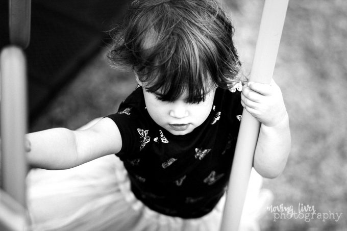
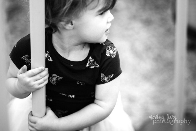
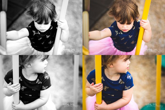
Let’s talk about these images:They are gorgeous black and white images with high contrast – the playground structure added a strong vertical visual element that frames the child.
Read more: Using Contrast and Luminance for Black & White Images
In terms of composition, the photos stand on their own, and a high contrast gives your eye something grounded to look at.
But what happens now:
Which one do you notice first? The colored images because the yellow playground structure is so bright and saturated that your eye is automatically drawn to it. Yellow is a warm tone and it jumps at you – the image simply jumps forward.
Again, neither format is correct or better than the other (besides personal preference). But the bright colors are more noticeable. The use of color, or hue, alone draws your eye in.
-
No.02Luminosity
Now let’s look at the two following photos. This time, both are colored, but one is more noticeable.
Which one does your eye immediately go to? If you answered the first on, why?
The answer might surprise you. Did you say to yourself, “it jumped out at me because it’s brighter and the color punches so I automatically looked at that one first”? Yes, that’s right, but why?!? That’s the big question that is tougher to answer unless you understand color theory.
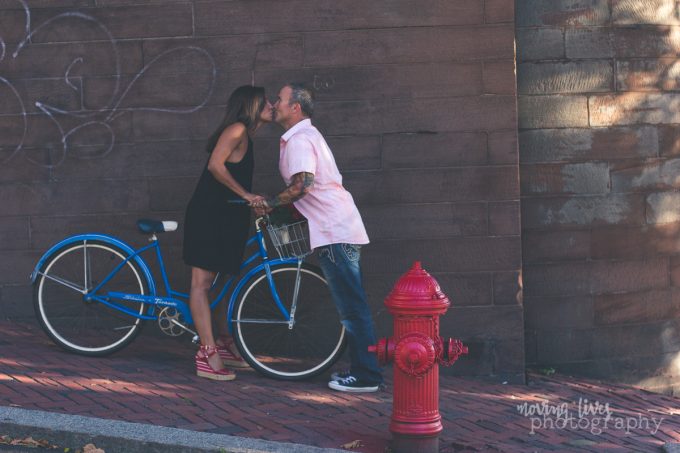
There’s two reasons the left photo popped. First, the luminosity is higher. In other words, the image is “brighter”.
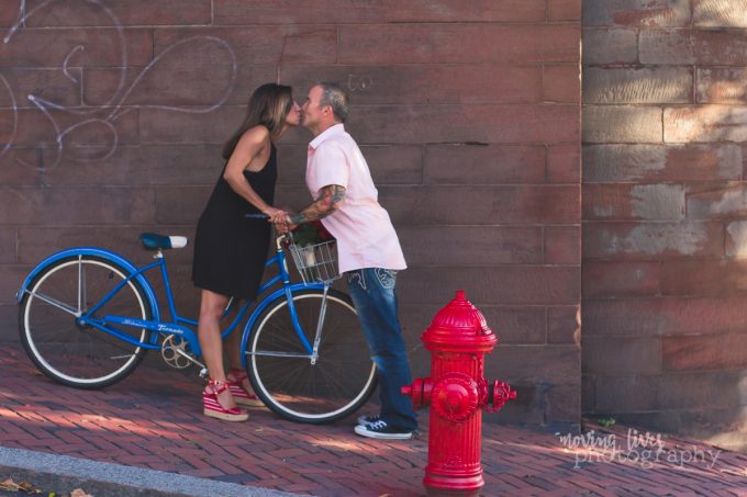
The other reason is that once you raise the luminosity, the red fire hydrant is jumps. Warm colors (red, orange, yellows) tend to “come forward” whereas cool colors (blues & greens) tend to recede into the background.
That’s why in the two images above, when the red color on the fire hydrant was highly saturated, it “jumped” in front of everything else, causing your eye to immediately be drawn to the picture on top. Did the blue color on the bike catch your eye? Probably not – because it receded into the background.
Another thing that you may have subconsciously noticed is that the bottom image has a cooler color tone. A blue split tone was added to the image and the overall color temperature was brought down to the blue range. By doing this it added a vintage look, but the colors are muted.
Because the bottom image depended highly on the overall warmer tones, it is yet another reason your eye was drawn to the first image.
Does this mean one image is better than the other? Absolutely not – it just means that the images with a brighter luminosity and warm colors tends to attract more attention.
-
No.03Saturation
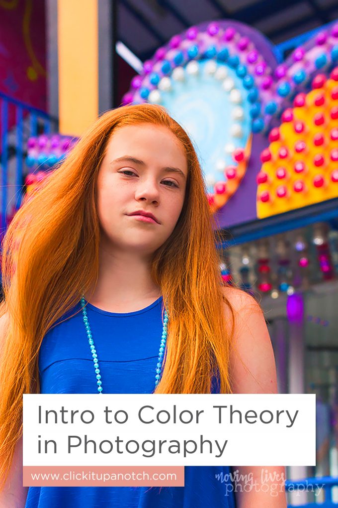
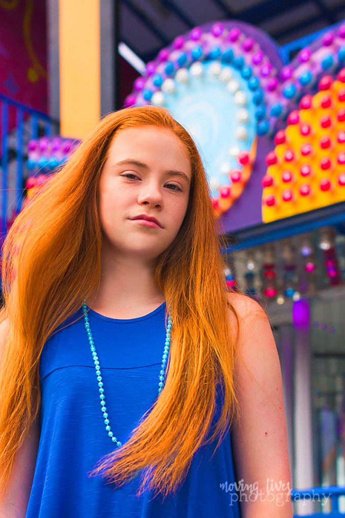
One of the most colorful shoots I did was at a local carnival. One of my favorite models agreed to do a few shots with me in front of some really saturated, colorful backgrounds.
Of course, I lucked out because the model had beautiful red hair, and that’s the first thing that pops out at you – the warmth of her hair. But the overall image is saturated and bright, giving it an energetic feel, jumping at you instantly.
Of course, the image shot in camera, which was taken in RAW format, was not quite as saturated. So I did a small amount of editing in Lightroom before using layer masks in Photoshop to make the image really pop.
Once again, the red is what jumps out at you – the orange-ish hue of her hair, the pink/orange colors in the carnival rides behind her. Not only that, but the luminosity is once again high. It’s a bright image all around.
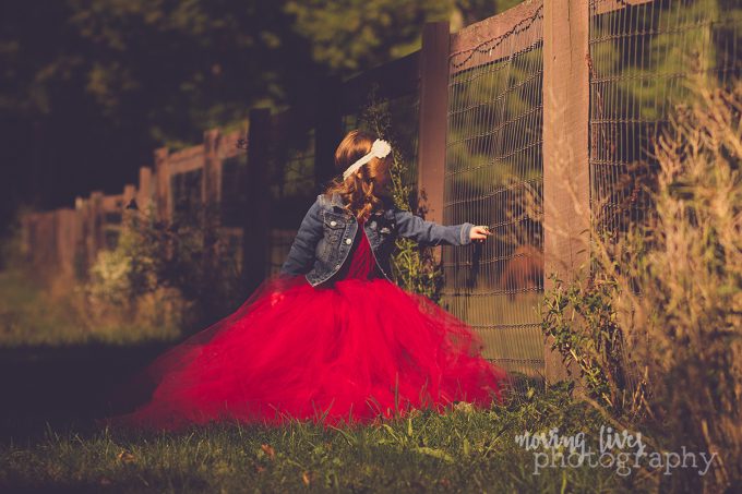
Another great example of saturation is a wonderful fall photo:
The red tulle, which is already great for movement and catching the eye, was given a very high saturation, with a blue undertone. Not only does this catch your eye, but it creates a matte look. In addition, the overall photo was given a warm split tone, which automatically draws your eye because warm colors jump.
Color defines our world. It’s not a conscious effort to notice certain things, but there’s a scientific reason behind what stands out in our world. It’s all about Color Theory. Stick with me because in the next post, I’m going to start talking about complimentary colors and how they can have an effect on your own brand and photography style.






No comments yet.