The way you view the world helps shape the way you compose your images with your camera. The details you choose to include (or leave out) when composing your images tell a story. They tell the story through your own personal perspective.
You can utilize compositional strategies to help strengthen your message to the viewer of your image. There are so many compositional strategies to choose from like framing, creating movement, creating depth in your images and negative space. Learning multiple compositional strategies will really enhance your images.
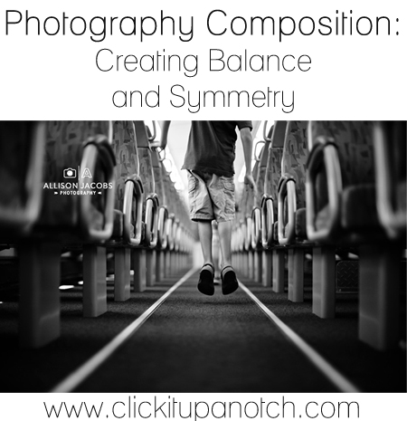
One of my personal favorites is using balance and symmetry within the frame. I tend to be drawn to center focused compositions and images with negative space to offer balance to my main subject. Looking for balance & symmetry in my environment provides stability and calm for the compositions in my images.
Read more: How to use leading lines to create amazing photos
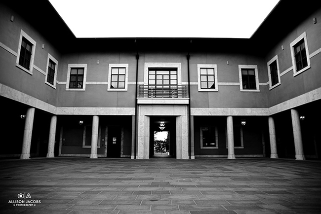
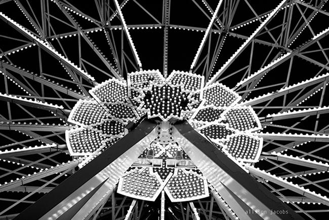
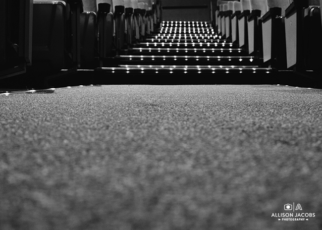
Using Symmetry to achieve balance in photography is a great way to show stability in a scene like with architectural images. Symmetry is achieved when there is a mirror image (or close to a mirror type image by using elements of the same size/mass) on either side of the frame like in the building above. This makes the center of the frame the main focal point. Using Symmetry can make the image feel stagnant because of the lack of movement throughout the frame therefore the focal point needs to be interesting enough to gain and keep the viewer’s attention. Using other techniques than symmetry to provide balance can offer more interesting images.
There are different ways to use elements in your photographs to provide balance like using color, contrasting tones, and visual weight.
In the below image the glass in the top left corner helps provide balance to the main subject (the quiche) in the bottom right corner. I could have used negative space in the top left corner to balance the elements in the image but I wanted the additional detail of the drink to add to the story. The image would be heavily weighted in the bottom corner without the drink & it may have seemed like something was missing. The drink fills in that gap while also adding to the overall image.
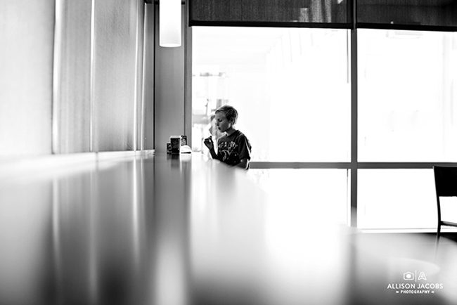
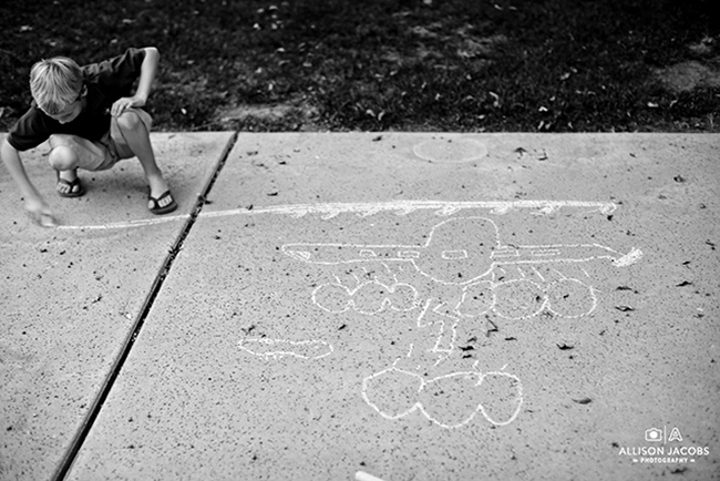
When looking to add balance to your images it can be helpful to know what will draw the viewer’s eye first in the image then balance it with the opposite in tones (or color). When you are shooting for black & white images, the eye is drawn to strong contrast. For example, in the above image the subject has on dark clothes & there is a strong contrast in that area of the image. Therefore the eye will go to the subject first. The lighter area (weaker contrasted area) of the photo is the concrete and this large space helps to balance the darker area of the image where the subject is placed. You can use this tip to draw the viewer to a certain object or subject by looking for the way the lights and darks contrast with each other. The darker area will pop from the lighter area and even if it is a small portion of the frame it will draw the viewer in.
Read more: 11 Photography Composition Rules to Know to Improve your Photography
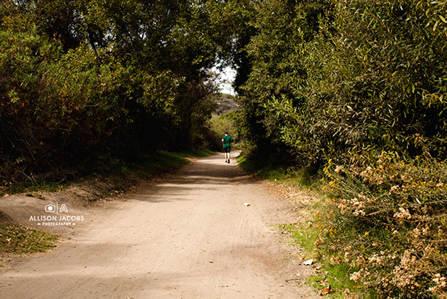
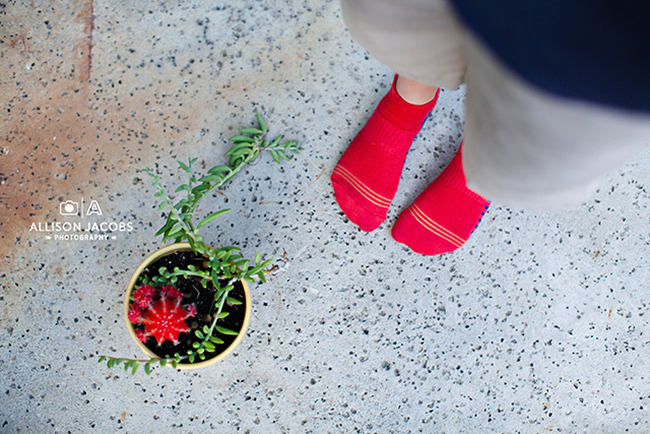
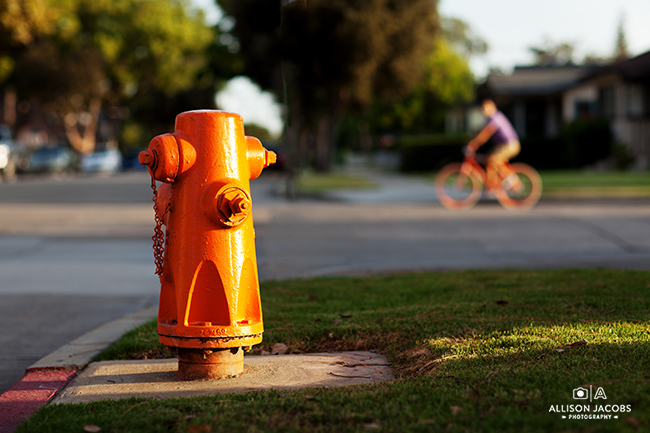
You can use color to create balance in an image too. In the examples below, one image has the red/green color combo along with the red being used in opposite corners of the image. This helps balance the image because the eye is drawn to the color red over the neutral color of the concrete. Having the color in both sides of the image helps give equal weight to those elements and therefore provides balance. You can see the same strategy illustrated in the image with the orange bike & the orange fire hydrant. The colors hold equal weight in 2 parts of the image and stand out against the background of the frame.
If you want to cause your viewer to feel uncomfortable or you want to illustrate tension though your imagery then purposefully creating an image that is out of balance is a great way to use this compositional strategy to meet your vision. If an image isn’t drawing you in or seems flat then take a minute to analyze the composition of the image and ask yourself what isn’t working. Look at the composition considering some of the basic rules and see if there is something out of balance. Then you can move forward from there & try something new. A different angle, emphasize a different element in the frame, choose another compositional strategy to use.
How do you use the compositional strategies to enhance your images?
Read more in our Photography Composition Series:
– Creating Depth in Your Images
– 4 Types of Framing
– Negative Space
– Creating Movement in Your Images
–8 Ways to Weave Intentional Design Into Documentary Photography





Love this article Allison! Beautiful imagery as usual :) I’m going to reread and save this as inspiration for my 365 :)
Such a great article! I haven’t used symmetry in my photography yet. Do you have links too other examples?
Allison, as always I love seeing your work. Great article! Very informative with great examples. I enjoyed reading it.
This article was so helpful and easy to understand for me, an intermediate photographer. I think it’s learning skills like artistic composition that gives our work that extra touch! Huge thank you!!