Every photo has a story to tell. Okay, so maybe not EVERY photograph, but so many photos aim to tell stories. With the telling of stories comes the interpretation of stories by an audience. How can you ensure that you’re conveying the message you intended? Well, there’s no way to guarantee your story will be “read” by everyone exactly as intended, but there are ways to remove ambiguity from your stories and communicate more effectively.
Read more: Storytelling Through Light, Emotion and Composition
Using light, composition, editing, and even capitalizing on human nature can enhance your ability to communicate your story with an audience.
-
No.01Light
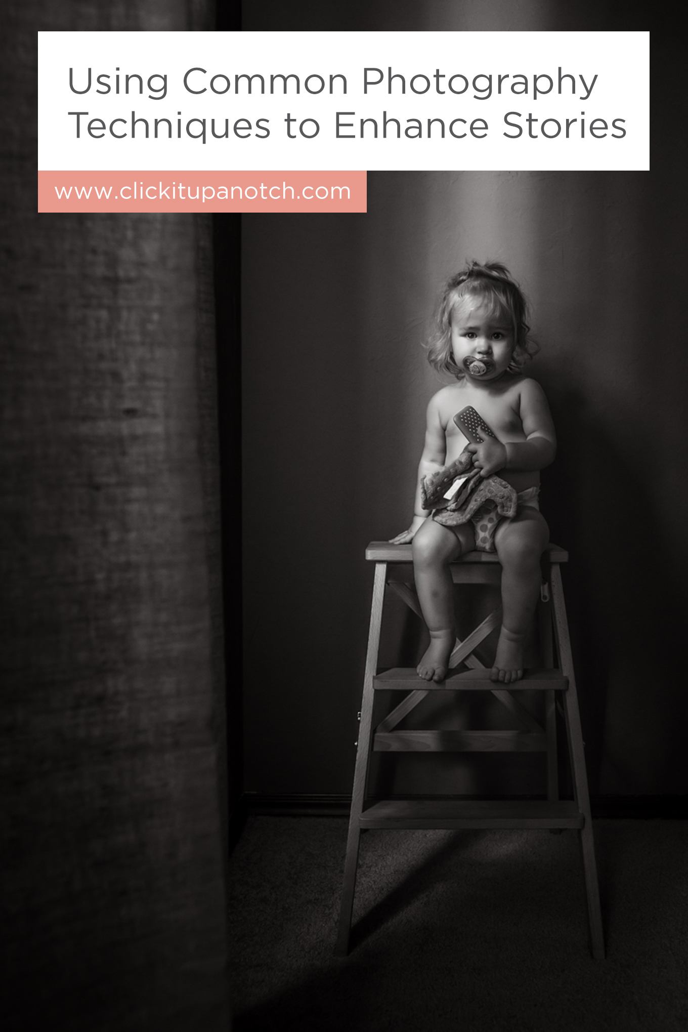
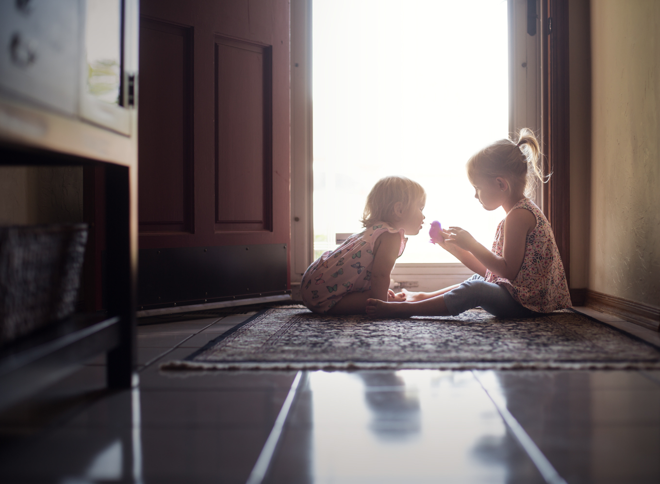
The easiest way to spotlight your subject is to, well, spotlight it. Okay, so you may not have a spotlight in your house, but you can find pockets of light that illuminate your subject or story. Light reveals, dark conceals.
Are there elements in the scene that don’t add to the story? Hide them in the darker areas of the photo. Are there elements crucial to the story that aren’t being seen? Move them into the light.
Compare it to a play; the stage is the realm of smoke and mirrors; when there’s a set change during an active scene, part of the stage will go dark and the transitions will take place while the audience is focused on what is happening in the light. Photography isn’t a live production, but the concept still applies.
Draw the viewer’s attention with light.
Light can also convey mood. Brighter, more evenly lit images generally convey a happy mood while more dramatically lit, low light images convey a quiet, introspective, and sometimes even sad mood. Make sure the lighting you choose enhances, and doesn’t compete with, the mood you hope to achieve.
-
No.02Composition
There are many composition techniques that allow a photographer to guide the viewer through the frame to convey a story to their audience.
Framing is literally creating a frame around your subjects with some element in the shooting environment. You can find a tunnel of trees, a doorway or window, or even a small opening in a tree that acts as a window. The goal of framing is to draw the viewer’s eye directly to the subject.
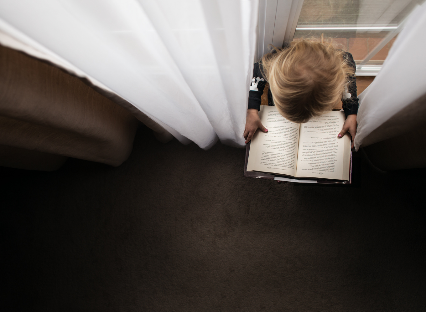
Leading lines is like drawing a map on your frame telling the viewer where to look. The human eye seeks patterns and lines. Utilizing leading lines to direct the viewer’s eye through the frame.
The rule of thirds is a well-established compositional technique, but considering directionality to this technique can strengthen your overall composition. In American culture, as well as many around the world, we read left to right, so the eye has learned to “read” photographs and art and even scenes on stage in the same direction.
The viewer’s eye will naturally enter the frame at the left and exit or land on the right. Utilizing this knowledge can enhance your composition. If your audience is part of a culture that reads in a different direction, alter this technique to fit that directionality.
-
No.03Editing
Editing can have a huge role in the overall impact of a photograph. Ideally, yes, we want to get it right in camera, but editing is a tool we can use to enhance these “In the Spotlight” techniques to strengthen our story.
Utilize dodge and burn tools to reveal and conceal specific elements of your frame.
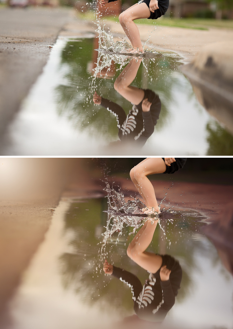
Enhance softness or remove color from distracting objects in the background.
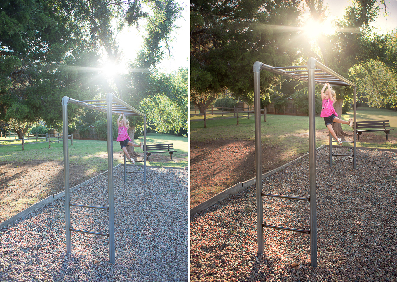
Add contrast to important elements of the frame.
-
No.04Capitalize on Anatomy
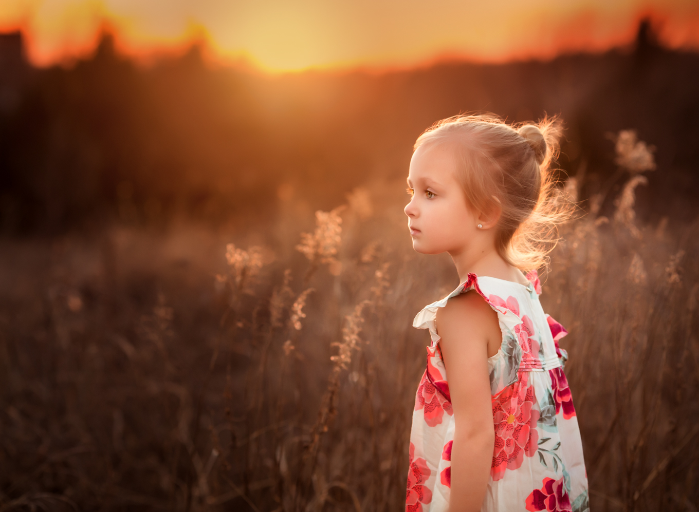
The human eye is drawn to sharpness and contrast. I call this the “bright shiny things” tendency. Elements that are in focus or have high contrast will drawn more focus than blurry and low focus elements.
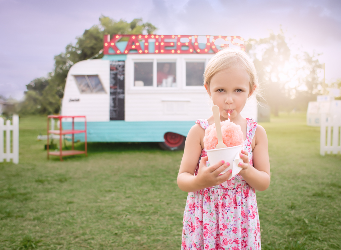
Using a wide aperture and narrow depth of field allows you to maintain sharp focus on your primary element and let the rest of the photo fade away into blur. The more blurred these elements are, the less the eye “sees” them. Place pertinent objects within, or near, the focal plane and elements of less importance farther from the focal plane.
Utilizing contrast can also draw the eye. Color contrast and light/dark contrast are two easy ways to add contrast to your photo. Find ways to add pops of color or complementary colors to draw focus. Areas of light against areas of dark also draw attention.
All stories and photographs are interpreted differently by each viewer and that may or may not align with your intention. By utilizing these techniques, you can more clearly communicate your intentions to your audience.
Read more about storytelling:
– Take your story to another level



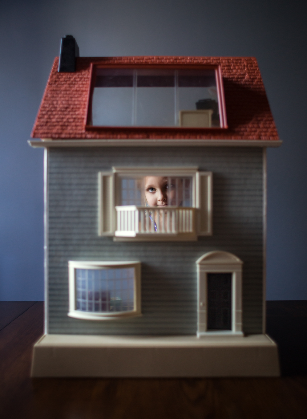
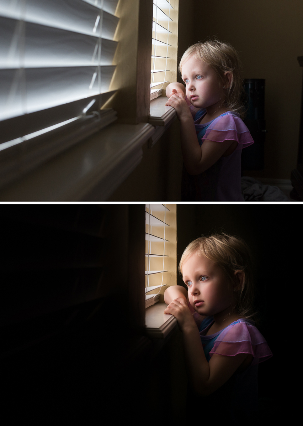





How did you get the surrounding area so black on the little girl looking out the window??
Courtney, can you share more about the dodge and burn tools? Are they in lightroom? And in your add contrast examples, it appears there was a tone/hue change as well as added contrast – can you share more about that edit?
Hi Kate! great post – one that I will refer to often! Quick question on one of the techniques – I love your photo where you have removed distracting objects from the background – where the boy is jumping in a puddle. How can you achieve that look? Can you please point me to any tutorials on doing this? Thanks!!
Love Kate’s pictures!!!
Thank you!!!