Generally speaking, I prefer clean simple edits. But sometimes images need a little extra editing to fully realize the vision I had while taking them.
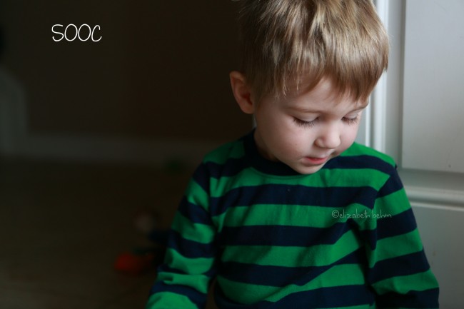
This image is one where I knew what I wanted, but my almost three year old wasn’t really in the mood where I could direct him (at all). He actually only came over to pester his sister who was playing in the floor by our front door. I encourage my kiddos to play near our front door, when the weather is nice, I open it to the storm door so there’s almost always gorgeous light in this area.
When he sat down, I immediately noticed how the soft light accentuated his still chubby little cheeks, he may be growing out of the baby stage way too fast for my liking, but occasionally I get little glimpses into the past. He’s always had gorgeous eyelashes (it’s always my boys that have the best eyelashes!) So when he glanced down at his sister’s toys, I snapped this shot.
Settings: I was shooting with my 24-70L at 60mm | f/2.8 | ISO 640 | ss 1/320.
I sharpened the RAW file in Canon’s RAW editing software (Digital Photo Professional) and converted to .jpeg for further editing.
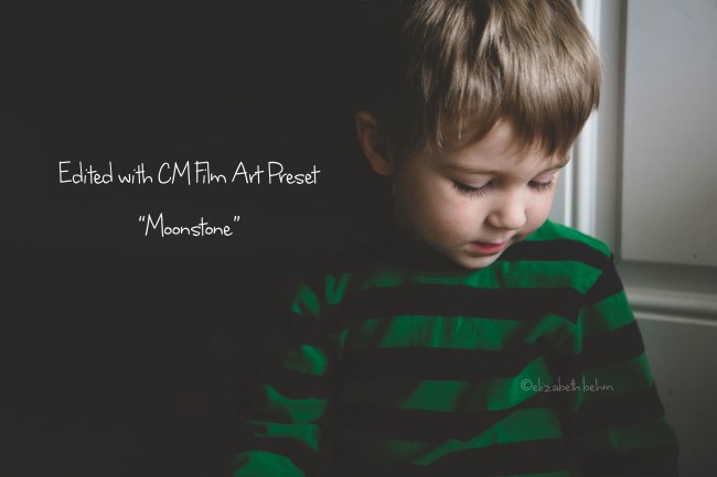
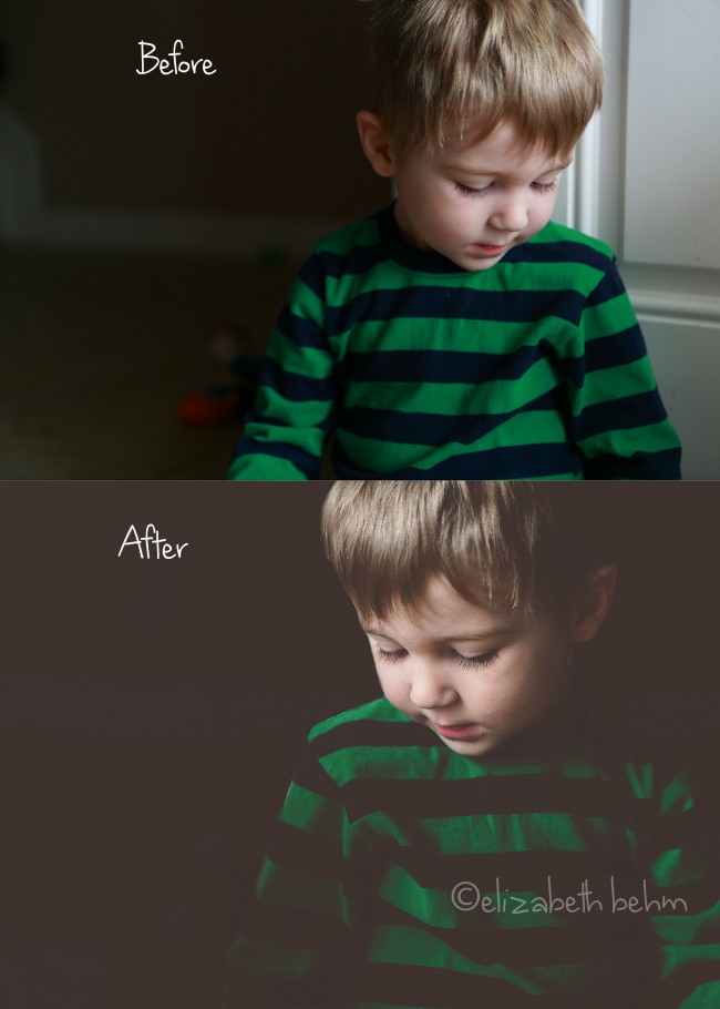
Then I opened the file in Lightroom 5 and ran one of my favorite presets from the CM (Clickin Moms) Film Art Presets. (These are also available for ACR but since I do most of my RAW edits in DPP, I bought the presets for use in Lightroom which I am trying to use more often). I used Moonstone with no adjustments and it gave the image the deeper, more serious feel I was hoping to achieve. I knew that it would darken the shadows from the empty space behind him and give the light on his face a more dramatic look.
I was tempted to leave the image as is, even though he’s composed with Rule of Thirds in mind, I didn’t really like that he was almost looking out of the frame, and I wanted to get rid of the white door if I could. Remember, when I snapped this shot, I was struck by the quick glimpse I had back to his sweet baby face that is changing every day. I wanted him to be looking back into the frame, “at the past”, instead of forward, “into the future”.
I felt that if I flipped the image horizontally it would help achieve the story I wanted to tell.
I opened the edited image in Photoshop for a little more tweaking.
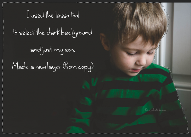
First I used the Lasso tool to select the dark background to the left and my son.
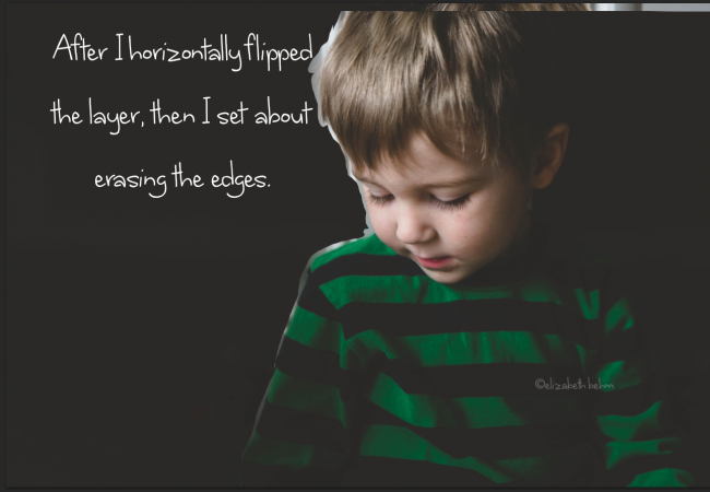
I made a new layer (from copy) and then from Edit>Transform>Flip Horizontal
I used a soft eraser 55 px, with a 15% hardness and erased the edges around his shirt, as I got up to his shoulder/face/hair where I wanted a more precise eraser, I changed the eraser size to 15 px, and 25% hardness, and then zoomed into 100% view in PS so I could be sure to be as precise as possible. It takes a bit of patience and experimenting, but I was able to get this erased in probably 2 minutes.
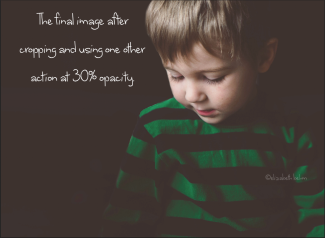
I cropped my image a bit more since the highlights in his hair were a bit distracting and I ran another action by Tracy Bradbury called, “Bornite” at 30% opacity to achieve my final image.
This edit is a bit different from what I usually do. I usually try to get the vision to play out as I am shooting so that there’s very little editing to be done. However there are times when your subject won’t be in just the right spot and with a few simple tools and tricks, like flipping the canvas and erasing layers- you can create the image you intended all along.





I’m always afraid of too much editing as well, but this was really well done! Just flipping the imagine horizontally made a huge difference. Love it!
Thank you!
Never thought to do this! Thanks for inspiring me to try this. I love your final edited image–the flip and all-black background really changes the feel and story of the image.
Thanks! It’s fun to see how something as simple as flipping can really change an image right?
I love the way this image is edited. It’s very nicely done.
Thanks Linda :)
This is great! I’ve always wanted to try this :) I love how the mood & feel of the image changes from the before to the edited. Nice job!
I use the CM presets on most of my work .. great post, thanks for sharing :)
Great post Liz! What a cute little guy! :)
gorgeous edits {and subject}
Liz you always amaze me. The thought process you put into your work (even your every day) is just amazing. THIS is why you are as talented as you are. You give it your all and then some. Beyond beautiful!
Amazing tutorial Liz! I love the dramatic results!
Thanks for letting is peek inside your head!
Thank you for sharing I love the end result..and the black backround beautiful
Fabulous! Thank you so much for sharing your technique. I love the finished image!
Hi! Great work with the photo! It’s nicely edited and I definitely like the flip. I’m curious, is there a reason you would use the lasso and eraser to make the selection, rather that something like the magic wand and the refine edge? Or, perhaps another method? Thanks so much for the tips!
Hey Steve, Thanks! When I tried magic wand with this particular edit- it grabbed too much of the door that I didn’t want to erase (I’ll admit I’ve never used the refine edge- I’ll have to give it a try! so I was kind of impatient and went for lasso/eraser combo that I’ve used before and selected only my son :)
awwww…. I love it! I honestly can say that i have never thought to flip an image to get the feel and emotion that I want! Lovely… I love that thought! Now…. I need to try this with my images. I love that action that you used in lightroom as well!
I was trying to find the action by Tracy Bradbury that you mentioned above. Is it available to buy?
Thanks sharli
I do believe the particular action I used was one of Tracy’s wonderful free shares on Clickin Mom’s forum :)
I love this!
Wow! This is really incredibly unimpressive! Thanks for sharing… not.
I really like the work and that the dark area isnt completely black but a faded black whit a little white glow in it as the light are there but dont really seems to slip through the black. its hard to explain, but really awesome
Hello, I’m happy to see this URL still active as I have it bookmarked as reference. I too try and shoot SOOC as much as possible but love your idea to make this picture tell your story. One bit confused me as I’m a newbie…. “I made a new layer (from copy) and then from Edit>Transform>Flip Horizontal”. Made from which copy? Can you be more specific/explain? Thanks for the helpful post!
This is really cool I’m thinking about getting into photography so great tips thank you