‘Tis the season for senior portraits! Last week I had a wonderful opportunity to do a photo shoot with two beautiful high school senior twins. I decided before the shoot that I would use some of the images for this post and share senior portraits tips. These are things that I like to keep in mind as the photographer during a senior session.
Read more: 5 Senior Portrait Ideas & Posing Made Simple
Senior Portraits Tips
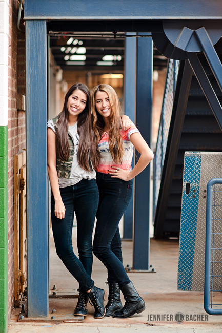
1. Look for structural elements (or other leading lines in nature if you aren’t near any architecture) to draw the viewer’s eye to the subject.
Since the session is all about them, you want everything in the image to point towards them. Find beams, staircases, walkways, paths, the lines of a building, etc. to use as leading lines or to frame your subject.
2. Choose an appropriate length lens (50mm or above) to avoid distortion when shooting close ups.
You don’t want heads or hips to look larger than they are in real life! Your senior girls will thank you later! Many argue that the best portrait length is 85mm or above. I shot almost this entire session with my 85 mm lens. The longer the length lens, the more compressed your background will look, which creates that soft, creamy look behind your subject that we all love!
During this session I briefly switched to my 24-70mm lens because I was tight on space in a particular area. I shot one image at 24mm and realized after looking at my screen on my camera that her head looked large in comparison to the rest of her body. It was because I was standing too close to her with a wide-angle lens! I quickly zoomed out to about 60mm, took a step in to frame her close up, and tried for a better shot. I recommend doing a quick test shot every time you switch lenses to double check for distortion. Don’t worry about making your client wait while you adjust. It’s more important to get the shot right in-camera so there are no regrets later!
3. Work with the weather/sun you are given the day of your shoot, not against it.
I had a fabulous location pegged out for our urban shoot where there were colored doors, old staircases, and vintage looking brick walls. I was so excited to shoot there! When I drove past the location earlier in the week it was overcast skies, so I didn’t think about the direction of the sun. Duh! When we arrived, however, there was direct, glaring sunlight shining on all those fun colored doors, and speckled light from the trees nearby.
I decided I would quickly become frustrated if I tried dodging all the crazy shadows on their faces and hot spots on their clothing. So we walked around to the shaded side of the building and found new areas where there was even lighting and filtered back lit opportunities. Be ready to change your plan, look for something that will work better for the lighting situation you are given. Bad light can easily ruin a good location!
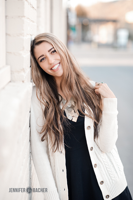
We found a really great cream brick wall that was in complete shade, but had the added bonus of a metal building right next to it that was reflecting sunlight back onto the wall. It was far enough away that it provided a soft, subtle reflection that added nice catchlights in their eyes and highlights to their faces/hair.
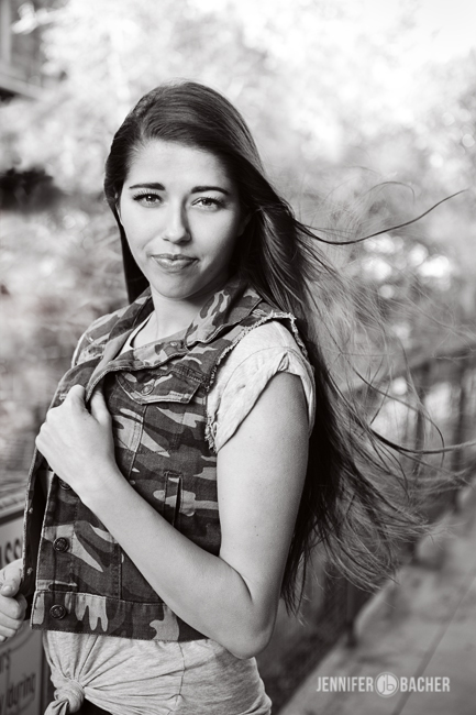
We were also dealing with wind during our shoot. Luckily it was a gusty wind, so we had periods of calm mixed with random gusts that came out of nowhere. We used the wind to our advantage by trying for those hair-flying-in-the-wind type dramatic looks. To do this, pose your subject toward the direction of the wind and tell them to wait for a minute until you get a gust. Then watch through your eyepiece and be ready to click the shutter just as the wind blows.
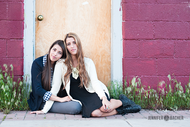
4. Choose poses that flatter your subject, look natural, and emphasize their personality. The goal is to capture who they are at this stage in their life. I generally don’t like portraits that look stiff and posed. These types of images are lacking a sense of movement and reality.
There are things you can do to make poses look natural. Here are some suggestions. Disclaimer: it is impossible to remember ALL these tips during a shoot! My suggestion is to focus on a couple at a time). You will notice I did not follow some of these rules in the pics I used for this post…ha ha, I did my best! :)
- Avoid shooting straight on, shoulder’s square to the camera, or arms directly by their side. Rather, create a soft bend in the arm, turn hips slightly for a more natural look. Also be aware of hunched shoulders.
- For girls, be aware of their hips and how to best flatter them. Shifting weight to the back leg slims the hip closest to the camera.
- More often than not, legs apart look better than legs together (defines a girl’s shape).
- For boys, aim for masculine posing. Hands on hips with hips cocked is NOT ideal for boys! Folded arms or clasped hands make for a more masculine look.
- Chin down to open up the eyes. Do an occasional shot from above if you have double chin problems.
- A big cheesy grin can sometimes look superficial. Try for a soft smile, or no smile for a more dramatic look. If you have made a connection with your seniors you’ll be more successful at getting natural expressions. Crack jokes, be playful, get them to loosen up and have fun!
- Use hands to frame the face or to give more visual appeal. Strive for graceful and elegant looking hands for girls and strong/masculine hands for boys. Watch for broken wrists and clenched fingers (relax the bends).
- There’s a delicate balance between making senior girls look sweet vs. sexy. Their mothers will thank you later if you can aim for the sweet!
5. Don’t forget to be creative!
Bring out that fisheye lens, Lensbaby lens, or do a shot that your senior mentions from Pinterest. I will sometimes incorporate a pose I’ve seen somewhere else, but put my own twist on it to make it my own. Seniors love these creative shots because they make their session unique and tells a story about their personality. I usually do the more creative and fun posing at the end when they are tired of smiling and posing. I want to end on a fun note so they remember the shoot as a positive experience!
These are just a few tips that came to mind. I’d love to hear any other favorites you may have too! The more you shoot, the more you will learn what to do/not to do the next time. Seniors are so much fun to work with and will generally do whatever you tell them to! Take advantage of this by doing your homework before the shoot, planning your posing, lighting and location so you are ready to rock it and have fun!

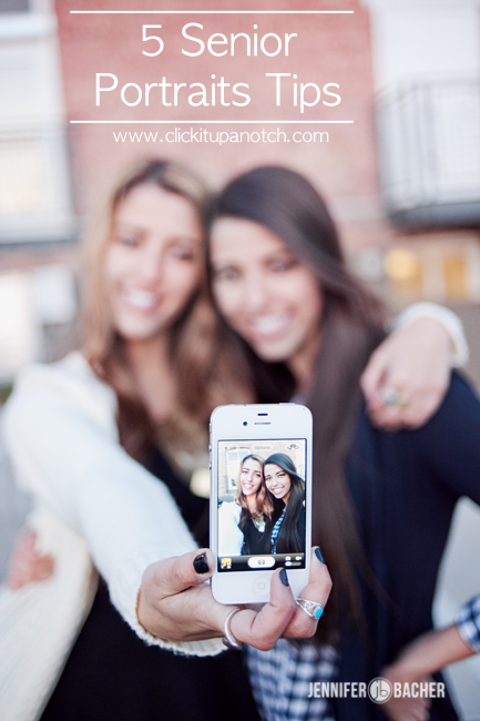

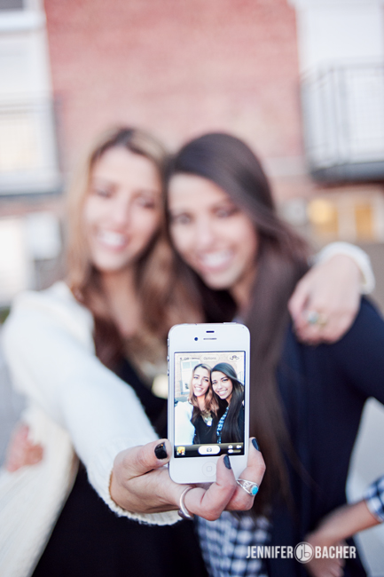


What great tips, I love the photo of them taking a picture of themselves with their iPhone.
Love the advice, and pointing out of mistakes made. Those girls are stunning!
Thanks Jen, great advice and beautiful photos!
Thanks for the tips! I’m getting ready to shoot my first senior session and found your tips helpful. :-)
Really appreciate all these tips. Thanks so much for the write up!
Love these tips! I have the hardest time posing guys! I love working with girls, I have a fun session with a Senior by the lake, the wind picked up just as slighting, but enough to make her dress flow – It was so fun! Thank you for the post!
Sorry about the autocorrect! I had a senior session and the wind picked up slighlty and I was perfect!
GREAT! GREAT! GREAT write up; especially about the lens choice. I shoot w/ my 85mm all day long. It’s go-to portrait lens. (Canon for life though, LOL). Thanks!
As an amateur photographer, I don’t think about working with the weather like you suggested. It seems simple to just walk around the location until you find what you are looking for like you did. If I have an assistant with me, I can send them to scout out the area so I don’t have my client looking tired in the pictures.
Great tips and nice pose ideas.
My opinion about structural elements is they make the subject looking insecure, like a kid holding a teddy bear.
Love these tips! Thanks so much!
Very helpful. I think making them feel comfortable is #1 tip.